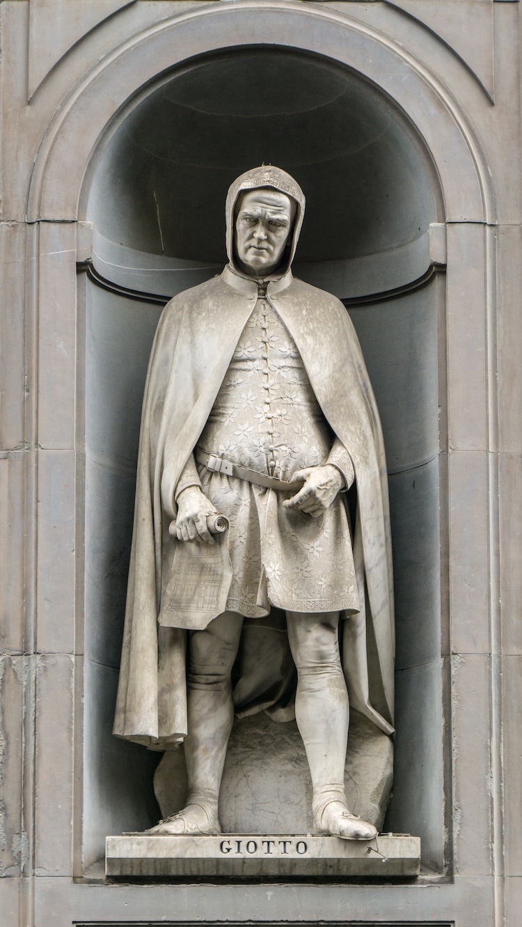
Stock Photos from Catay/Shutterstock The Italian Renaissance is regarded as one of the most vibrant periods in western art history. Artists like Leonardo da Vinci and Michelangelo created highly realistic works that emphasized a renewed interest in anatomy and proportion. To find the catalyst for this remarkable change, one has to look back to a painter from the Proto-Renaissance period named Giotto. At a time when the Byzantine style of flat, stylized compositions dominated Italy, Giotto based his art on life. His naturalistic paintings set the foundation for successors like Botticelli and Michelangelo. So much so that Giotto is often regarded as the father of the Italian Renaissance, and even the father of European painting. Here, we explore Giotto’s mythic life and the development of his naturalist style. 
Stock Photos from EQRoy/Shutterstock ; Early LifeGiotto di Bondone (c. 1267-1337) was estimated to have been born around the year 1267 near Florence. According to myth, Giotto was raised in the countryside as a young shepherd, where he often drew pictures of sheep on the ground. The story goes that one day, the esteemed Byzantine-style painter Cimabue spotted Giotto’s talent and offered him an apprenticeship. The Renaissance historian Vasari writes many allegorical examples of Giotto’s prodigious talent. In one incident, Giotto painted a fly on the wall that was so realistic, Cimabue tried in vain to brush it off. In another, Giotto demonstrated his skill to the current pope by drawing a perfect circle without the use of any tool. Although the accuracy of these episodes is dubious, it is true that Giotto’s skills surpassed his tutor after not too long, and he established himself as a dominant painter. 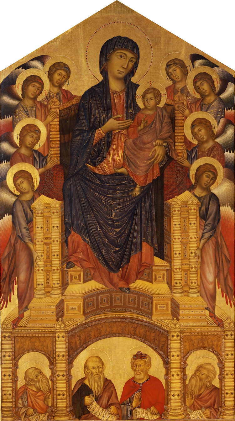
Cimabue, “Maesta of Santa Trinita,” c. 1280-90. (Photo: Wikimedia Commons [Public Domain]) The Scrovegni ChapelBetween 1303 and 1310, Giotto produced his most famous work inside the Scrovegni Chapel in Padua. His frescoes were divided into 37 narrative scenes which focused on the theme of Salvation and emphasized the Virgin Mary. He arranged the cycle into 3 tiers on the walls and placed the painting of The Last Judgement on the counterfacade. The entire decoration of the Scrovegni Chapel is unified by Giotto’s heavy use of the expensive ultramarine blue—although much of it has decayed over time. 
Stock Photos from EQRoy/Shutterstock ; StyleUnlike his tutor Cimabue, Giotto did not follow the Byzantine style, in which figures were stylized and floating. Instead, he drew from life—imbuing his characters with emotion and realism. Even the figures’ clothes have naturalistic drapery. Additionally, Giotto uses foreshortening and forced perspective in many of his compositions, giving a sense of depth to his paintings. 
Giotto, “No. 36 Scenes from the Life of Christ: 20. Lamentation (The Mourning of Christ),” c. 1304-1306. (Photo: Wikimedia Commons [Public Domain]) Later YearsGiotto achieved remarkable fame and prestige during his lifetime and traveled to commissions across Italy, including Rome, Naples, and Assisi. In Naples, Giotto was made first court painter by King Robert with a yearly pension. Eventually, however, Giotto returned to Florence, where he worked until his death in January of 1337. 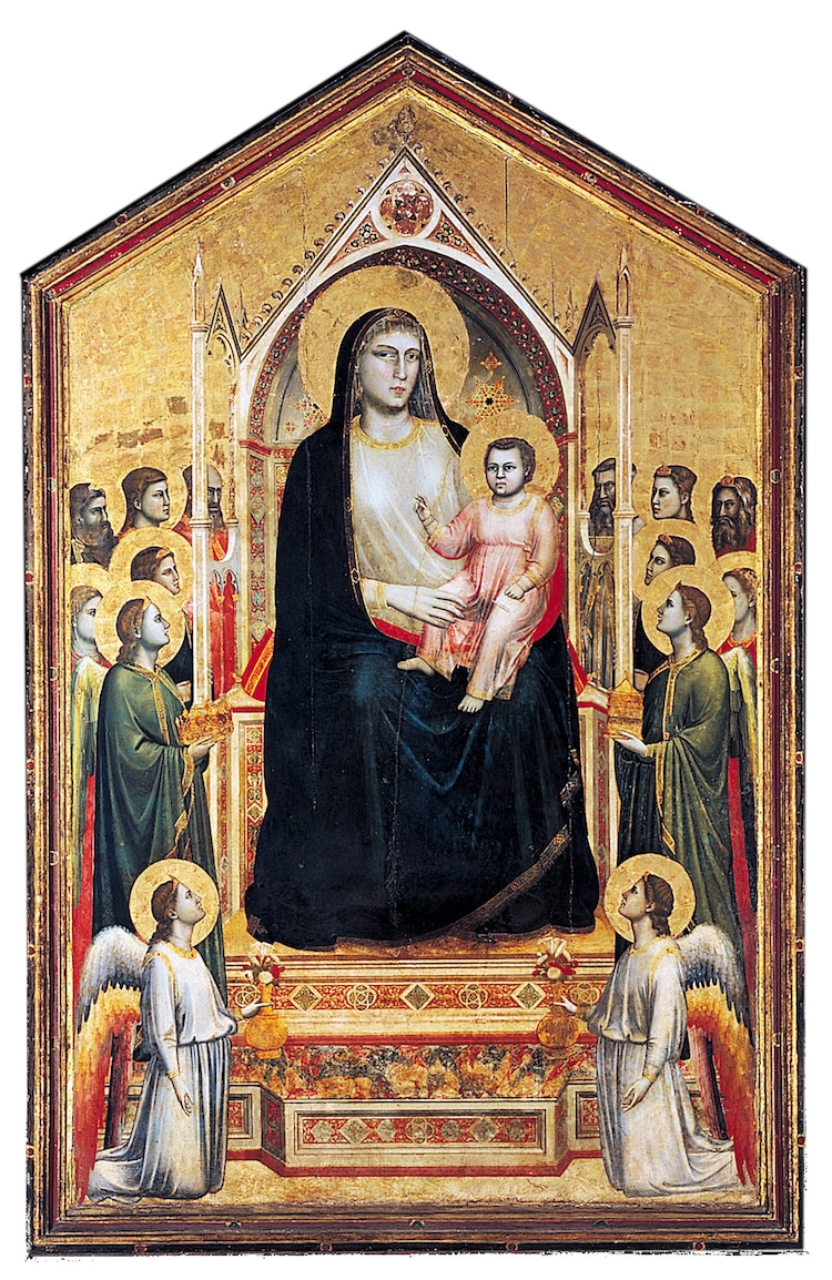
Giotto, “Ognissanti Madonna,” 1310. (Photo: Wikimedia Commons [Public Domain]) LegacyGiotto’s greatness was not only renowned among artist circles during his lifetime. He was also immortalized by his contemporary Dante in The Divine Comedy ;when a painter in Purgatorio (XI, 94-96) said: “Cimabue believed that he held the field/In painting, and now Giotto has the cry,/ So the fame of the former is obscure.” The emotion and naturalism of Giotto’s painting was highly popular and spurred an increased interest in concepts of realism and perspective that had been dormant since antiquity. Eventually, these humanist interests culminated in the Renaissance, where Giotto’s name became legend. 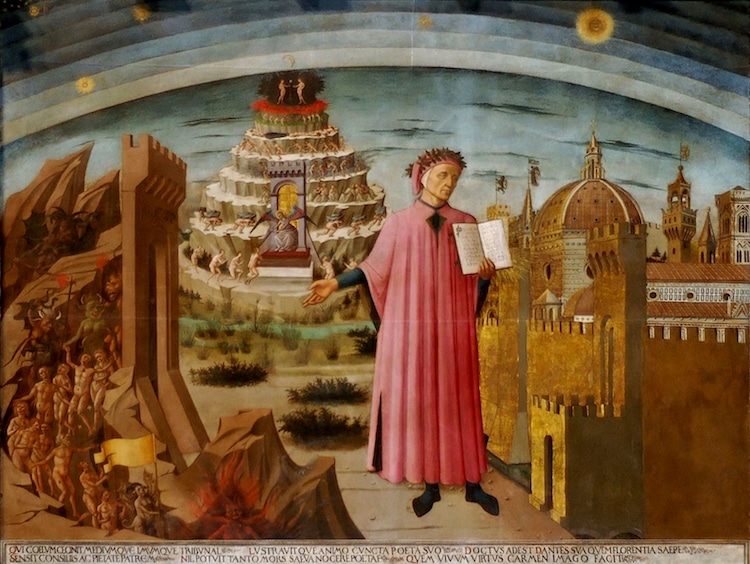
Domenico di Michelino, “Dante and the Divine Comedy,” 1465. (Photo: Wikimedia Commons [Public Domain]) Related Articles:Who Is Titian? Exploring the Life and Art of the Renaissance Master of Color The Significance of Botticelli’s Renaissance Masterpiece ‘The Birth of Venus’ Mannerism: The Style That Put an Elaborate Twist on Renaissance Art 8 Caravaggio Paintings That Broke All the Rules (and Where to See Them) The post Who Is Giotto? Learn About the Life and Art of the Father of the Renaissance appeared first on My Modern Met. via RSSUnify feed https://mymodernmet.com/giotto-life-and-art/
0 Comments
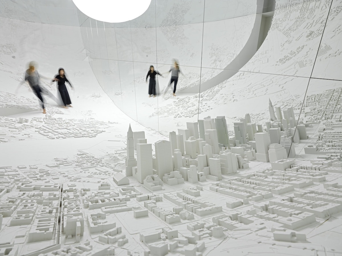
Photo: Peter Mallet Artist and stage designer Es Devlin ;explores the evolution of human thought and history in her sprawling installation titled Memory Palace. The massive, immersive work recently concluded its showing at London’s Pitzhanger Manor & Gallery where it filled their space with a chronological landscape that plotted “pivotal shifts in human perspective” from the beginning of our history to the present day. The monochromatic space was constructed in a rounded room equipped with mirrors to multiply the area and produce the illusion that the viewer was standing on the edge of the world. Along its surface were symbols of these momentous events carved out of bamboo. Some of the memories included were: the first cave drawings in southern Africa; Nicolaus Copernicus drawing the first heliocentric map of the universe in 1543; Rosa Parks refusing to give up her seat on the bus in 1955; and Greta Thunberg and her climate change strike in 2018. Fittingly, Memory Palace was inspired by Devlin’s past. “When I was a child I lived next door to a 1:100 scale model of my town which performed a ‘son et lumiere’ show,” she explained in a statement. “The windows of individual buildings would illuminate to locate stories told in voiceover. In a way, it was a memory palace in action: ideas, words and sounds indexed within physical architecture: I never forgot any of those stories as each was indelibly etched into the buildings I passed daily.” Ultimately, Devlin is the editor of the events included in her installation. While the viewer may not have agreed with what she presented, it’s hard to argue with what she believes is the most profound change that humans must make next. “It’s the shift we are now beginning to undertake as we re-evaluate all of our practices in the light of the climate crisis. It’s my hope that, surrounded by the traces of our historical leaps of imagination, the viewer will feel a sense of possibility that our species can achieve another momentous collective shift of perspective.” Artist and stage designer Es Devlin explores the evolution of human history and thought in her immersive art installation titled ;Memory Palace.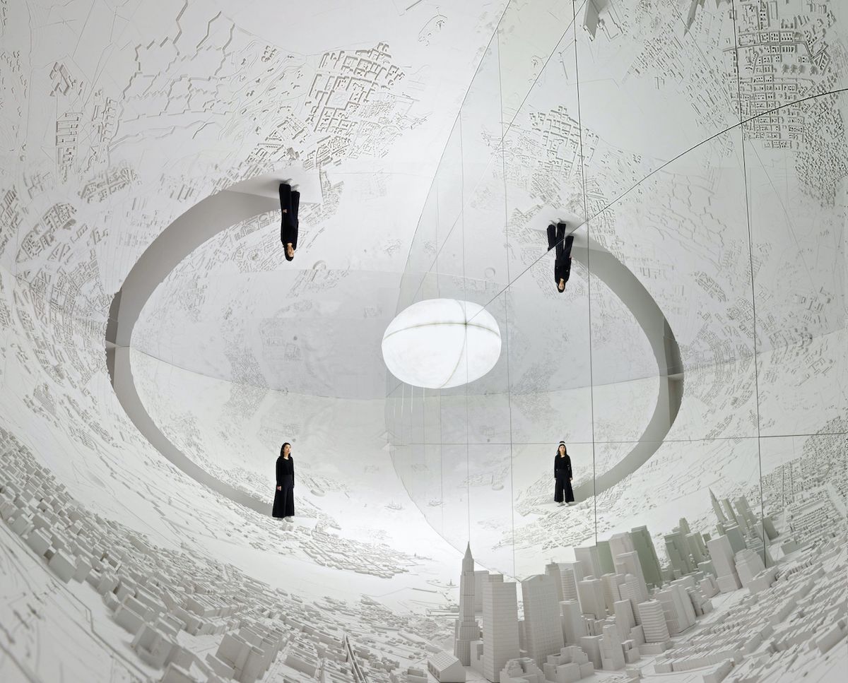
Photo: Peter Mallet 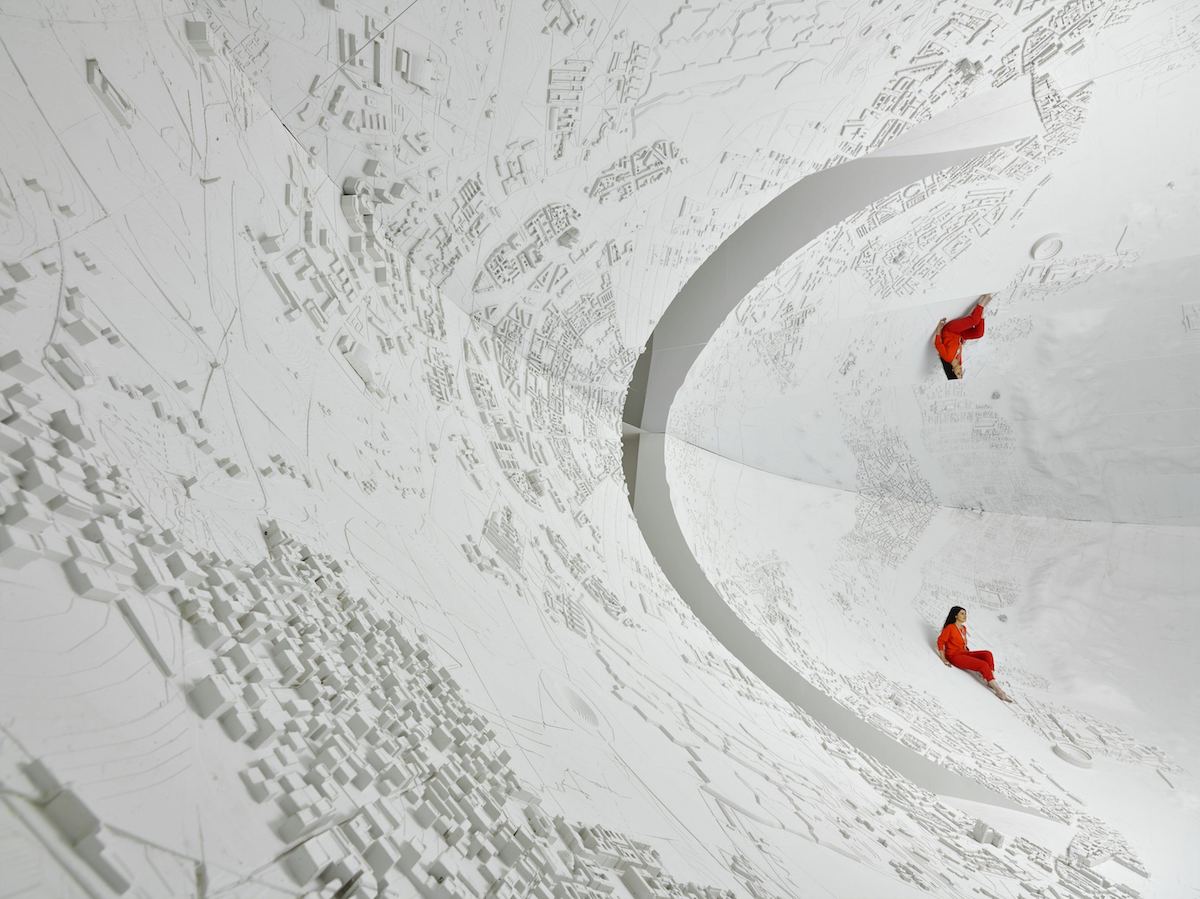
Photo: Peter Mallet 
Photo: Peter Mallet The mirrored room, which recently concluded a showing at the Pitzhanger Manor & Gallery, has elements carved from bamboo.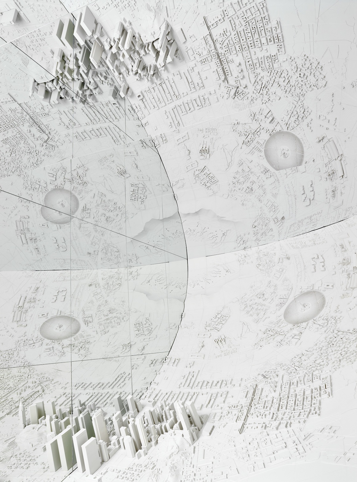
Photo: Peter Mallet It depicted events from the first cave paintings all the way to Greta Thunberg and her climate change strike in 2018.
Photo: Peter Mallet 
Photo: Peter Mallet 
Photo: Peter Mallet 
Photo: Peter Mallet Es Devlin: Website | InstagramMy Modern Met granted permission to feature photos by Es Devlin.Related Articles:Artist Spends Entire Year Turning Abandoned Mansion into Immersive InstallationImmersive 3D Installation Invites Viewers to Step Inside a Giant PhotographInterview: Bruce Munro Illuminates California’s Wine Country with ‘Field of Light’ InstallationThe post Immersive Installation Chronicles Humanity’s Past and Present While Challenging Us to Think of the Future appeared first on My Modern Met. via RSSUnify feed https://mymodernmet.com/es-devlin-memory-palace-immersive-installation/ 
This post may contain affiliate links. If you make a purchase, My Modern Met may earn an affiliate commission. Please read our disclosure for more info. Forever pushing the boundaries of photography, Leica has released the newest model in its range of black and white ranger finder cameras. The Leica M10 Monochrom has all the traits of the M10-P platform, but with a 40-megapixel full-frame monochrome sensor. So why would one want to buy a full-frame camera that can’t shoot color photos? There are quite a few reasons. Leica is staking its claim on the importance of black and white photography with the Monochrom line. In fact, the M10’s sensor has been specifically designed for monochrome photography. Without any color arrays, there are fewer glass and filter layers, which makes it capable of shooting in any lighting condition while maintaining beautiful contrast and crisp sharpness. Additionally, the sensor’s wide ISO range (160 to 100,000) allows photographers to obtain images with clearly defined areas of shadow and illumination—even when shooting in high-contrast or uneven light. And, of course, the M10 Monochrom also contains some of the best features of the M10-P. This includes a silent shutter, touchscreen, thin body design, and Wi-Fi connectivity—a first for the Monochrom. One important note, however, is that the M10 Monochrom lacks video functionality. Though the last generation Monochrom included this, Leica said it found that photographers simply weren’t using it, and so it’s been stripped out. In terms of design, Leica has mostly kept things classic. To keep photographers blending into the crowd, Leica has blacked out the shutter and lens release buttons. The trademark red Leica dot on the front of the camera is also missing, so street photographers will remain inconspicuous. At $8,295, the price tag may be steep for some; but if you are a photographer who specializes in black and white photography, it’s well worth the expense. Currently, the Leica M10 Monochrom is available for preorder. The Leica M10 Monochrom is a full-frame camera exclusively for black and white photography.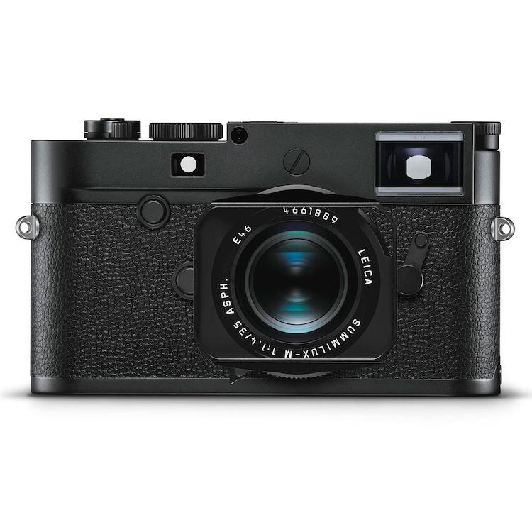 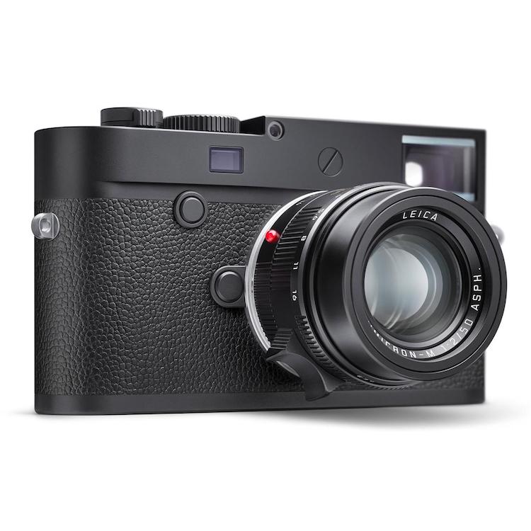 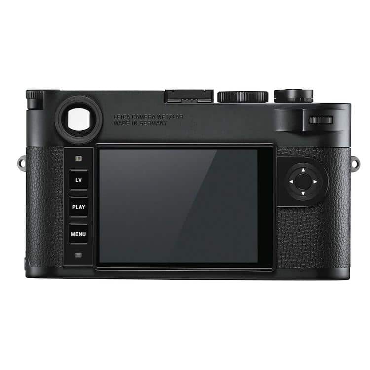
The slim, subtle design hides a powerful camera with a 40-megapixel sensor.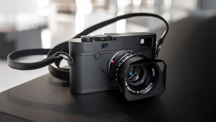 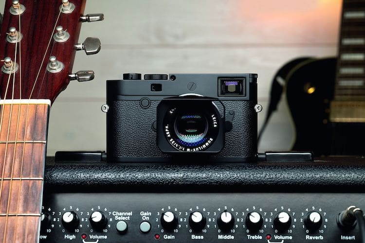
Photographer Alan Schaller demonstrates the beautiful contrast and sharpness of the M10 Monochrom.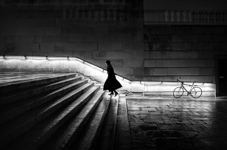
Photo: Alan Schaller 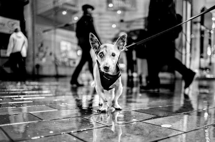
Photo: Alan Schaller The camera’s sensor, built specifically for greyscale photos, is designed to handle any lighting situation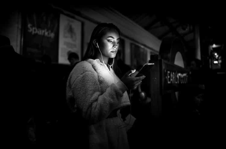
Photo: Alan Schaller 
Photo: Alan Schaller Leica: ;Website ;| ;Facebook ;| ;Instagram All images via Leica.Related Articles:The Leica M10-P Is the Iconic Brand’s Quietest Camera Ever Leica Q2 Is the Compact Full-Frame Camera You’ve Been Waiting For Leica Unveils the SL2 Full-Frame Mirrorless Camera That Shoots 5K Video Leica Introduces the M-E (Type 240), Its Entry-Level Version of the Beloved M Series Camera The post Leica M10 Monochrom Is Designed Specifically for Black and White Photography appeared first on My Modern Met. via RSSUnify feed https://mymodernmet.com/leica-m10-monochrom/ 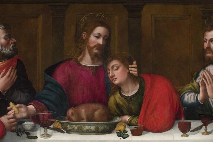
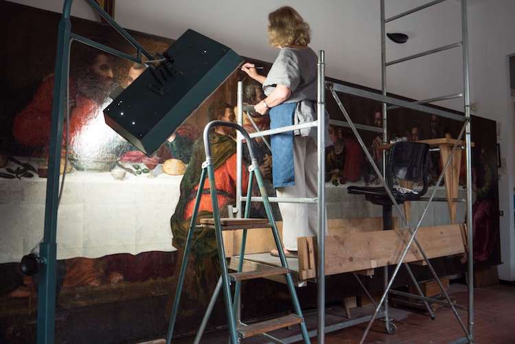
This post may contain affiliate links. If you make a purchase, My Modern Met may earn an affiliate commission. Please read our disclosure for more info. Unfortunately, when it comes to art, women often aren’t recognized in history. Many talented female artists are often overlooked in favor of their male contemporaries, simply due to circumstance or the opportunities presented to them because of their gender. But in Florence, there’s a group working to make sure that women get the acknowledgement they deserve. And thanks to their efforts, one incredible painting by a 16th-century nun is getting its rightful place in the spotlight. Advancing Women Artists is a non-profit committed to identifying and restoring works of art by women throughout Tuscany. They highlight these often unknown artists from the Renaissance through their extensive online database and publications. One of their most recent efforts focused on a vibrant mural by Plautilla Nelli. Nelli was both a nun and a self-taught artist. Her enormous, 21-foot painting of the ;Last Supper, created around 1568, was brought back from the brink of decay by an expert set of art restorers (who all happened to be female) working with the organization. While we often associate Last Supper ;depictions with Leonardo da Vinci, it was a popular subject for artists at the time. Nelli’s rendition is a stunning achievement, particularly when one looks at her aptitude for painting the human body. Her apostles are expressive and full of emotion, with their features laid out in precise detail. The work is made all the more impressive when one considers that at the time, women were barred from studying anatomy. 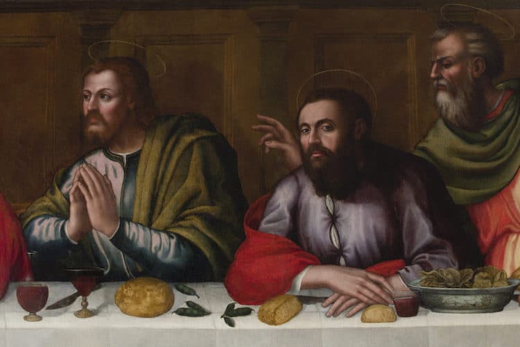
Equally impressive is the table. Strewn with expertly rendered wine glasses, bread, knives, and salt cellars, it stands with any still life created during its time. The great skill Nelli has displayed was also known during her time, though always with the caveat that it was unfortunate that she was a woman. She was only one of four women mentioned by Giorgio Vasari in his important Lives of the Most Excellent Painters, Sculptors and Architects. He does compliment her, stating: “There were so many of her paintings in the houses of gentlemen in Florence, it would be tedious to mention them all.” But he also makes it clear that her gender, in his opinion, is a hindrance. “She would have done wonderful things if she had only studied as men do.” It’s that type of thinking that is part of the reason why Nelli, and so many other female painters of the day, were often overlooked then and even today. Nelli’s Last Supper hung in the dining hall of her convent until the house was dissolved in the early 19th century. From there, it’s been on an adventure, moving from the monastery of Santa Maria Novella to being neglected in a warehouse to surviving the great Florence flood of 1960. It then became part of the Santa Maria Novella museum, but was not on public display. Thanks to the efforts of Advancing Women Artists, that has changed. After raising the necessary funds, the organization’s all-female team of restorers set about bringing the painting back to life. “We restored the canvas and, while doing so, rediscovered Nelli’s story and her personality,” said lead conservator Rossella Lari. “She had powerful brushstrokes and loaded her brushes with paint.” Now that the work is done, Nelli’s ;Last Supper ;has taken its rightful place in the Santa Maria Novella museum as part of its permanent display. No longer destined to the background, Nelli has gained increased fame thanks to the work of Advancing Women Artists. Learn more about the epic restoration and Nelli’s ;Last Supper ;in Visible. Plautilla Nelli And Her Last Supper Restored. After years of neglect, Plautilla Nelli’s 1568 ;Last Supper has been restored.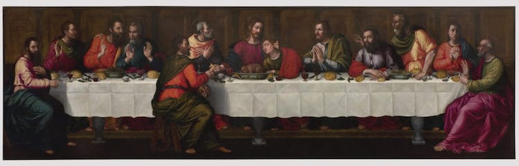 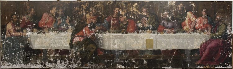
Nelli was a nun and self-taught artist working during the Italian Renaissance.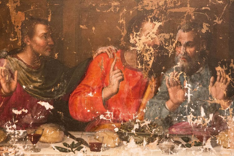 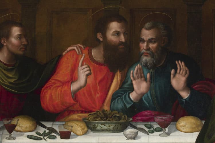
A non-profit organization called Advancing Women Artists raised funds to restore the painting and put it on permanent display.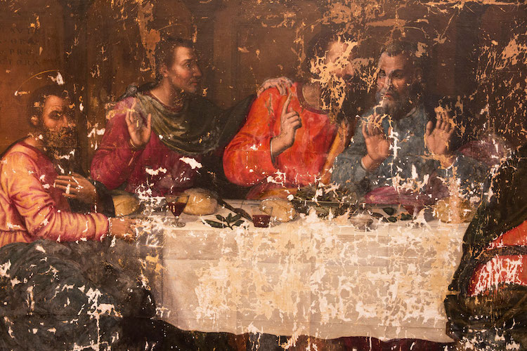 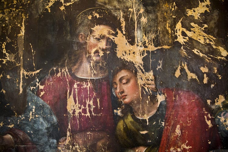
Their all-female team of curators, scientists, and art restorers worked tirelessly on the project.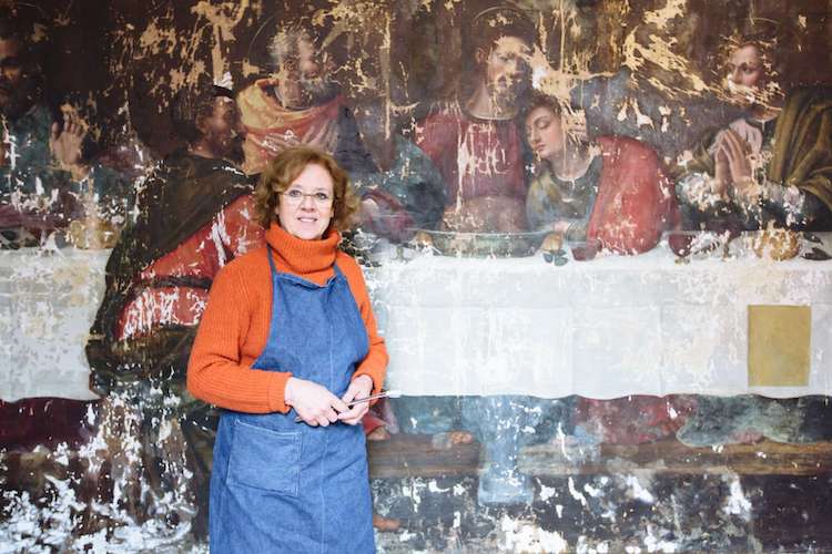 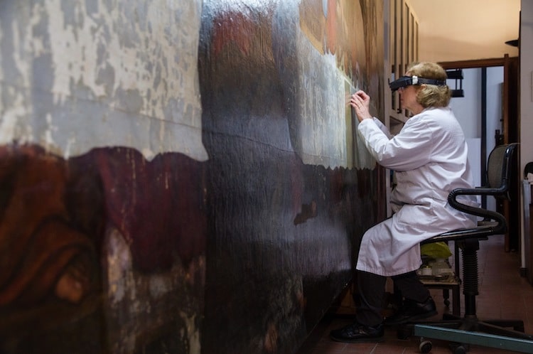
Now, Nelli is getting her rightful place next to top male painters from the 16th century.
All images via Rabatti&Domingie.Related Articles:10 Famous Female Painters Every Art Lover Should Know Online Database Features Overlooked Female Artists from 15th-19th Centuries Empowering Art Book Highlights Female Artists Overlooked by Museums This Woman Has Been Anonymously Funding Female Artists for 22 Years The post 16th-Century Nun’s Incredible ‘Last Supper’ Is Restored by an All-Female Team of Experts appeared first on My Modern Met. via RSSUnify feed https://mymodernmet.com/plautilla-nelli-last-supper/ 
This post may contain affiliate links. If you make a purchase, My Modern Met may earn an affiliate commission. Please read our disclosure for more info. Everything about Salvador Dalí screams “unique.” An avant-garde artist and undisputed leader of the Surrealist movement, Dalí is renowned for his unusual art inspired by the subconscious and reminiscent of dreams. In order to channel this one-of-a-kind approach to aesthetics, we’ve compiled a collection of stylish gifts with a surreal twist. In this selection of quirky products, you’ll discover goodies inspired by different aspects of ;Dalí’s life. A few of these gifts are designed to look like the artist himself, from tiny dolls to “toe”-tally creative socks. Some are modeled after his paintings, including the “melting” clock from The Persistence of Memory and earrings that look like The Eye of Time. And others simply capture his quirky side, as evident in a mustache mug and a stuffed anteater—inspired, if you can believe it, by the artist’s own unusual pet! ; ; Capture your quirky side with these Dalí-inspired gifts. Want to channel your avant-garde alter ego? Check out these Salvador Dalí gift ideas.; Dalí ;Action Figure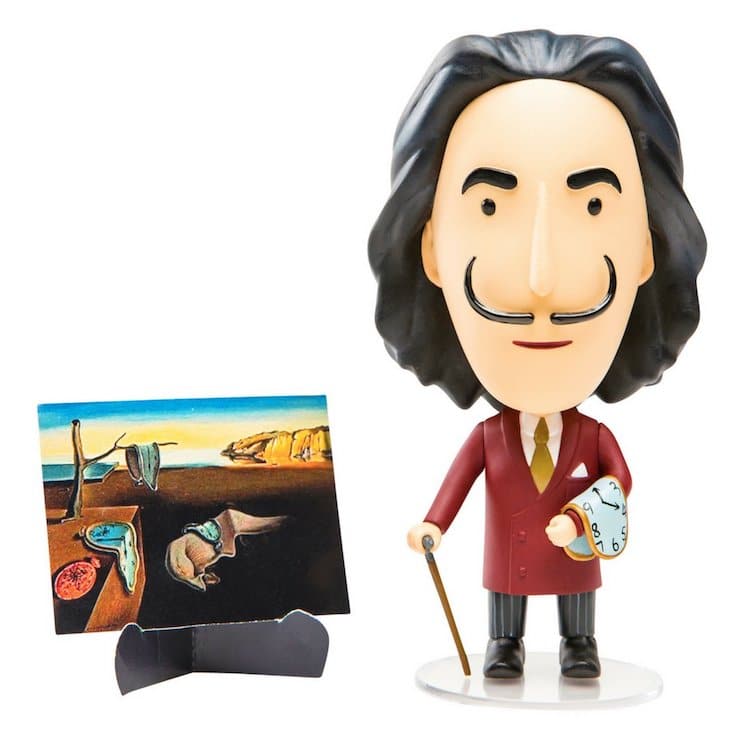
Today Is Art Day | $29.99 ; Mustache Mug
minimedium | $14.57 ; Melting Clock
Enapy Store | $24.99 ; The Eye of Time Earrings
MaryLionJewelry | $12.62 ; Anteater Toy
Blue Frog Toys | $9.49 ; Surreal Socks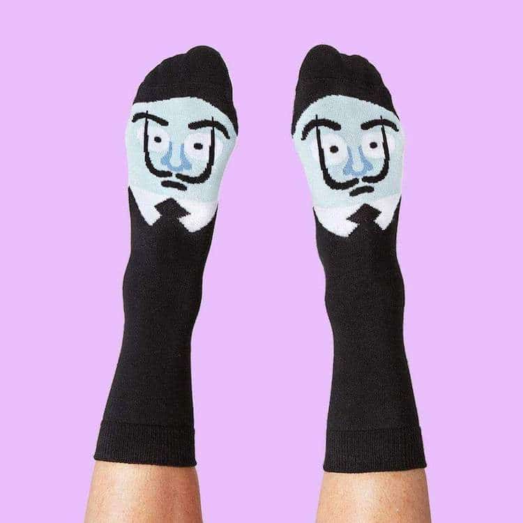
Chatty Feet | $39.95 ; The Elephants Necklace
Artifactoria | $89 ; Persistence of Memory Socks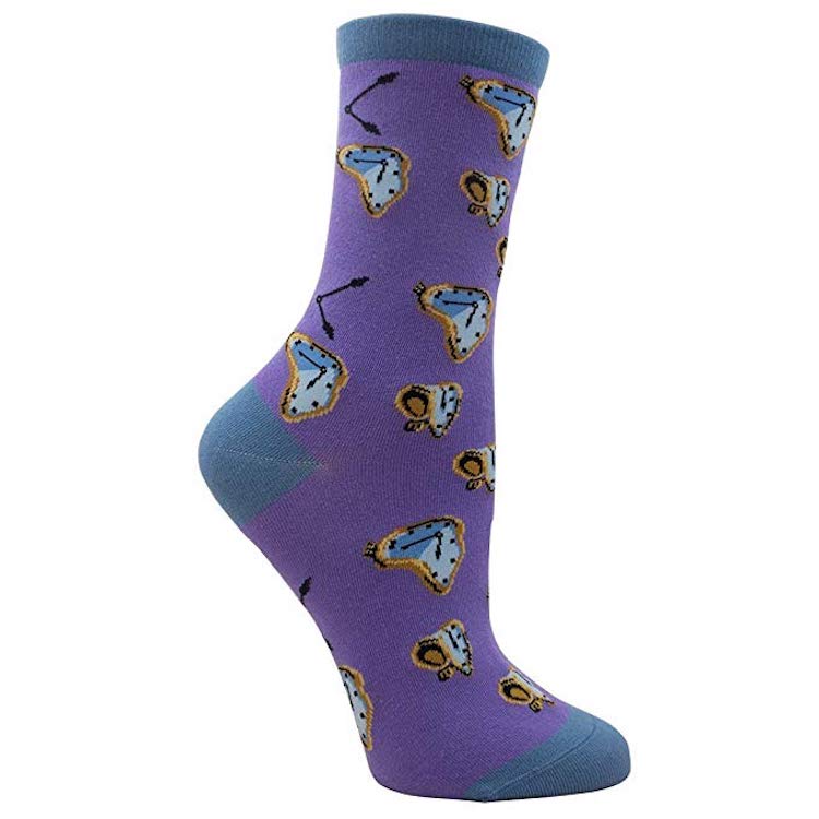
Imagery Socks | $7.99 ; Dalí Kokeshi Doll
Sketch.Inc | $44 ; The Temptation of St. Anthony Puzzle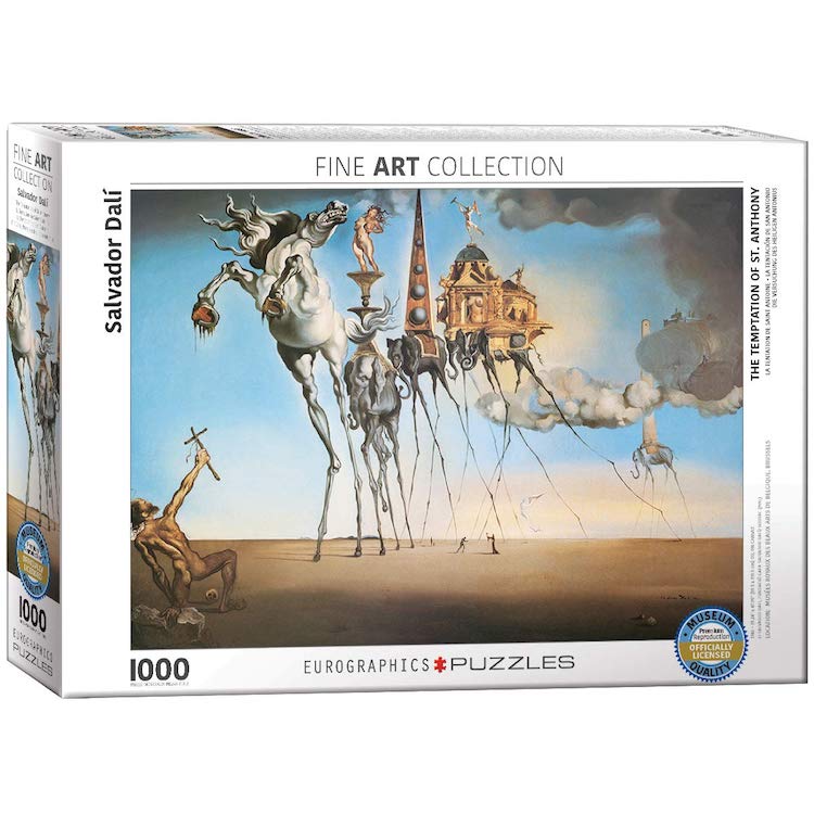
EuroGraphics | $21.99 ; Perfume Bottle-Inspired Pin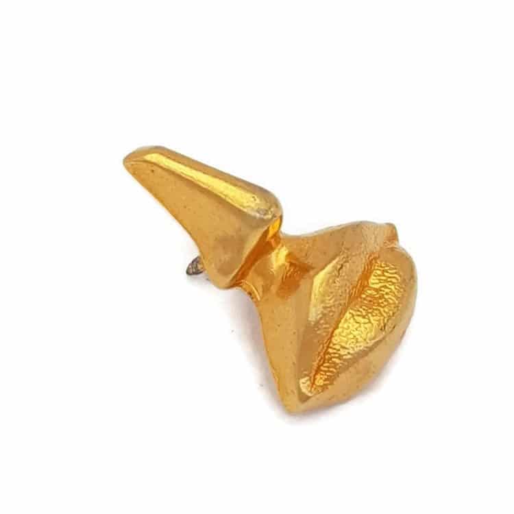
MarieLouisette | $29.02 ; Dalí ;Cookbook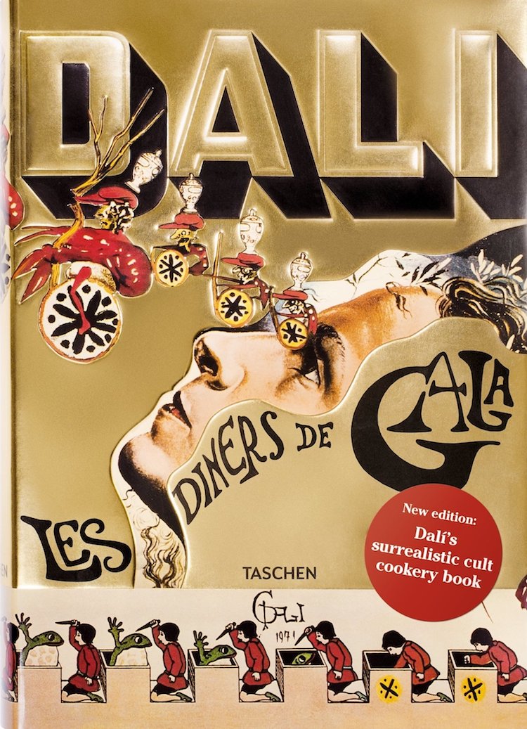
Salvador Dalí | $40.84 ; Salvador Dalí Enamel Pin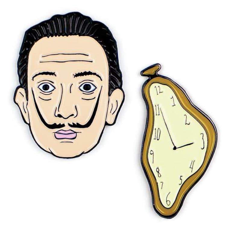
Unemployed Philosophers Guild } $15.95 ; Lobster Telephone Case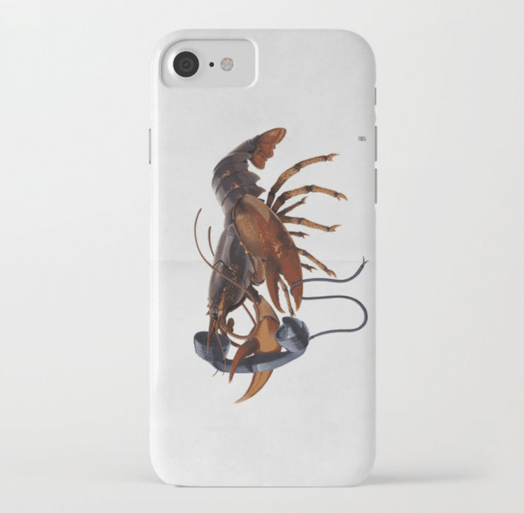
rob art | $28.79 ; Melting Clock Sticker
Level26Studio | $1.75 Alice’s Adventures in Wonderland ;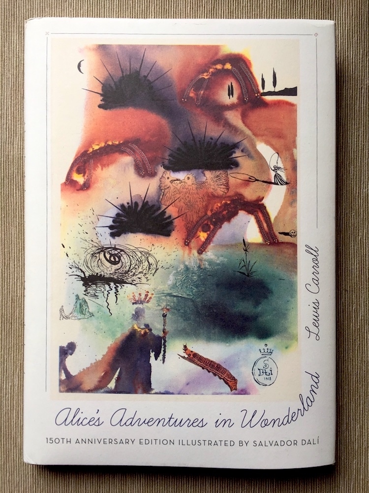
Lewis Carroll | $16.58 ; Salvador Catli ;Enamel Pin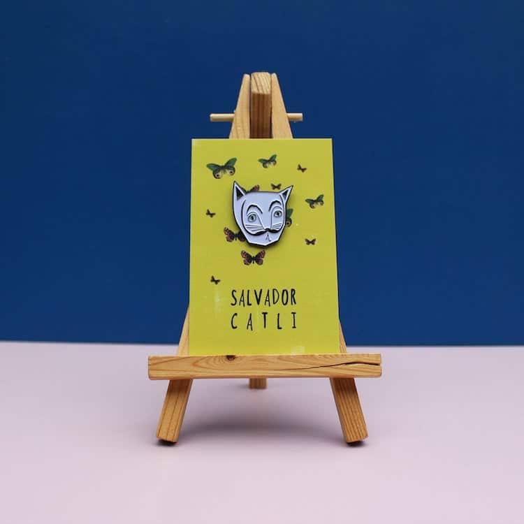
Niaski | $12.50 ; Related Articles:20+ Art History Accessories That Turn Everyday Objects into Masterpieces 15 Contemporary Art Gifts Inspired by Today’s Top Artists 15 Quirky Presents Inspired by Pop Art 20+ Creative Gifts for Anyone Who Loves Frida Kahlo The post 17 Quirky Gifts Inspired by Surrealist Salvador Dalí appeared first on My Modern Met. via RSSUnify feed https://mymodernmet.com/salvador-dali-gift-ideas/ 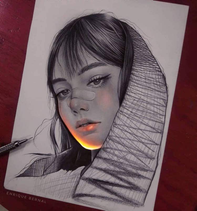
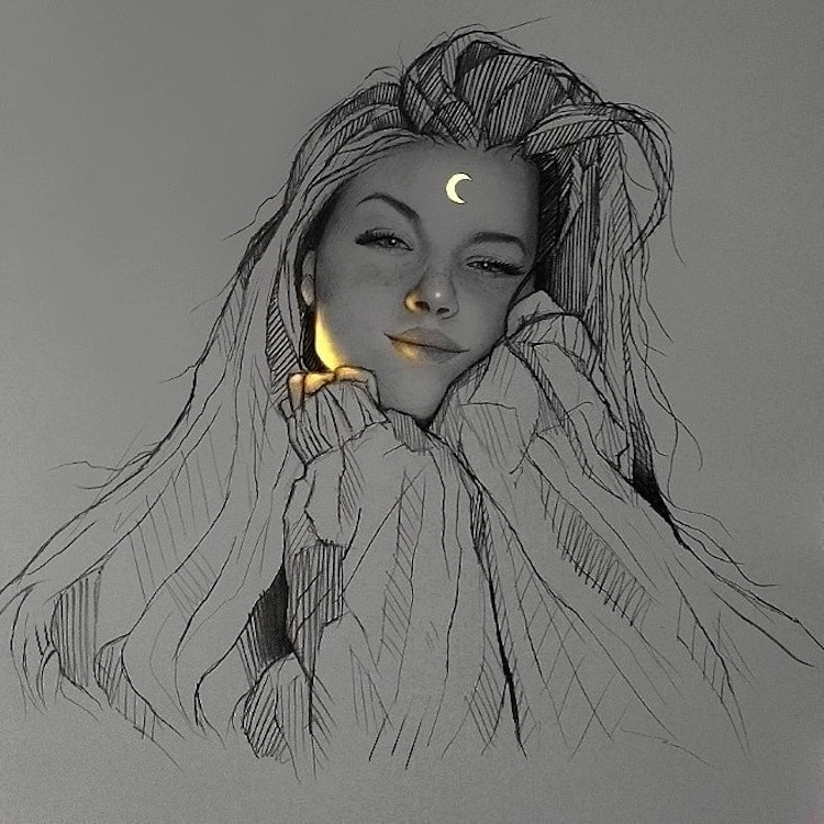
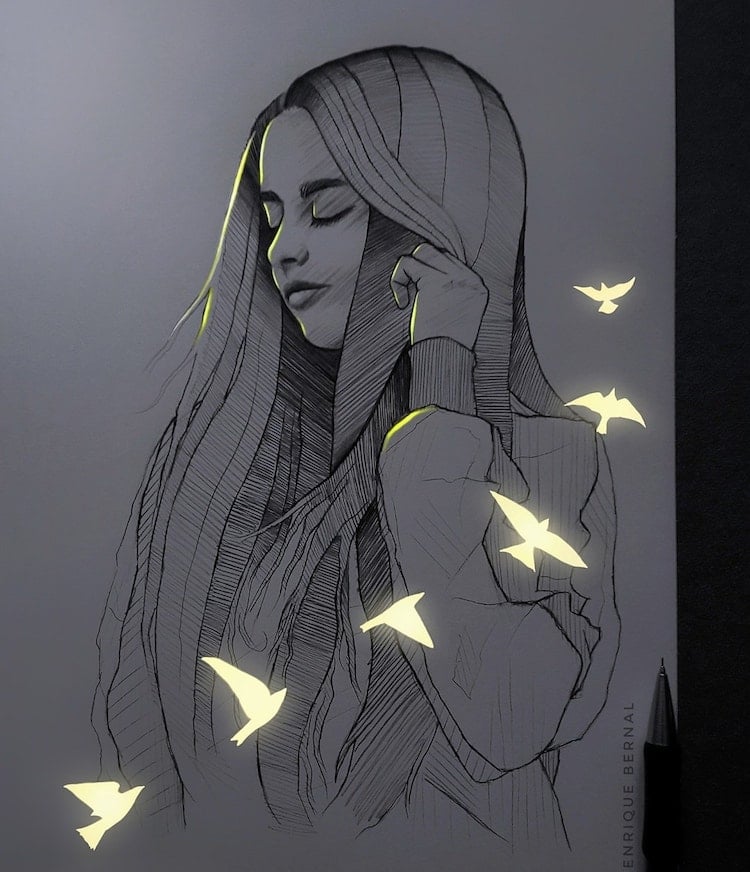
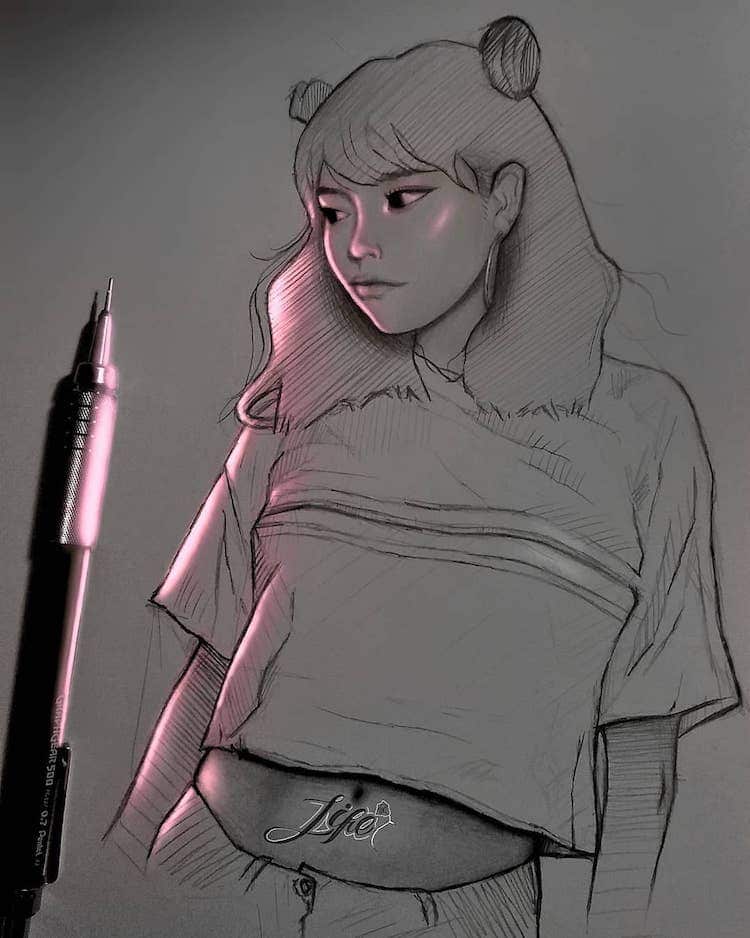
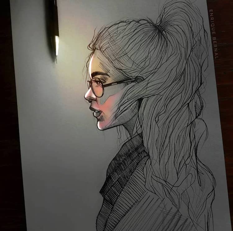
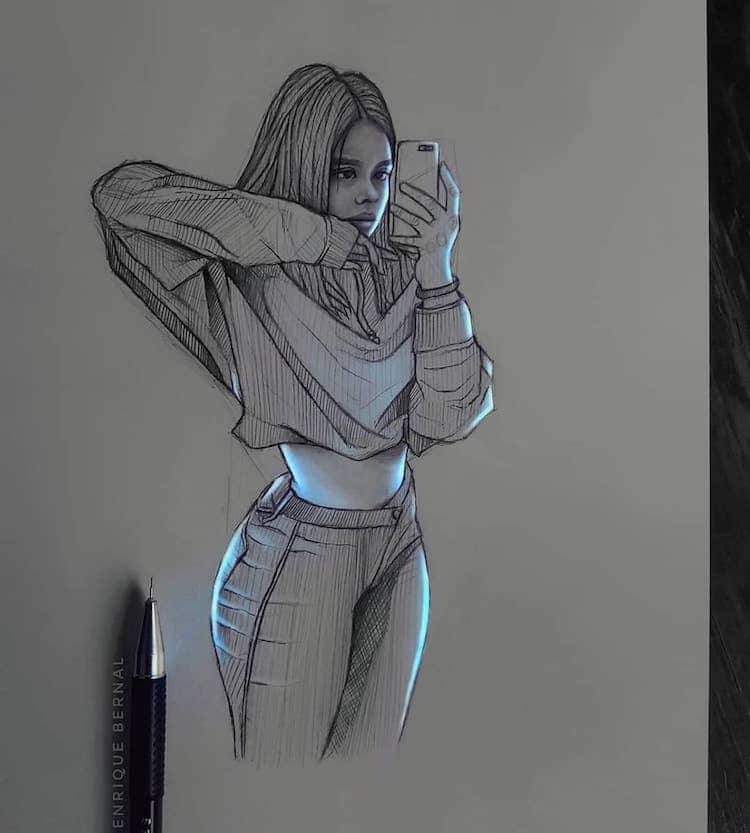
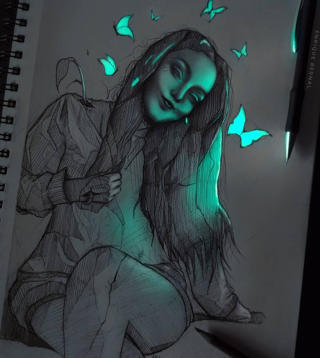
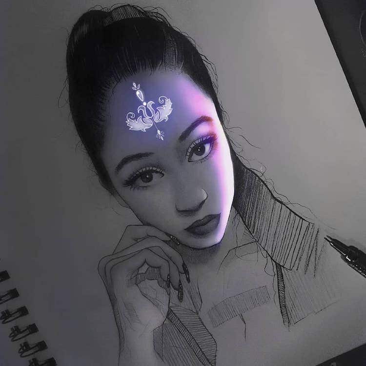
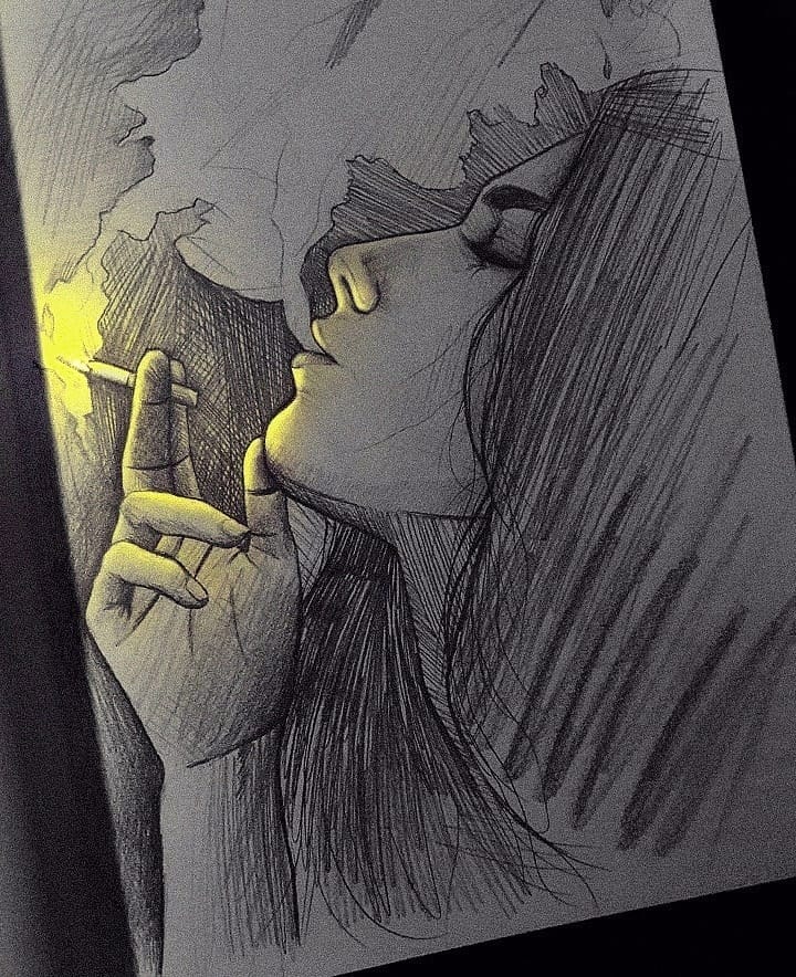
Artist Enrique Bernal (AKA Kike) has found a way to make his pencil sketches glow with life. His realistic drawings—which range from portraits to animals—are made using mechanical pencils and pens. Recently, however, Bernal has added extra effects to his illustrations with stunning results. After completing the pencil sketch, Bernal uses the artist app Medibang Paint to add artificial lighting to his drawings. This digital “glow” imitates an unknown fluorescent light source. Bernal makes clever use of the placement of the glare, as well as the color. In some of his works, the artist uses the technique to contour the features of a person’s face and body, as though they were being warmed by a mysterious light. In others, Bernal utilizes digital manipulation even more to add fantastical effects like shining butterflies and glowing tattoos. These creative choices seem to add another layer to Bernal’s already fantastic sketches. The mystery of the glow makes these illustrations pop off the page. Scroll down to see how Bernal enhances his drawings with digital lighting. To keep up to date with the artist’s latest creations, you follow him on Instagram. Artist Enrique Bernal makes pencil drawings that look like they’re lit with fluorescent lights.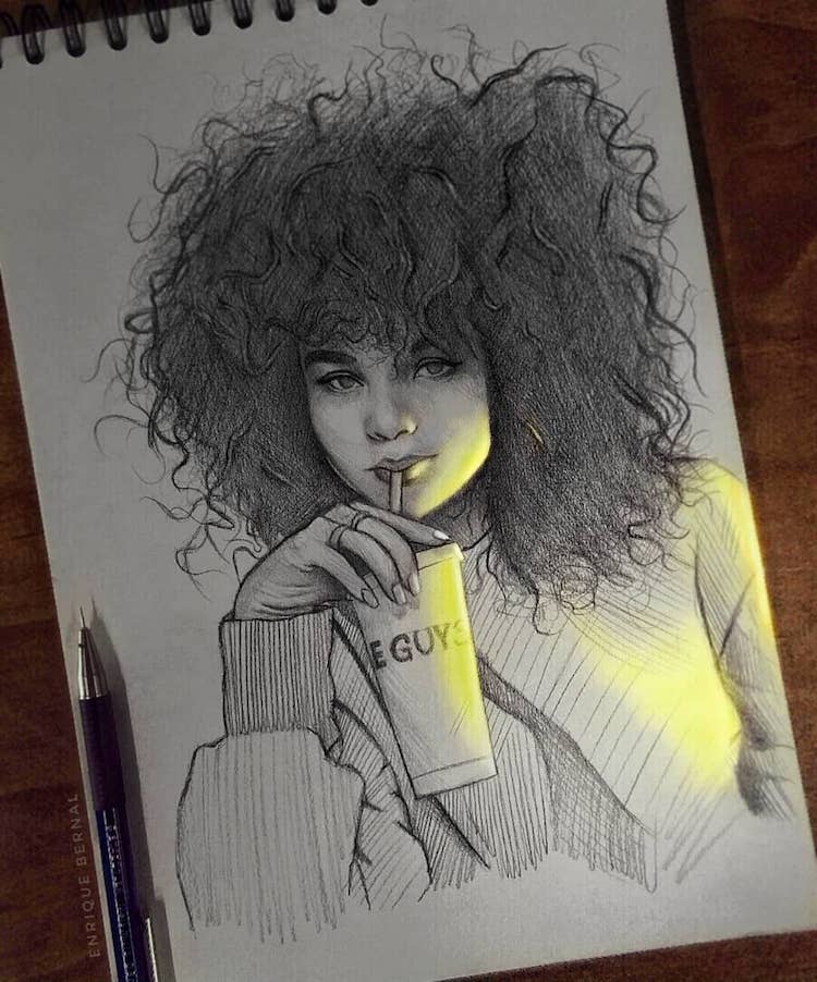
After completing each sketch, the artist uses an app called “Medibang Paint” to add artificial highlights.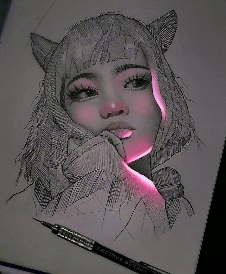
These glowing details seem to bring Bernal’s sketches to life.
My Modern Met granted permission to feature photos by Enrique Bernal.Related Articles:Artist Uses Her Own Thigh as a Canvas for Stunning Ink Drawings Intricate Architecture Drawings Capture the Beauty of Gothic Buildings Across Europe Striking Pen and Ink Drawings Illustrate the Human Connection to Nature The post Artist Creates Pencil Drawings That Look Like They’re Lit With Fluorescent Lights appeared first on My Modern Met. via RSSUnify feed https://mymodernmet.com/enrique-bernal-florescent-drawings/ 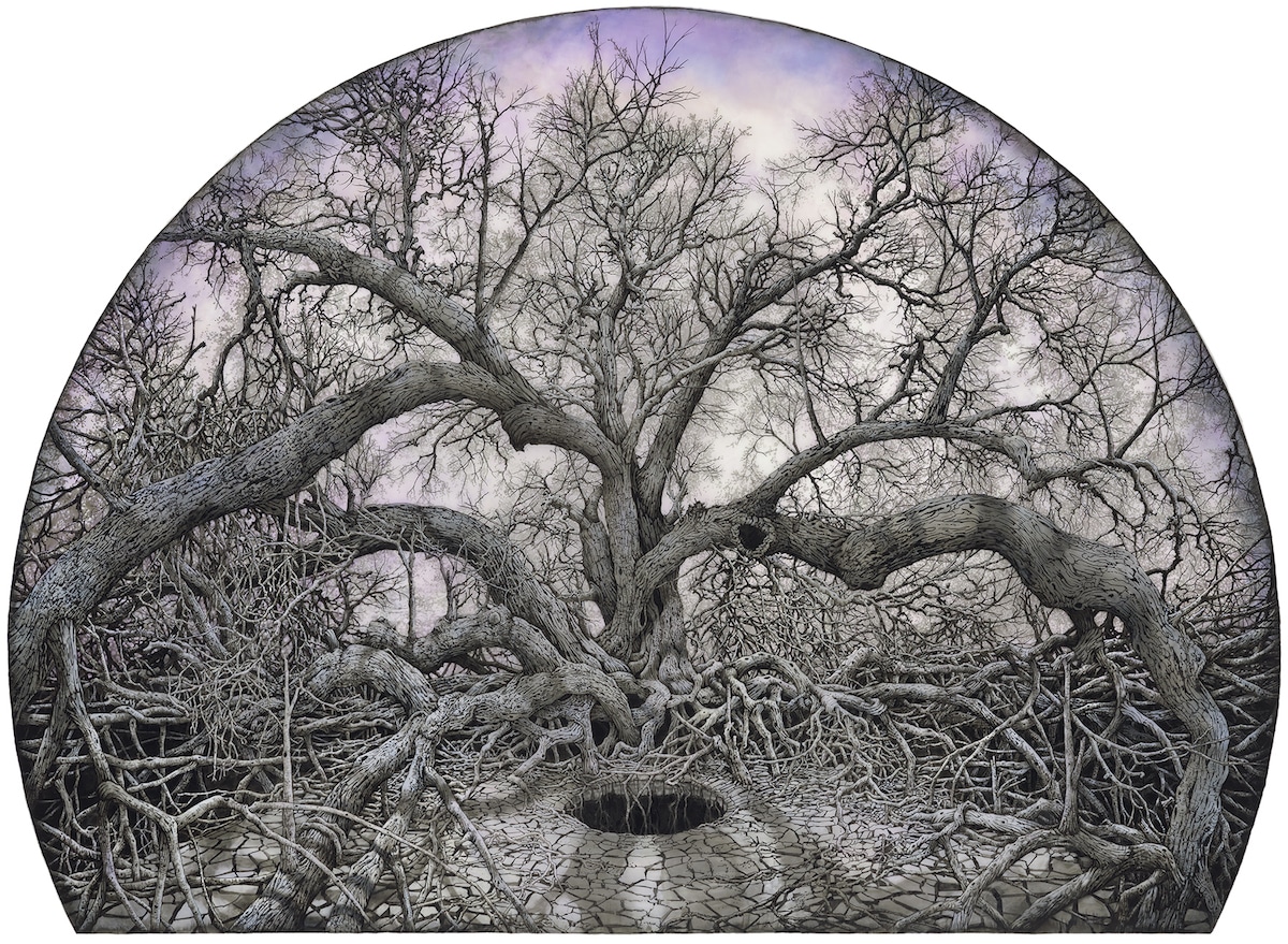
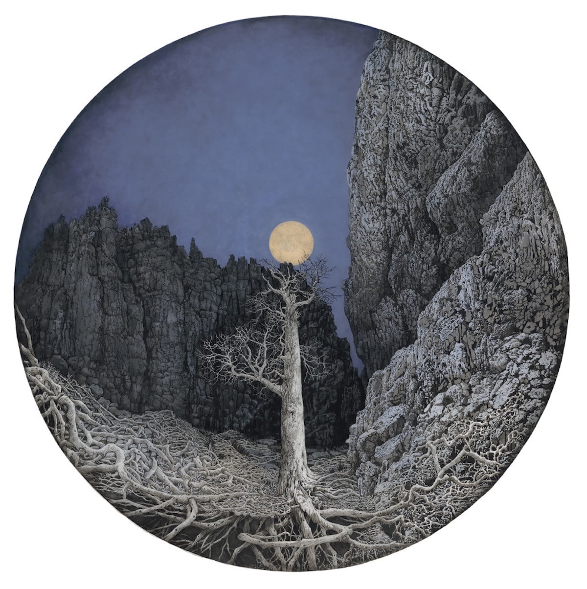
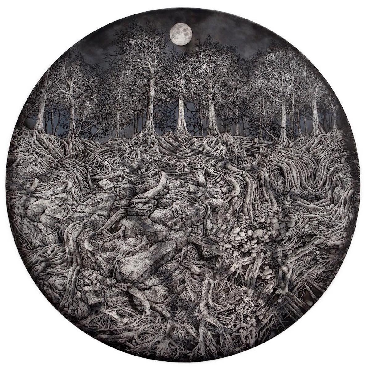
Los Angeles-based artist Rachael Pease explores memories of rural landscapes through her intricate drawings. Each piece documents real trees she’s seen and photographed. Before Pease puts pen to paper, she brainstorms compositions by putting together a collage from different photos. Once the artist’s satisfied, she applies India ink on frosted mylar, resulting in a rich, glowing effect. “As I draw, I weave reality with strings of fantasy and inspiration that I received from the actual trees at the location,” Pease explains. “In my studio, I revisit the trees and talk to them. I think about the roots breaking the dry soil in the ground or how a branch bends over one’s head to the sky. Trees provide me with a mirror to look inward. They make me nostalgic of the wild freedom, wonder, and fear I experienced growing up in my home forests of Indiana. My goal as an artist is to help provide access for others to that self-reflective mirror, to reconnect us with looking and be an envoy of nature.” Pease applies meticulous detail to the texture of the trees and the dry landscapes they grow from. The bold trees’ silhouettes are contrasted by the soft and slightly colorful skies, offering a visually realistic balance. She also consciously frames the drawings in a circle or oval, which seems to emulate the perspective of binoculars or a telescope. In some works, the branches of the trees dominate the composition, in others, it is the strong labyrinth of roots. To keep up to date with Pease’s latest creations you can follow her on Instagram. Los Angeles-based artist Rachael Pease uses India ink on frosted mylar to compose her intricate landscape drawings.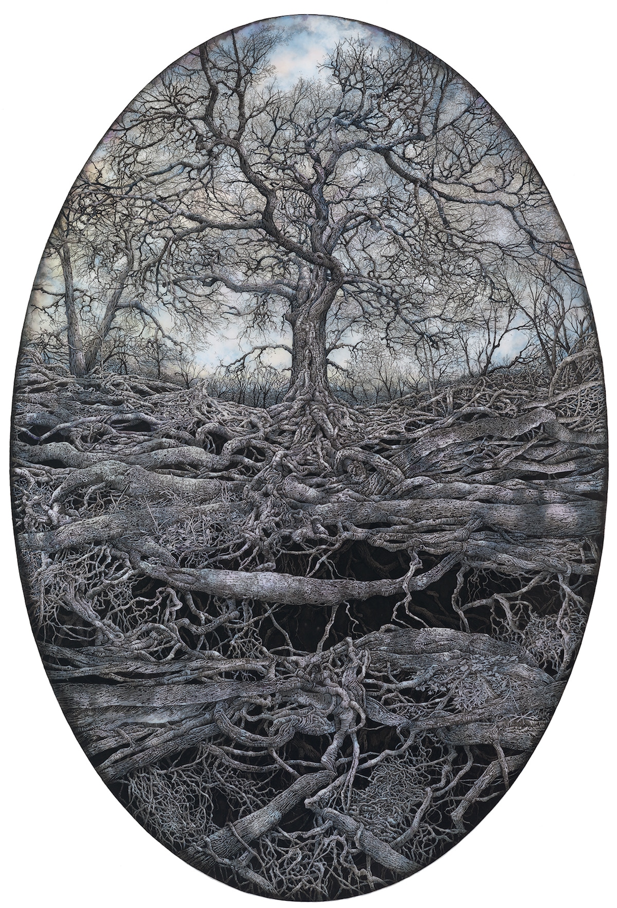
Each illustration features giant trees with wild, unruly roots.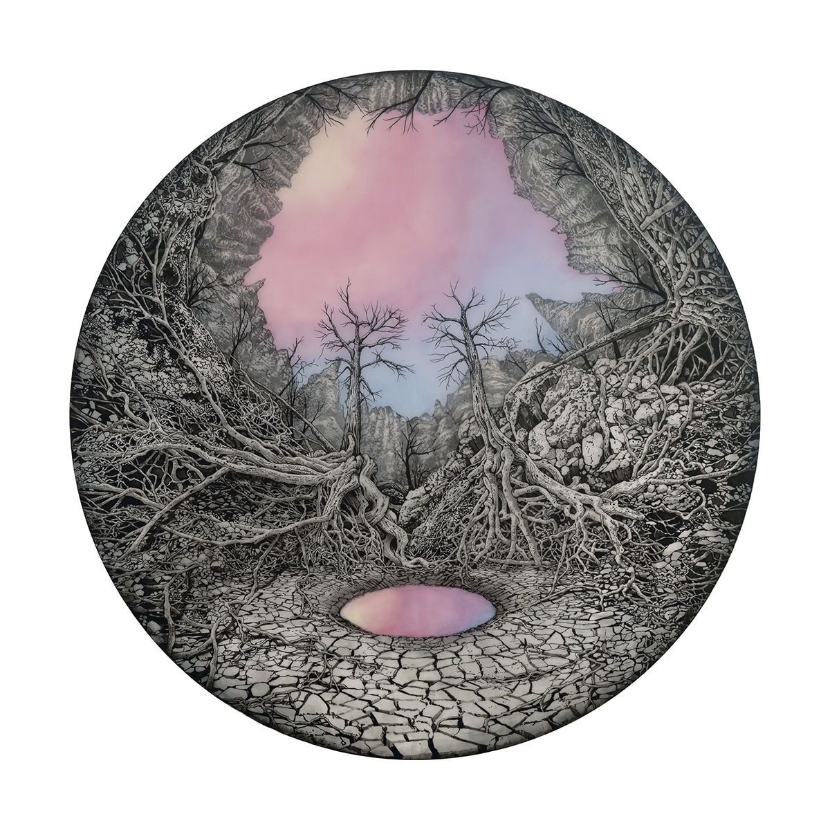 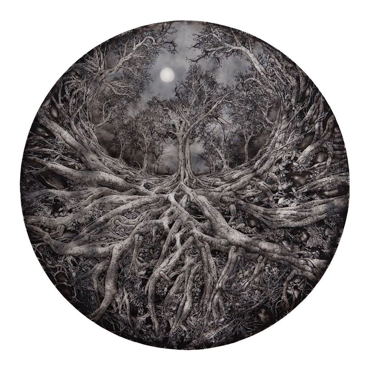 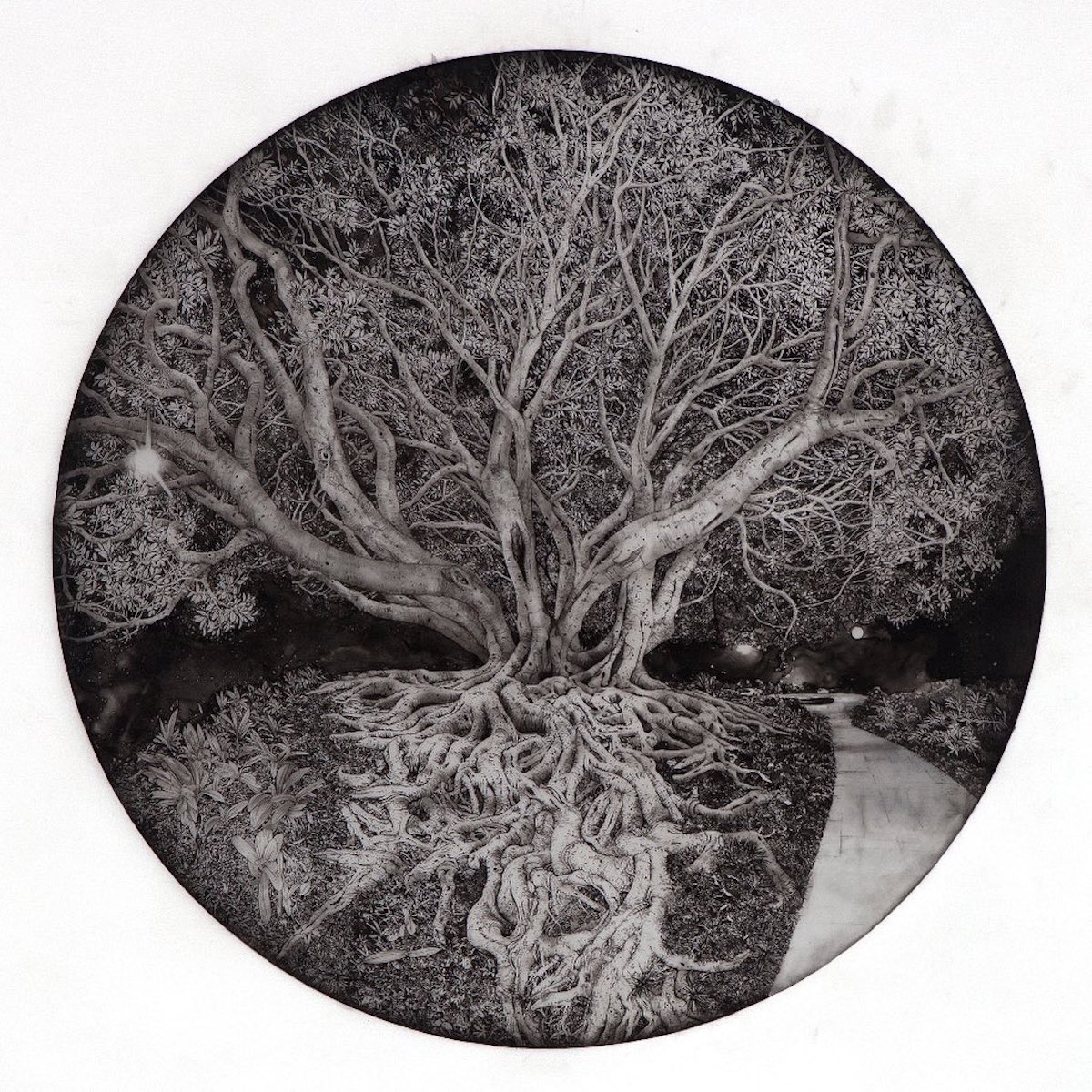 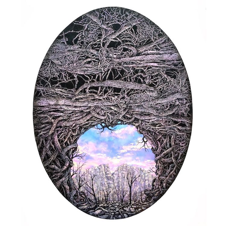 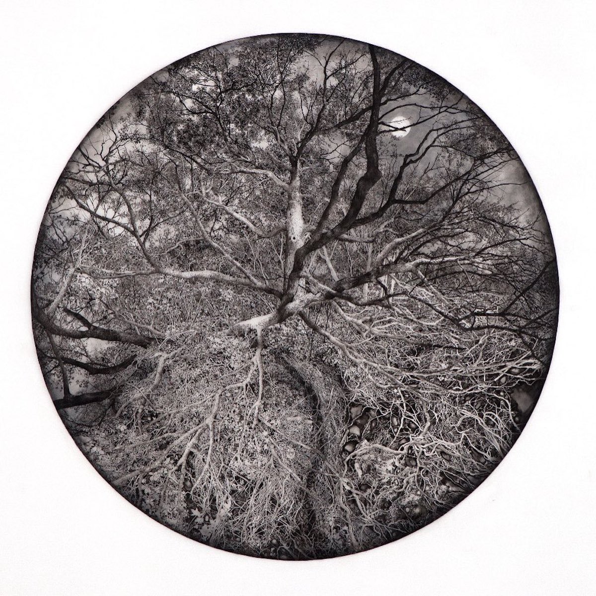 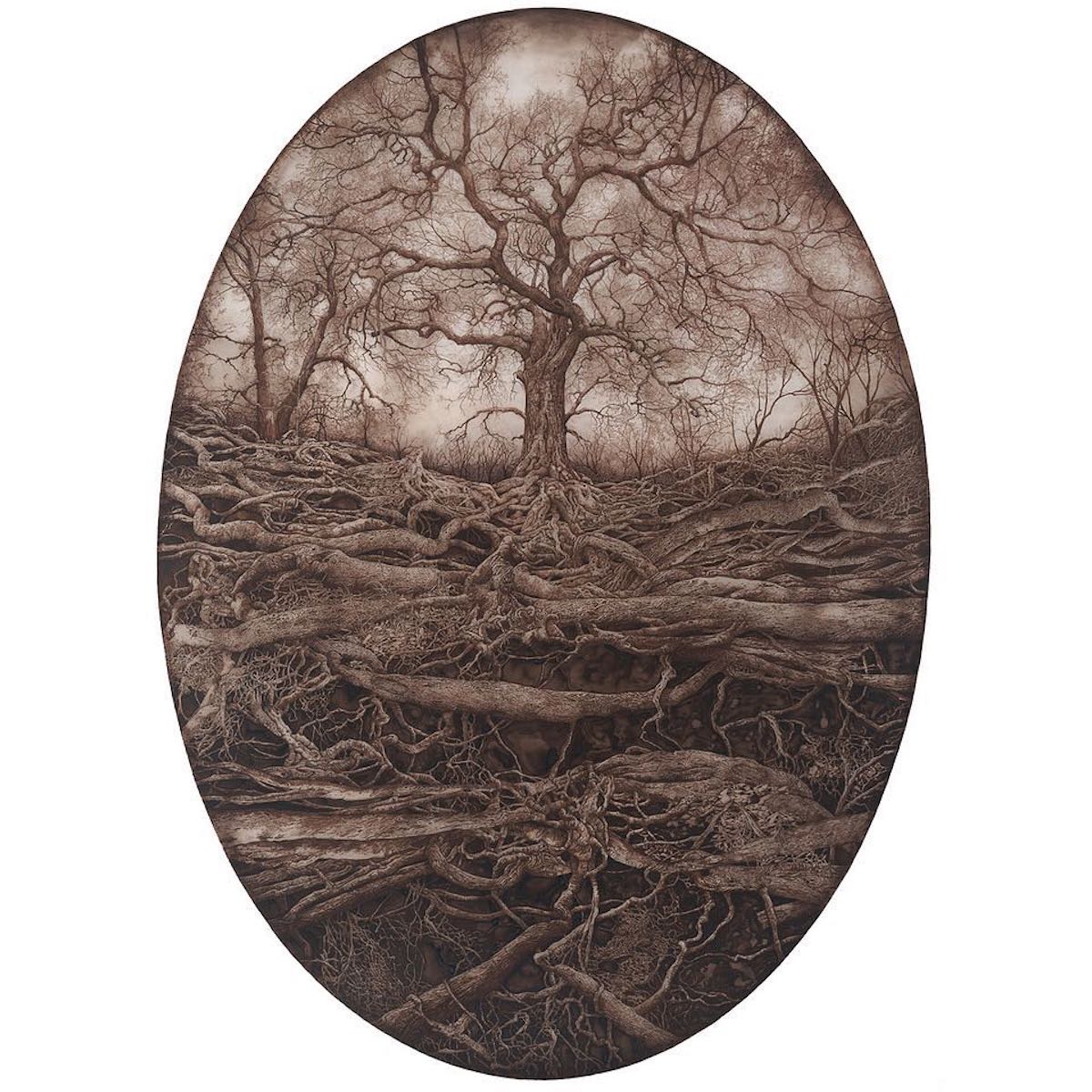
;
My Modern Met granted permission to feature photos by Rachael Pease.Related Articles:Artist Uses Her Own Thigh as a Canvas for Stunning Ink Drawings Intricate Architecture Drawings Capture the Beauty of Gothic Buildings Across Europe The post Incredibly Detailed Illustrations of Giant Trees With Unruly Roots appeared first on My Modern Met. via RSSUnify feed https://mymodernmet.com/rachael-pease-drawings/ 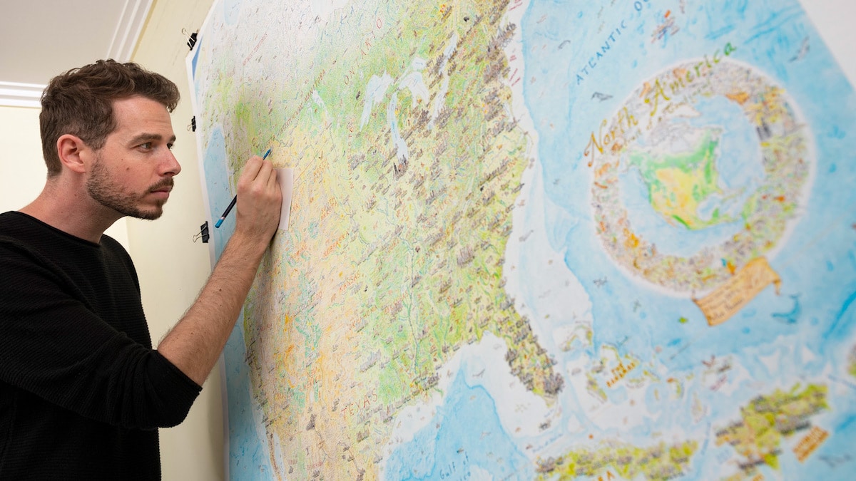
Artist and cartographer Anton Thomas is making waves for his enormous, hand-drawn map of North America. Executed in pen and colored pencil over the course of nearly 5 years, he spent almost 4,000 hours creating this incredibly detailed view of the continent. It’s an ambitious project that required Thomas’ dedication and a lot of sacrifice; but in the end, he was rewarded both personally and professionally for his trouble. The 5′ x 4′ map sprawls across a single piece of paper and is a testament to Thomas’ tenacity. No ordinary map, North America: Portrait of a Continent ;is filled with Easter eggs waiting to be discovered. This includes 600 individual city skylines, as well as thousands of details that help tell the story of an individual place. Whether it be local flora or fauna or emblematic symbols of a city or monument, Thomas has managed to draw just the right thing to set off every location. Thomas’ project is made all the more impressive when one considers that he didn’t leave his day job until the last year of the project, which means that his research and execution had to be incorporated into his off time. Such a long development period also meant that Thomas’ drawing style changed over time. As he wracked up more hours working on the map, his skills sharpened. This refinement in his skills also meant that large portions of the map had to be erased and redrawn in order to make the finished product look uniform. In the end, all of Thomas’ efforts paid off. The completion of the map left Thomas time in 2019 to begin a side hustle giving talks about cartography and his map at schools, universities, and conferences. He was also able to execute some small illustrations for ;The Washington Post. ;And, best of all, he has been able to spread his love of cartography and let people around the world enjoy his map thanks to prints he sells on his website. Want to learn more about this epic, hand-drawn map? Read on for My Modern Met’s exclusive interview with Thomas.
Growing up in New Zealand, it’s not hard to be inspired by geography. The landscape is diverse and dramatically beautiful. I remember being captivated as a kid when I first took a flight between Nelson and Wellington. The places in my life were suddenly revealed from above as part of a grand theatre of geography, and maps helped me to understand this. I felt called to adventure by every page of an atlas, every road map in the glovebox of mum’s car, every bend of our coastline.
Drawing on that fridge in Montreal back in 2012 had a huge impact. It gave me the desire and confidence to pursue cartography further. While I drew maps constantly as a child, I ignored this passion as a teenager in exchange for playing guitar. That fridge was the first big drawing I’d done in years and it was so enjoyable, plus I could see myself improving each day. Meanwhile, friends were responding to the artwork in the most fascinating way. They would spend real time perusing it, pointing at it, using it to share stories about their lives. And it was clear why—I was drawing real places. Right there I got a taste of the power of mapping, that beating heart of cartography that makes it such an engaging artform: place. Also, while drawing, I listened to more music and podcasts than ever before. This became one of my favorite aspects about being a visual artist; with the soundscape wide open you can listen to anything as you work. This has vast potential.
The map changed everything. It’s worth mentioning that during most of the project I had a day job, I only went full-time with my work in early 2018. This is a major reason that it took so long. I would get home, then draw at night, weekends, and holidays. The sheer scale of the task, all the hours alone, the sacrifice of my free time—at times I wondered if I was going mad. But I loved it. It was teaching me so much and I couldn’t imagine giving up on what I’d started. It gave me thousands of hours of drawing experience and taught me considerable patience. One of the biggest surprises from the map has been the number of spinoffs I didn’t expect. For example, I give a lot of talks now—from elementary schools to universities, conferences, and events around the world. I wouldn’t have guessed that drawing a huge map would lead to a passion for public speaking, which in turn has taken me in many new directions. From this to everything around the print release to all the music, podcasts, and audiobooks I enjoyed while drawing it, the map taught me more than I could’ve ever imagined.
When I redrew a massive portion because my drawing had improved. By spending thousands of hours drawing on one piece of paper—that single original—a big inconsistency in quality opened between the older and newer stuff. This gulf became so significant that I opted to redraw a vast area (the western half of the U.S. and much of western Canada), which included scratching off huge amounts of the pen with an Exacto knife. Scraping the fine liner from the paper was a painfully slow, delicate process that I did not enjoy. It was the most grueling stage and it went on for over a year. Nonetheless, I’m glad I found a technique to execute this, as the map needed it. You can’t just leave an entire region subpar.
It has changed so much. Until then, my life literally revolved around drawing it. In the weeks after completion, I didn’t even know who I was anymore, I felt I was trying to escape the orbit of a planet. As drawing the map demanded all my time, I’ve had a lot of business to catch up on since finishing. From image capture to printing, shipping, website building, e-commerce, marketing, general admin, and much more, it has been a big shift from the days of simply drawing a giant map. No single demand now compares to the enormity of drawing it, but switching between these varying concerns has taken getting used to. Since finishing in February, I learned that yes, perhaps you can make your art your career, but that doesn’t mean you always get to create all day. Sooner or later you’ll have to manage your business, and 2019 taught me that in spades.
There were many highlights, but I look back at Cuba especially fondly. Around this time I’d started listening to music to match the places I was drawing. Along with region-specific music, I’d watch movies, listen to podcasts, even go out for food and drink from the region—whatever I could do to feel I was tapping into a place. I was trying to treat mapping like a method actor. This idea was first unlocked with Cuba. I became fascinated by the country when I watched Buena Vista Social Club, just before I started drawing it. I truly loved the music, and as I drew the island I cycled through a range of Cuban artists, far beyond only Buena Vista. That level of connection with the task was so fun—it enriched the map and my style—and I’ve explored the method mapping approach ever since. I even celebrated completing the country with a Cuban cigar. Drawing Cuba taught me new ways to feel engaged and inspired by the work.
At the country, state, or city level, there’s so much research involved. I can’t just make things up. Whether it’s an elephant seal or a Mayan pyramid, there’s homework behind everything. It’s a tricky business as the world is vast and complex—any illustrated map of it is an extreme simplification. Whatever the place, I read all I can to get a sense of its defining features. I’ll plan it out while trawling the internet—photos, maps, Wikipedia, travel sites, blogs, news, anything—approaching it as though I were planning to visit. Some things are iconic and easy choices (e.g. including the Statue of Liberty in NYC, Chichen Itza in the Yucatan), but at other times I could spend hours hunting for clues. Simply getting your bearings in the infinite lakes of the Canadian shield is hard, let alone determining how to represent such a region. Every place is different, so you have to be flexible as you go. Working on Miami is nothing like working on Nunavut. While I can’t expect to please everybody—the maps are just my own interpretation of geography—cartographers have a role in defining places in the public mind. It’s important to take that responsibility seriously and treat all regions with respect. I’m not sure what it is to get it right exactly, but by choosing memorable things that would be familiar to a local, perhaps you get closer to something real. Our world is so astoundingly interesting that you’re never far from good options.
It’s hard to compare the North America map with anything else—the scale of work was extreme. Every state or province was like a new project. Even its cartouche (the title emblem) took longer to draw than the entire Washington Post set. Smaller projects are wonderful as they don’t require some life-dominating commitment, and my efficiency and drawing ability is far higher than when North America started. Almost any project seems smaller in comparison, so I’m very excited to use all I’ve learned on new, manageable pieces. New ideas, new frontiers. There is so much to map.
Everyone has their own experiences with my maps, and they take away different things. It’s always fascinating to hear what people have to say. I do hope to help inspire interest in geography and maps—and thus interest in the wider world. By presenting real places in this lively illustrated style, perhaps it will draw more people into maps. I’d like to encourage geographic literacy as much as I can; and with that, appreciation for our incredible planet. As for my story: I hope to encourage people to follow their passion and creative instincts and to be patient and resilient in that journey. Don’t be afraid of making sacrifices for your art, especially early on. If you can carve out space in your life to get lost in your work, to devote the immense hours necessary to hone your craft, it will take you places you can’t predict. If you love creating something, then just do it—a lot. There’s no need to immediately worry about where it’s going. I want people to know that it’s okay to lose yourself in the craft you love, to work at it obsessively, to feel consumed by it even. People around you may not understand, but don’t worry about what others think. Just create. If you’re deeply inspired by something that you’re investing real time in, that inspiration will flow out into the rest of your life.
Nothing excites me more than considering what’s next. For now, I’ll focus on smaller projects, starting with a small world map of animals I’ve been imagining for years. I also want to explore some ideas around mapping my home country of New Zealand. 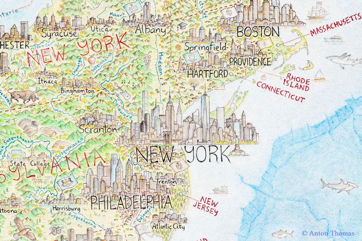 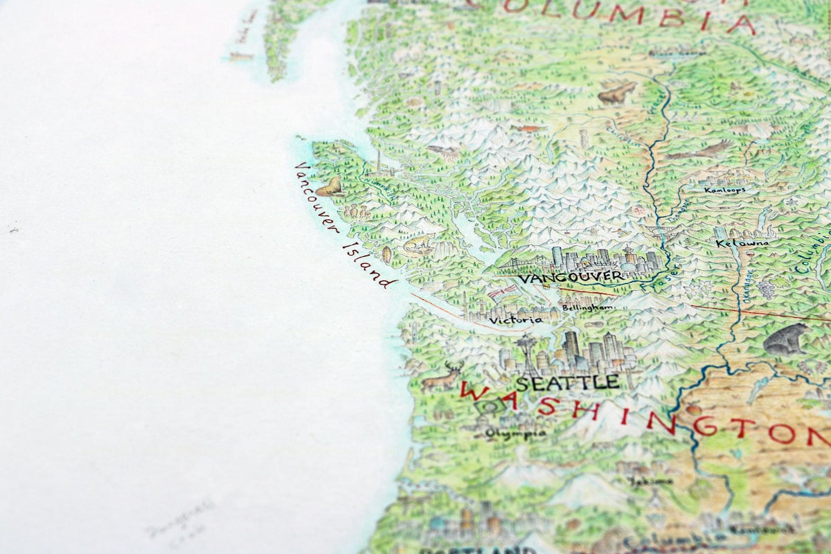 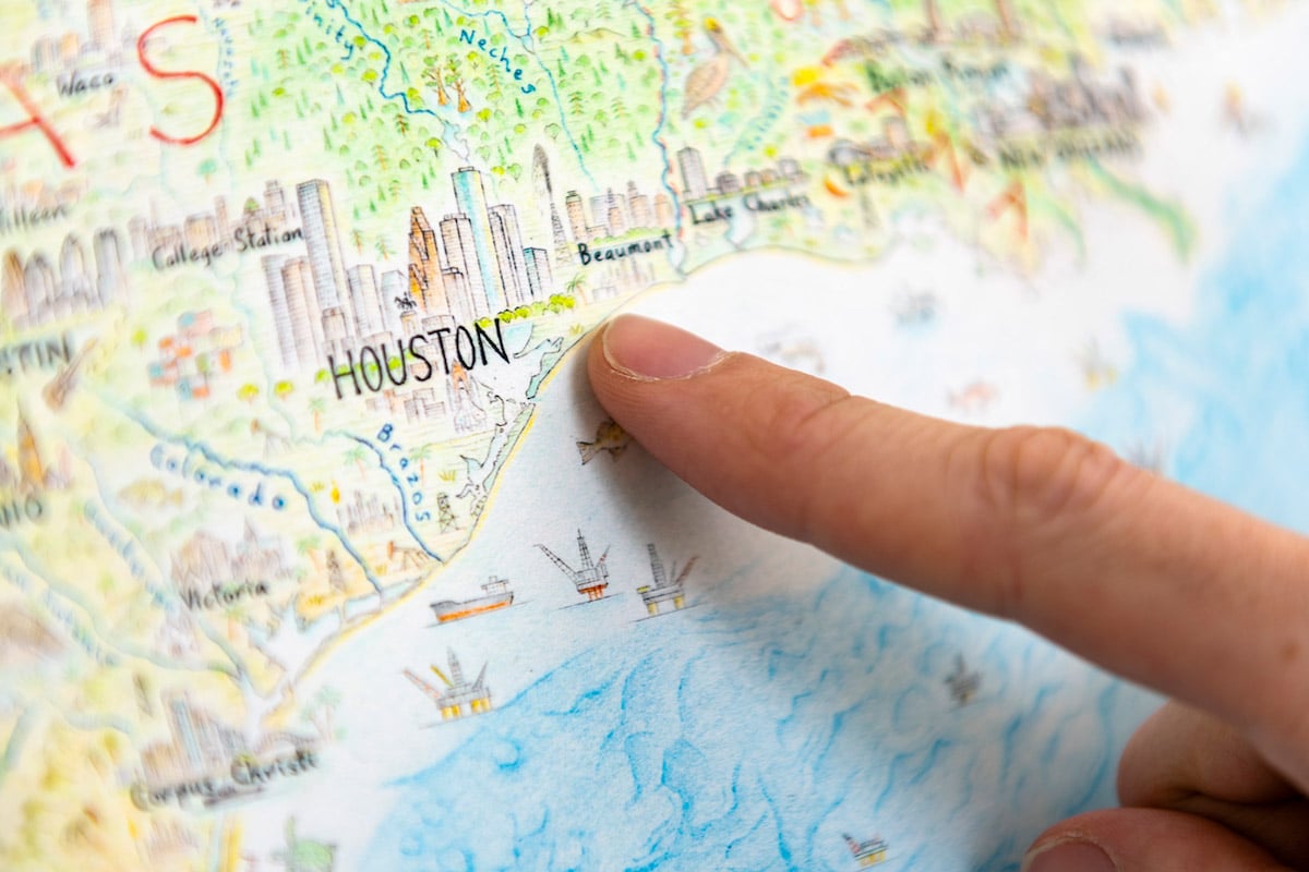 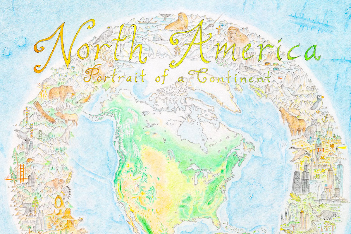
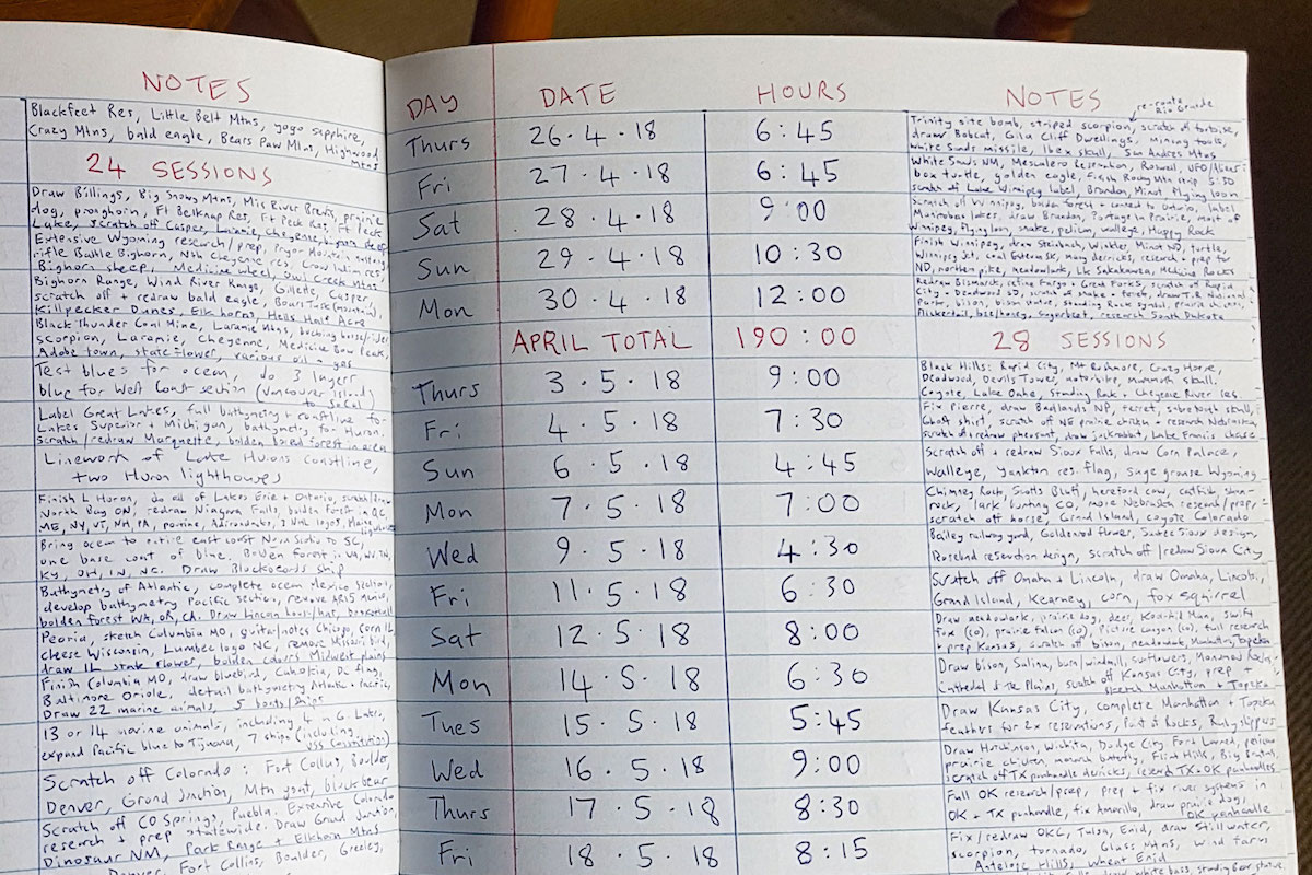
Time log from the creation of the map. Anton Thomas: Website | Facebook | InstagramMy Modern Met granted permission to feature photos by Anton Thomas.Related Articles:Artists Spend 5 Months Creating Enormous Pen and Ink Map of InvernessClever Map of the UK Uses Over 1,400 Song Titles to Reference LocationsThese Amazing Maps Show All the Rivers Running Through the United StatesJapanese Artist Spends Years Completing Enormous, Intricate Pen and Ink DrawingsThe post Interview: Artist Spends 5 Years Drawing Giant Colored Pencil Map of North America appeared first on My Modern Met. via RSSUnify feed https://mymodernmet.com/anton-thomas-north-america-pen-map/ 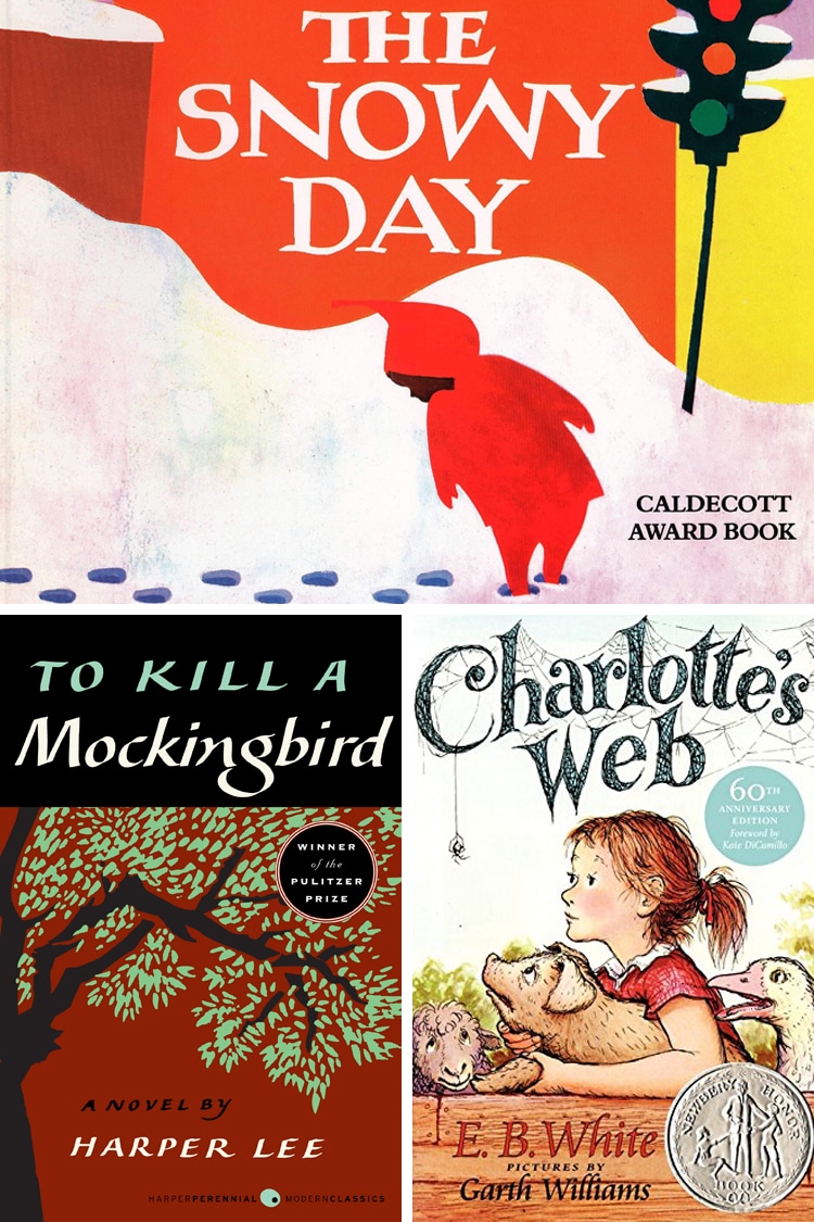
This post may contain affiliate links. If you make a purchase, My Modern Met may earn an affiliate commission. Please read our disclosure for more info. Libraries are one of the best parts of any community. They are a haven for book lovers of all ages and have been for many, many years. The New York Public Library (NYPL), in fact, is celebrating its 125th anniversary in 2020. To honor this monumental birthday, the library system calculated its 10 most borrowed books of all time. The NYPL is huge. It has one of the largest collections of books in the U.S. that’s second only to the Library of Congress. And given the diversity of New York—particularly New York City—it’s safe to say that any book on its list has near-universal appeal. So, what texts saw the most checkouts? Six of the 10 books on this list are children’s literature, which makes sense given that libraries are an amazing resource for parents with young kids. The number one spot is held by Caldecott-winner Ezra Jack Keat’s The Snowy Day which was released in the middle of the 20th century; it has a staggering 485,583 checkouts. “In print and in the Library’s catalog continuously since 1962, this charming, beautifully illustrated tale of a child enjoying the simple magic that snow brings to his city is one of the Library’s top circulated books every year,” NYPL writes, “across all neighborhoods we serve.” Scroll down for the complete list of the 10 most borrowed books from the NYPL. In honor of the New York Public Library’s 125 anniversary, the institution calculated the 10 most borrowed books of all time:; 1. The Snowy Day by Ezra Jack Keat
; 2. The Cat in the Hat by Dr. Seuss
The Dr. Seuss classic has 469,650 checkouts and counting. ; 3. 1984 by George Orwell
; 4. Where the Wild Things Are by Maurice Sendak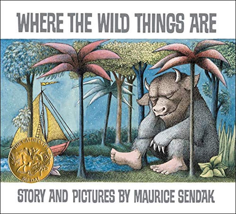
The beloved children’s story (which was made into a motion picture) has 436,016 checkouts. ; 5. To Kill a Mockingbird by Harper Lee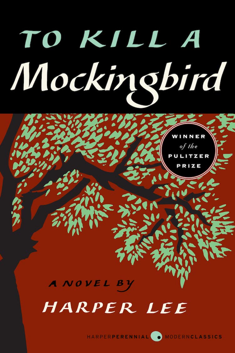
Harper Lee’s literary sensation took fifth on the list with 422,912 checkouts. ; 6. Charlotte’s Web by E.B. White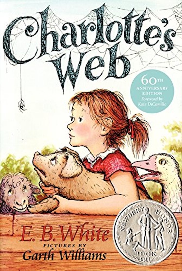
The classic story of Wilbur and Charlotte has 337,948 checkouts and counting. ; 7. Fahrenheit 451 by Ray Bradbury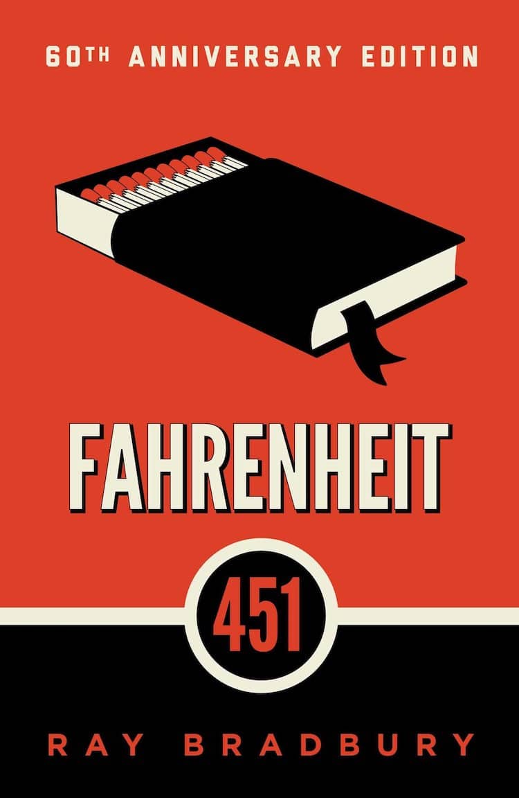
A regular on high school reading lists, ;Fahrenheit 451 is seventh on the list with 316,404 checkouts. ; 8. How to Win Friends and Influence People by Dale Carnegie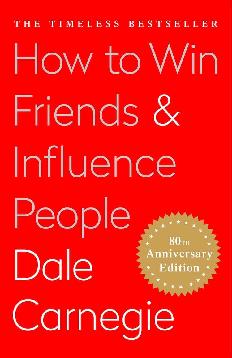
Dale Carnegie’s ;How to Win Friends and Influence People came out in 1936 and is still in constant circulation boasting 284,524 checkouts. ; 9. Harry Potter and the Sorcerer’s Stone by J.K. Rowling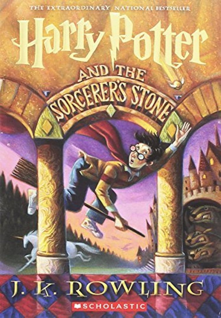
The youngest book on the list, J.K. Rowling’s contemporary classic made the top ten with 231,022 checkouts. ; 10. The Very Hungry Caterpillar by Eric Carle
; New York Public Library: Website | Instagram | Facebook ; All images via Amazon.Related Articles:These Are Barack Obama’s Favorite Music, Movies, TV Shows, and Books of 2019 New York Public Library Staff Reveal Their Meaningful Literary Tattoos Take a Virtual Tour of Every Inch of the New York Public Library’s Incredible Interior New York Public Library Is Lending Ties and Briefcases to People for Job Interviews The post New York Public Library Reveals 10 Most Borrowed Books of All Time appeared first on My Modern Met. via RSSUnify feed https://mymodernmet.com/nypl-most-borrowed-books-of-all-time/ 
Toshio Saeki, the legendary Japanese artist known for blending eroticism, horror, and humor in his works, passed away this week at the age of 74. During his life, he was given the moniker “the Godfather of Japanese Erotica,” amassing a dedicated underground following before a widespread, renewed interest in his work arrived during the past decade. Among the symbols of that resurgence were appearances in shows at Jeffrey Deitch Gallery, Art Basel in Hong Kong, and Jiu Xiang Ju Gallery in Taipei. via RSSUnify feed http://hifructose.com/2020/01/18/collaborators-share-tributes-to-late-japanese-artist-toshio-saeki/ |
AboutContemporary Art and Design Lover Archives
April 2021
Categories |
 Advancing Women Artists:
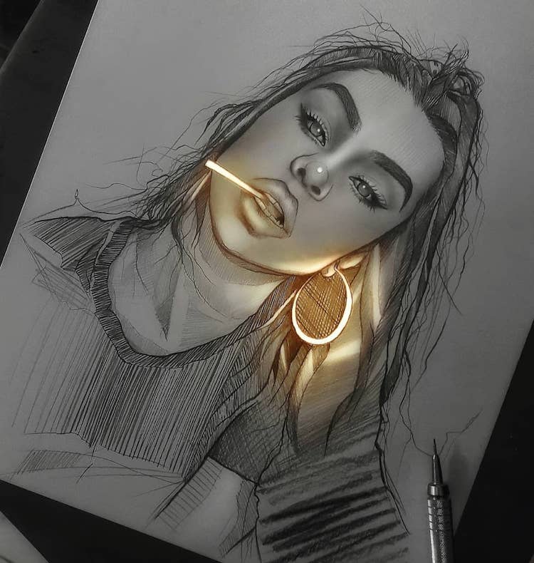
 Enrique Bernal:
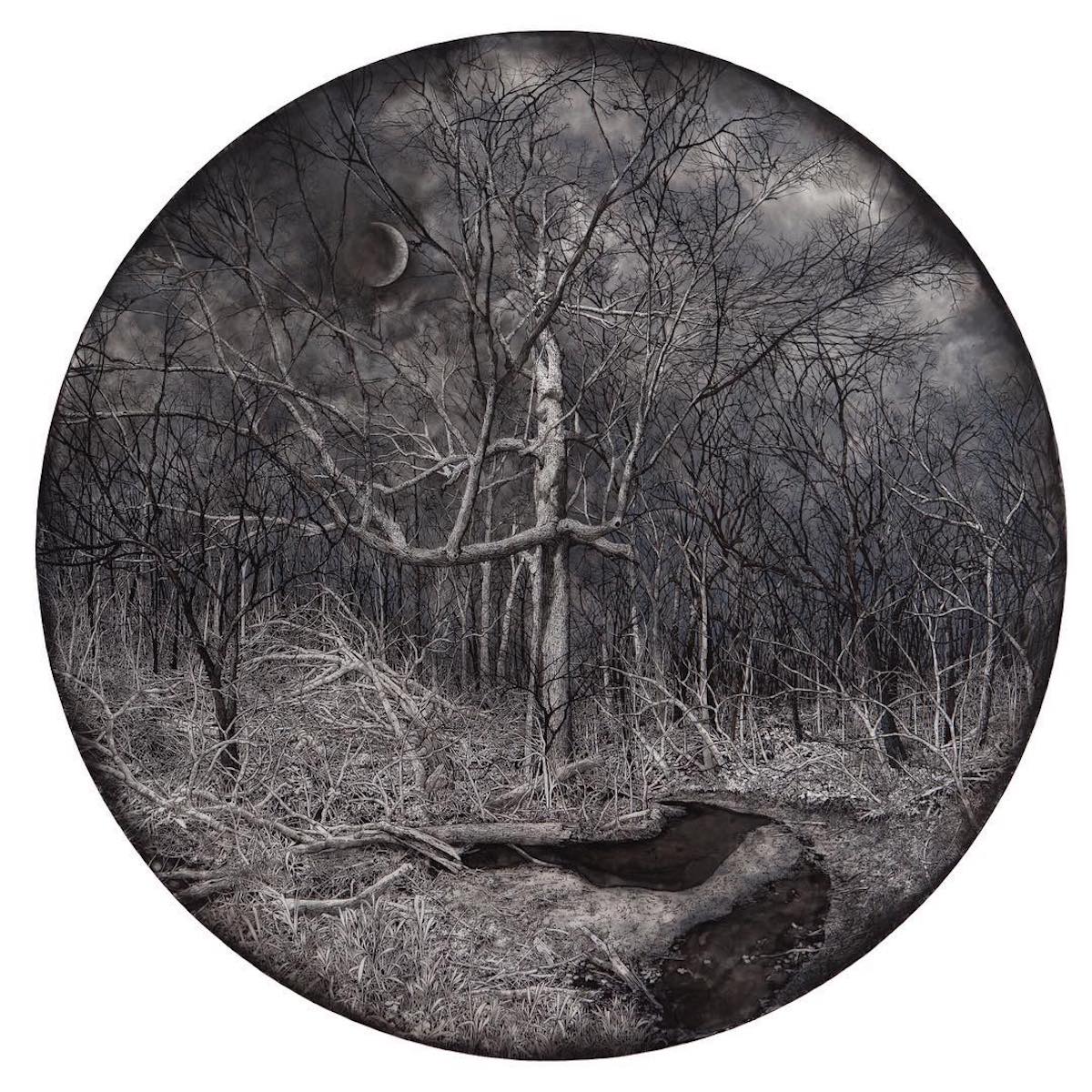
 Rachael Pease:
 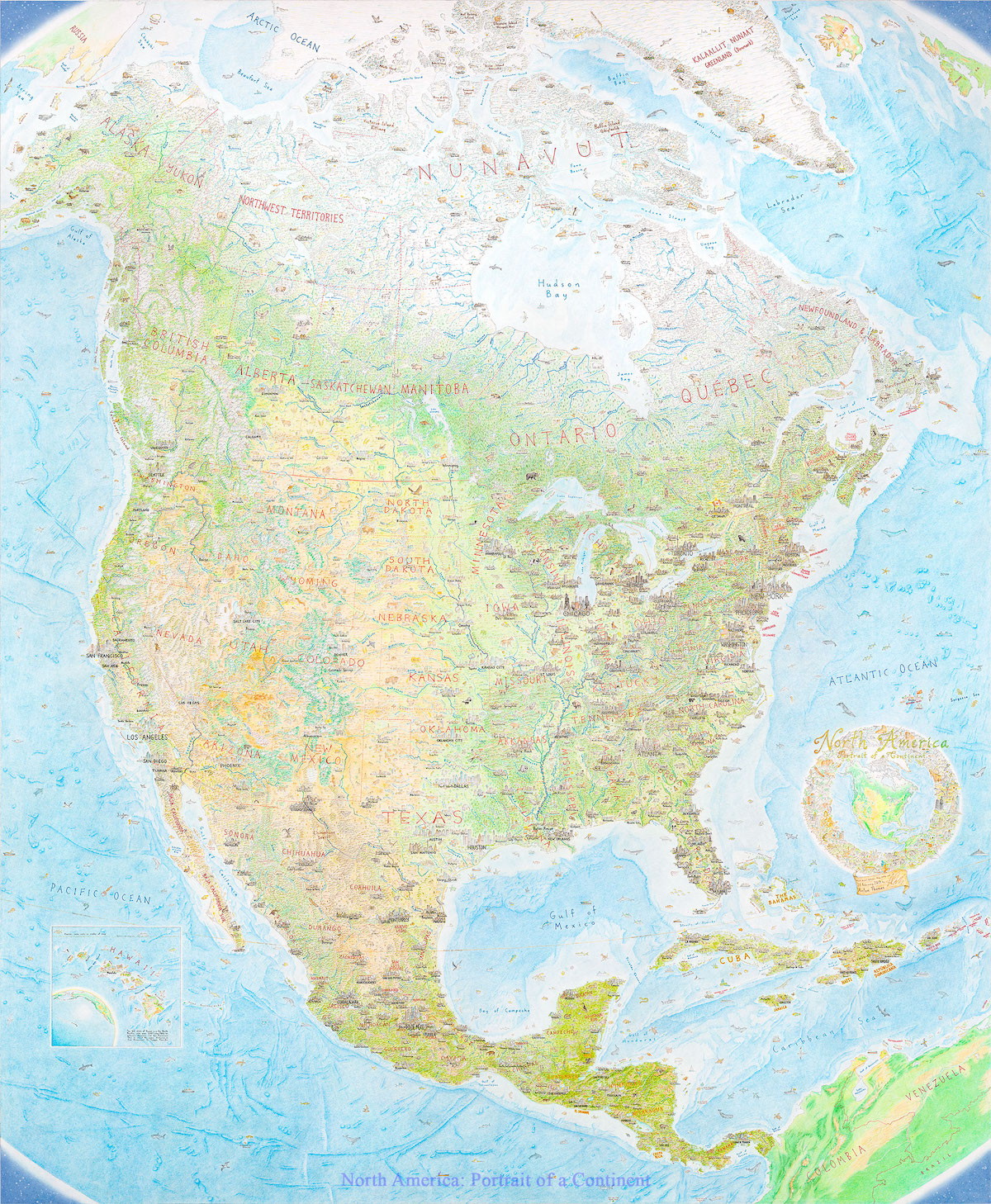 What was it about maps that captured your imagination as a child?
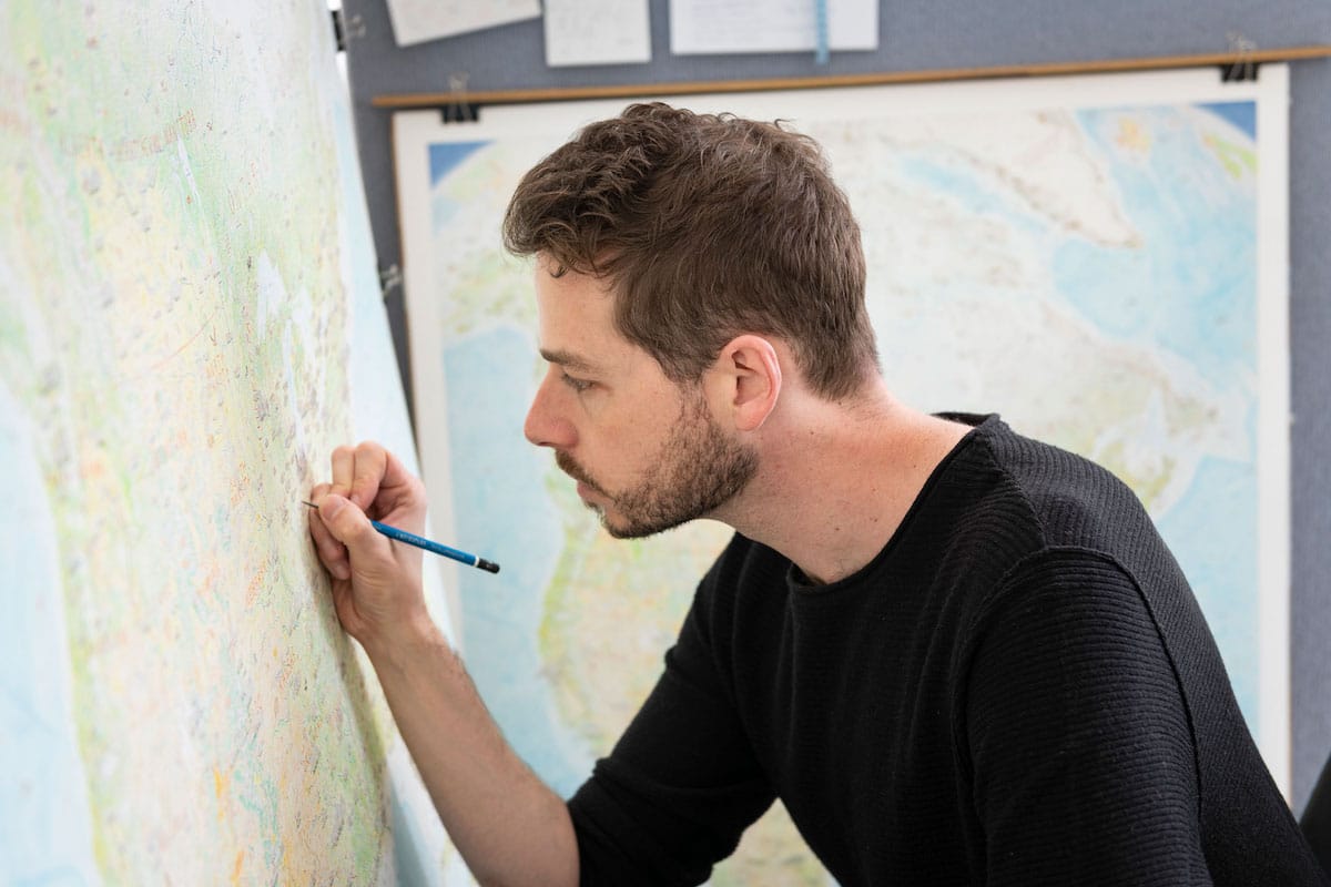 Your first major map-drawing experience was on a refrigerator. What did that experience teach you in preparation for your next map?
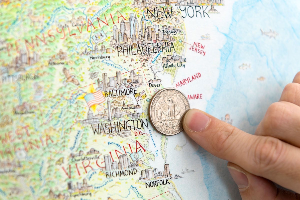 It took nearly 5 years to complete the North America map. How did the project change you as an artist—or as a person—during that time?
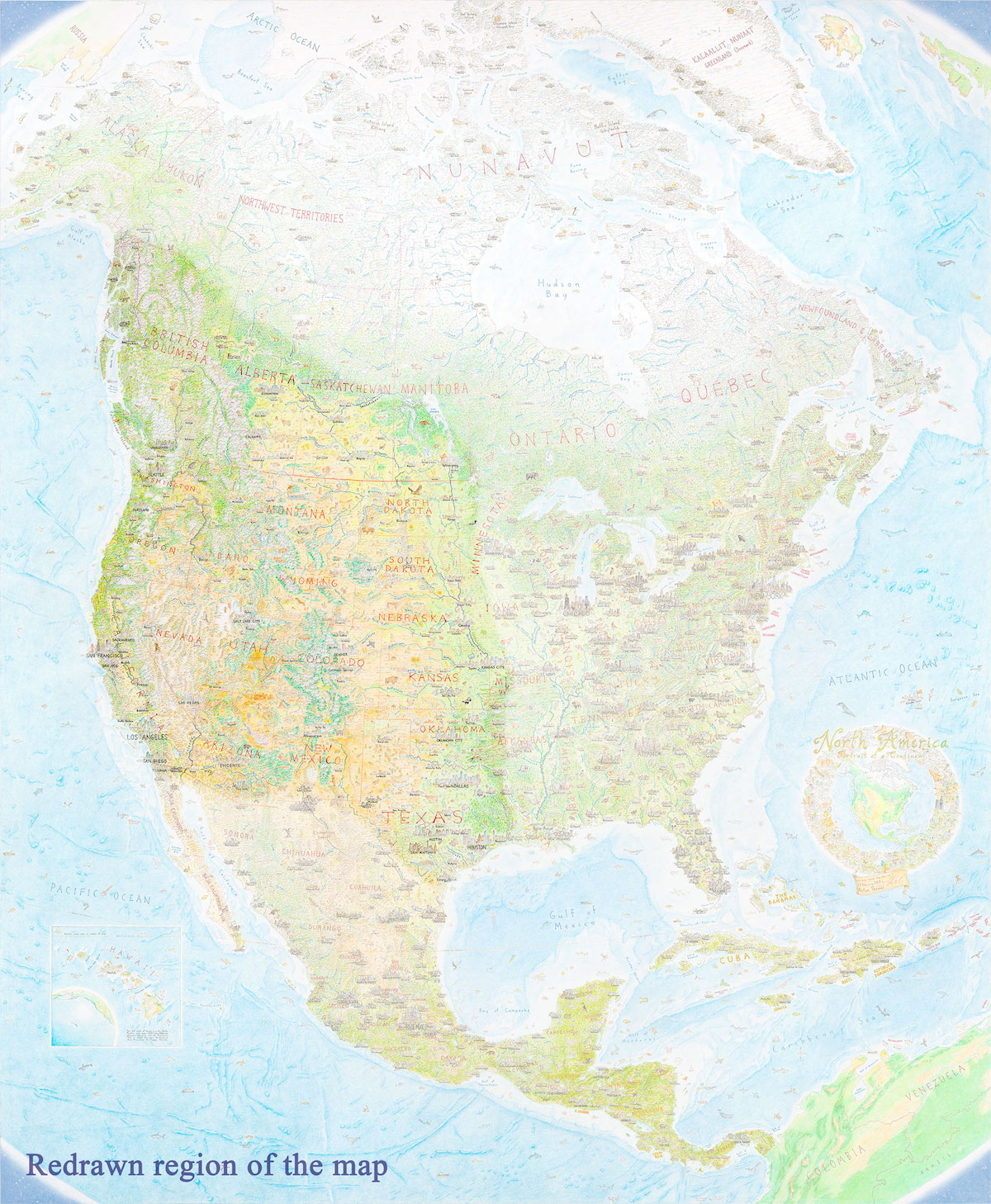 What was the most challenging part of executing the North America map?
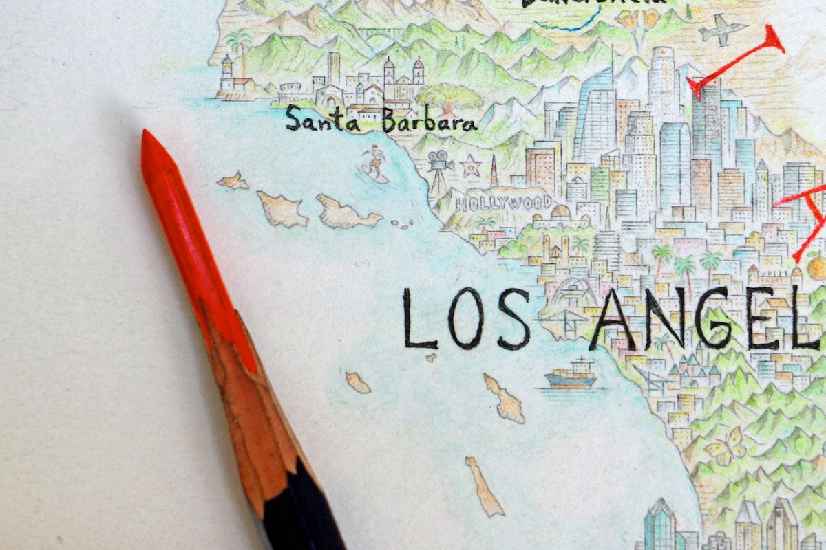 It was almost a year ago that it was completed. How has your life changed since that time?
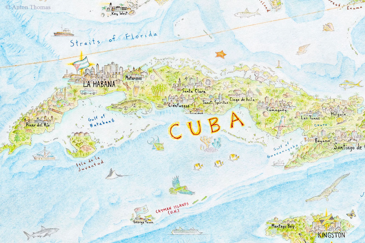 Do any areas of the map have special meaning to you? ;
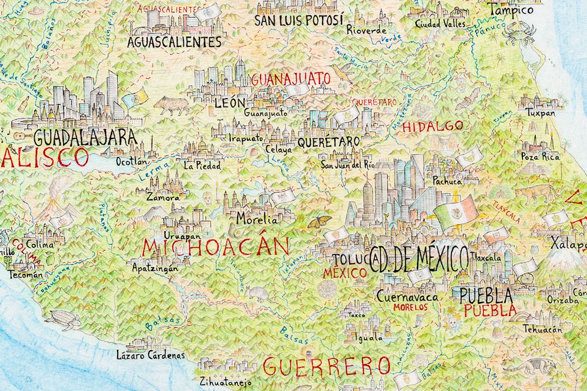 The map is filled with so many details. What kind of research was involved in deciding what hidden gems would define different areas?
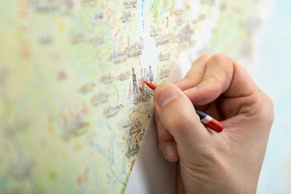 How is working on smaller illustrations, like the maps you did for The Washington Post, creatively different for you?
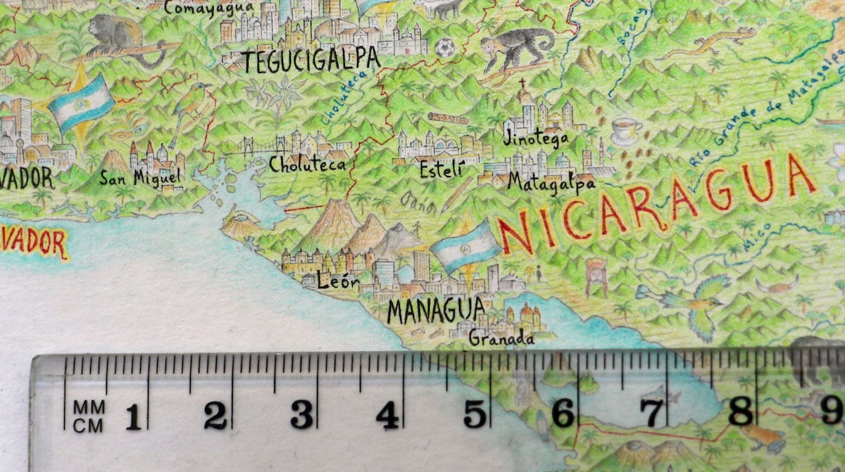 What do you hope that people take away from your work and your story?
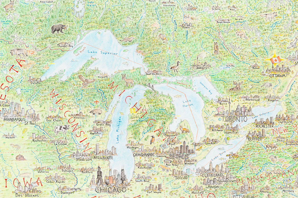 What’s next?
 The Snowy Day tops the list with 485,583 checkouts.
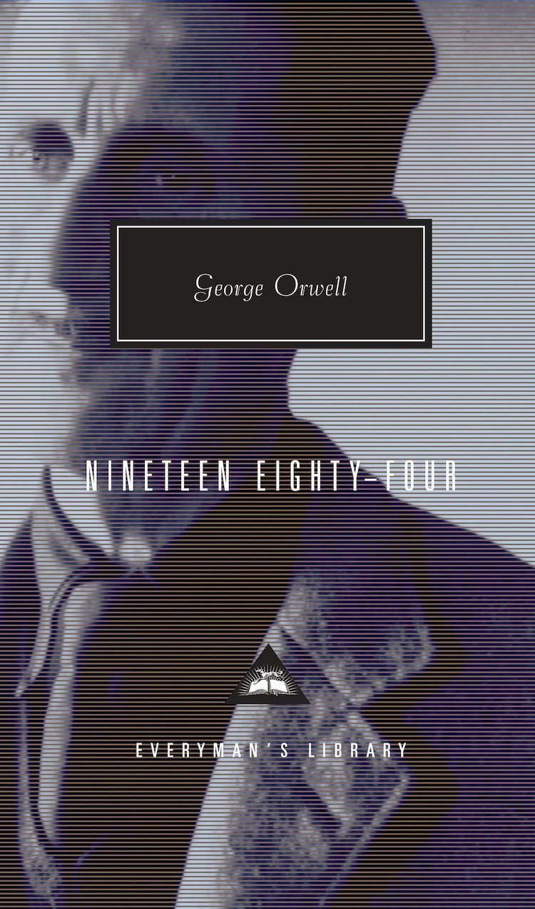 1984 comes in third with 441,770 checkouts.
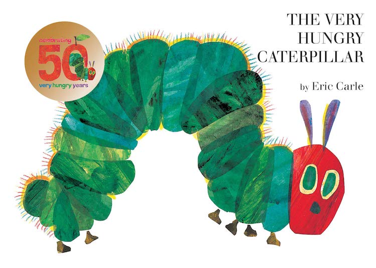
 RSS Feed
