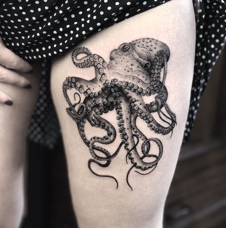
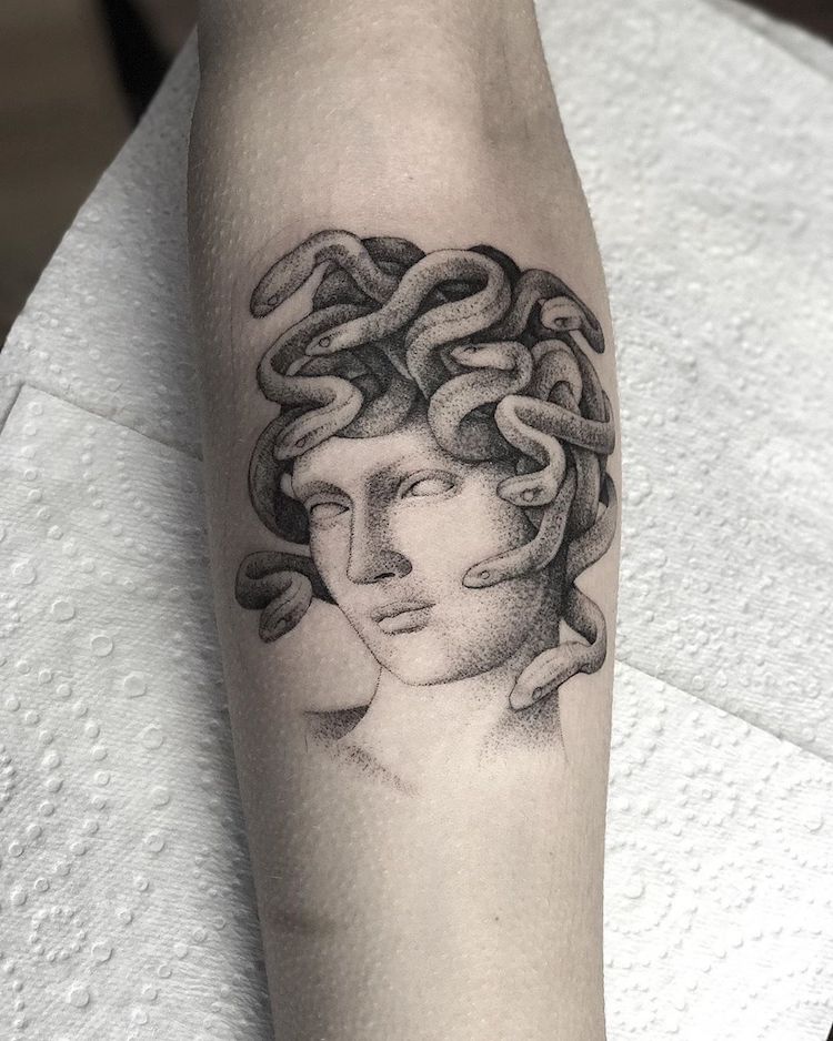
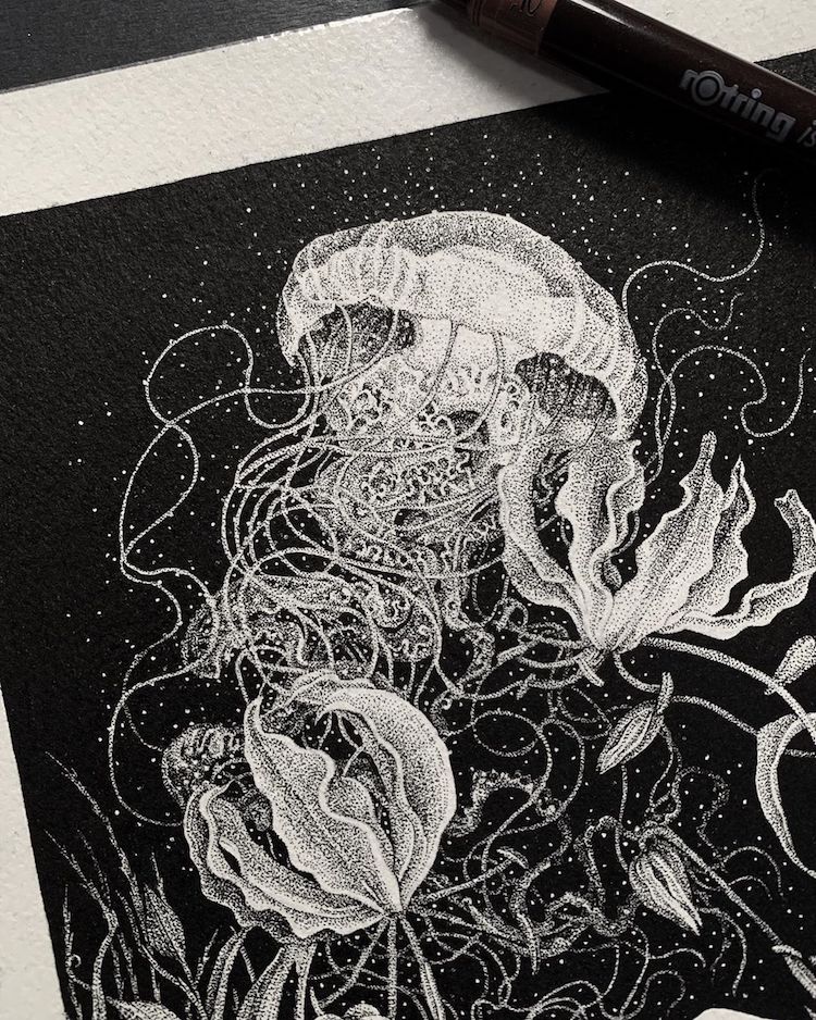
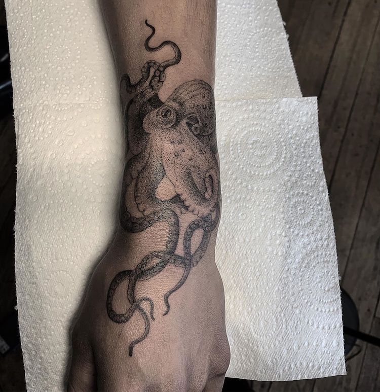
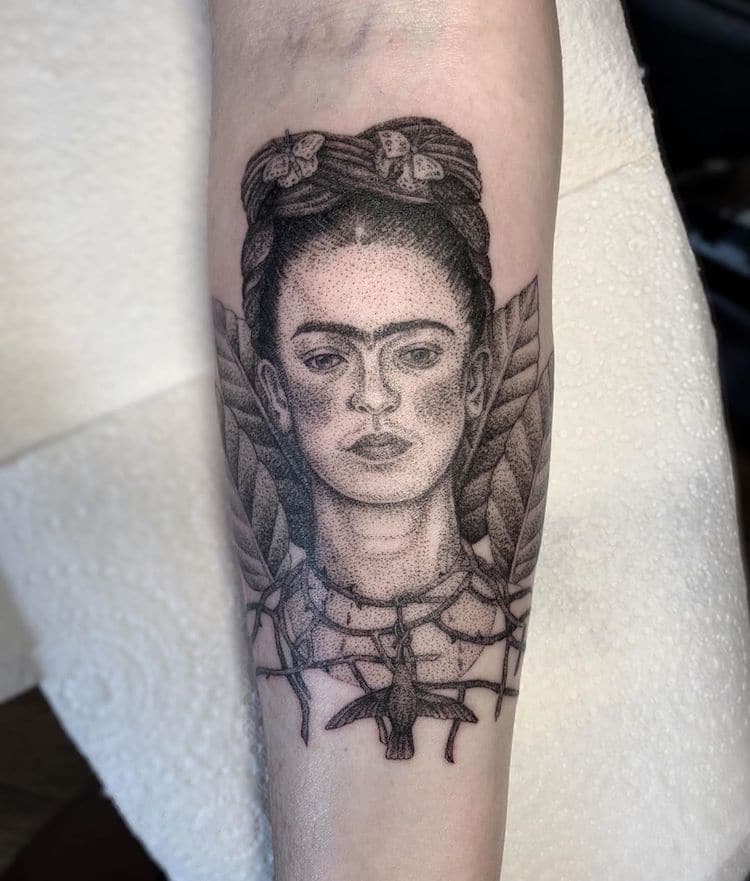
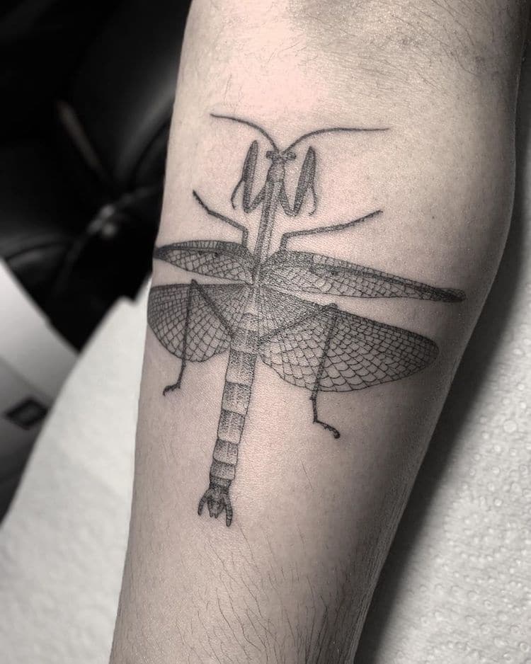
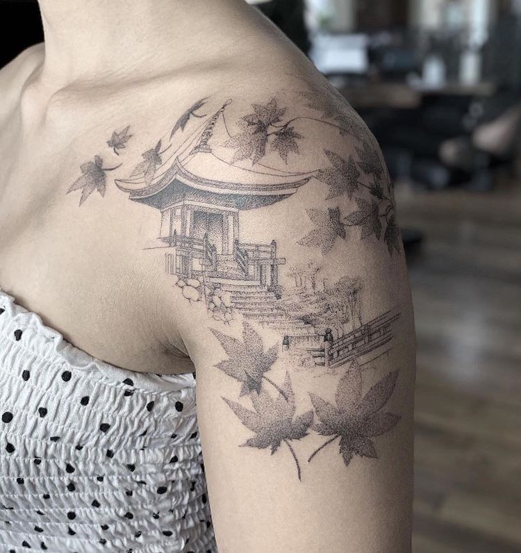
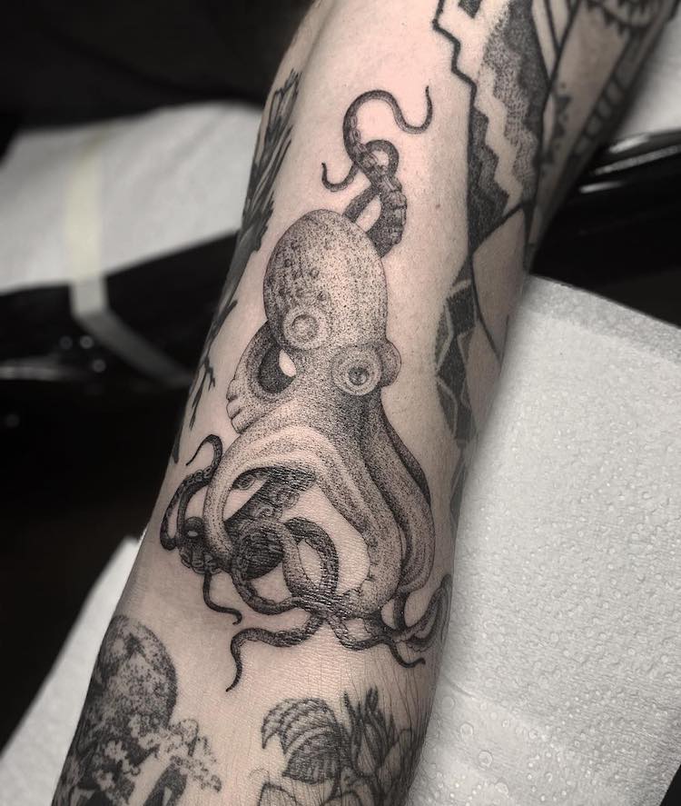
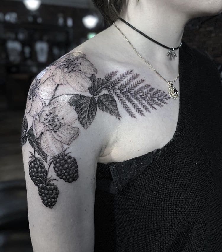
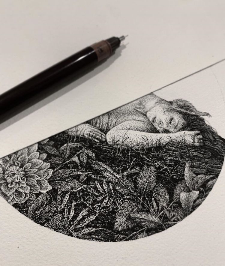
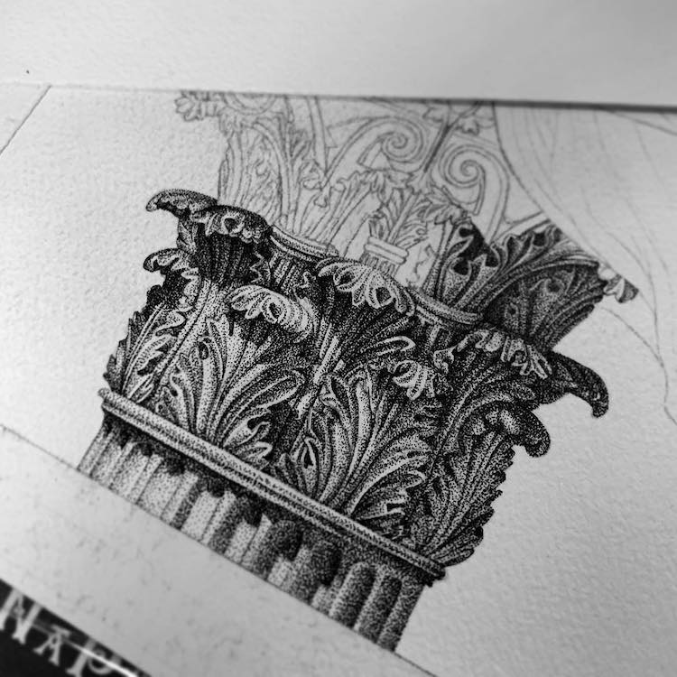
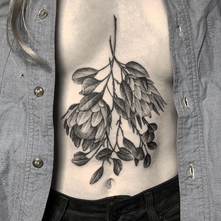
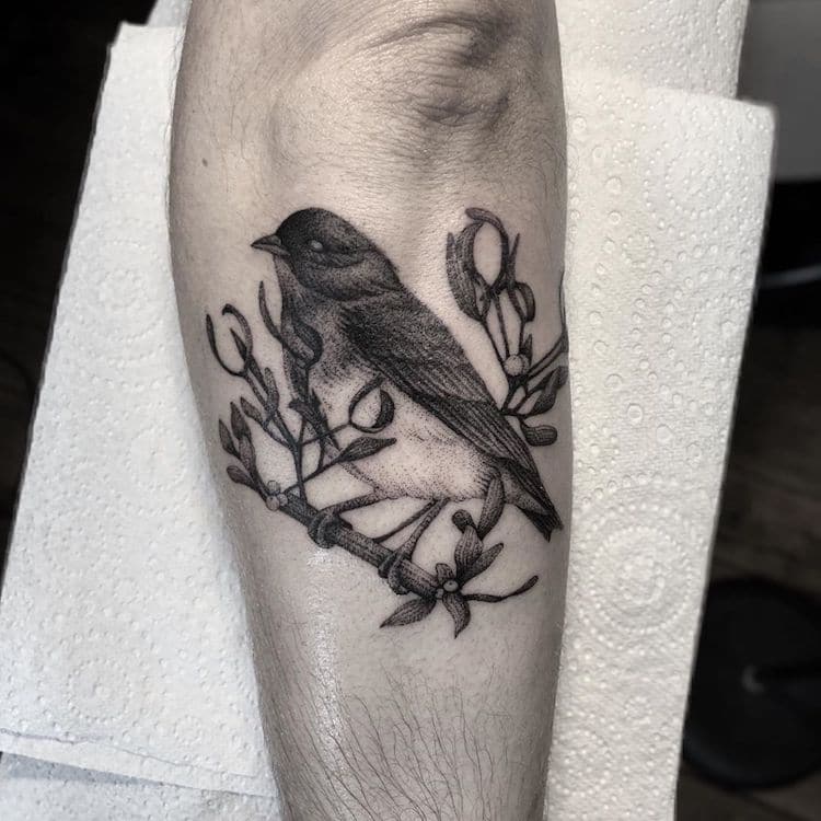
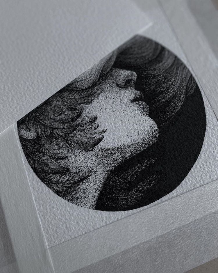
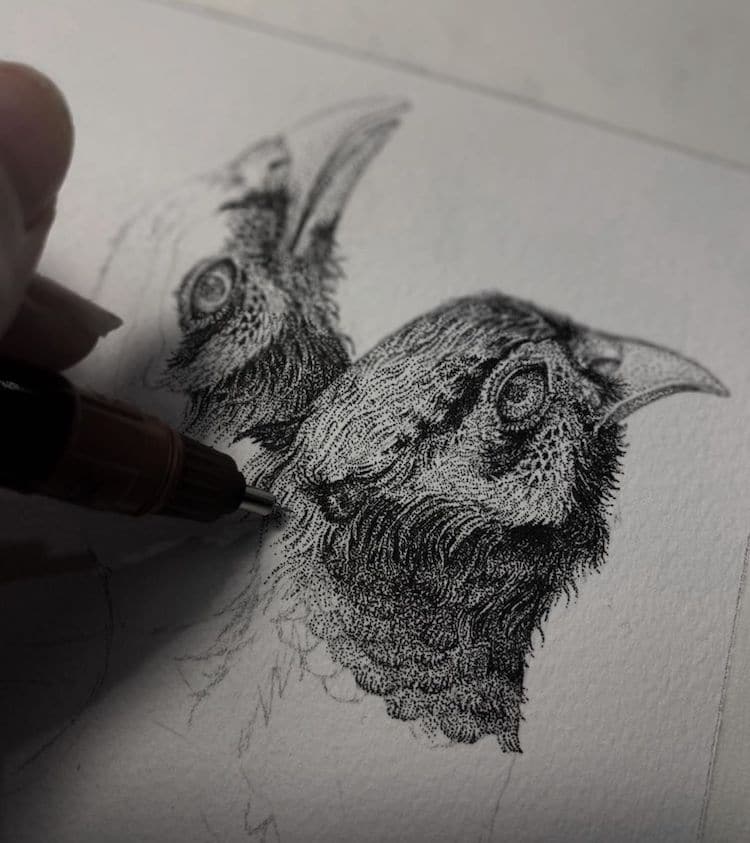
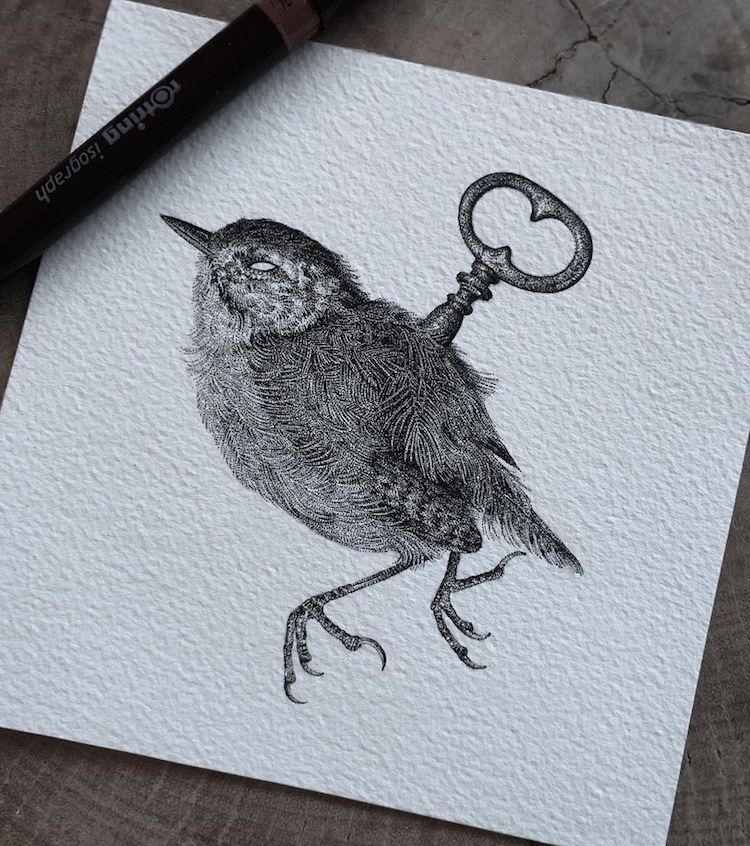
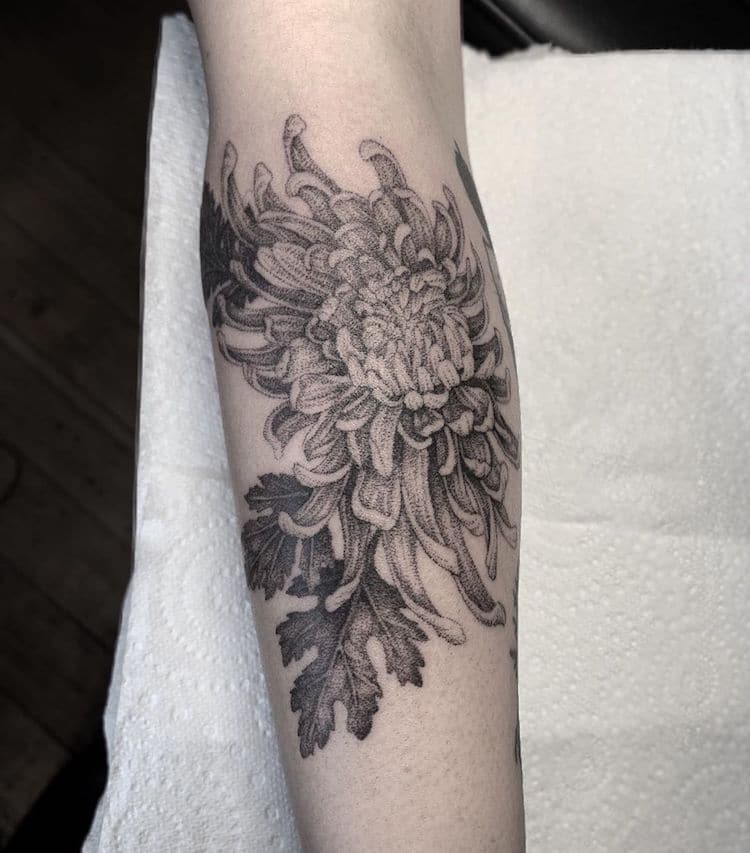
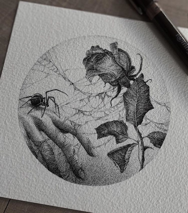
When Melbourne-based artist Annita Maslov isn’t illustrating, she’s in her tattoo studio translating her intricate pen and ink drawings into body art. With a focus on historical, gothic, and nature-inspired motifs, she renders each monochrome design in black ink, dot by dot, resulting in incredible works that look just like old lithographs etched onto the skin. Maslov started her career as a freelance illustrator, but naturally progressed onto tattooing after she started receiving more and more commissions. She now works at Heretic Tattoo in Fitzroy, Australia, where she has a constant stream of clients who want her beautifully detailed drawings permanently inked onto their bodies. From florals, skulls, and figures of mythology to insects, birds, and sea creatures, each delicate work showcases Maslov’s mind-blowing talent. If you’re in Melbourne, you can admire Maslov’s illustrations up-close during her first solo show at Beinart Gallery from November 30 to December 22, 2019. In the meantime, scroll down to see some of the artist’s beautiful illustrations and tattoos (and you can find even more from her portfolio on Instagram). Melbourne-based artist Annita Maslov translates her intricate pen and ink drawings into delicate dot work tattoos.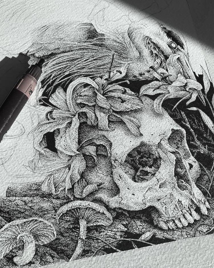 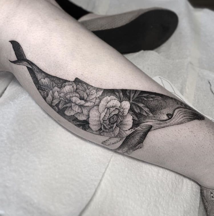 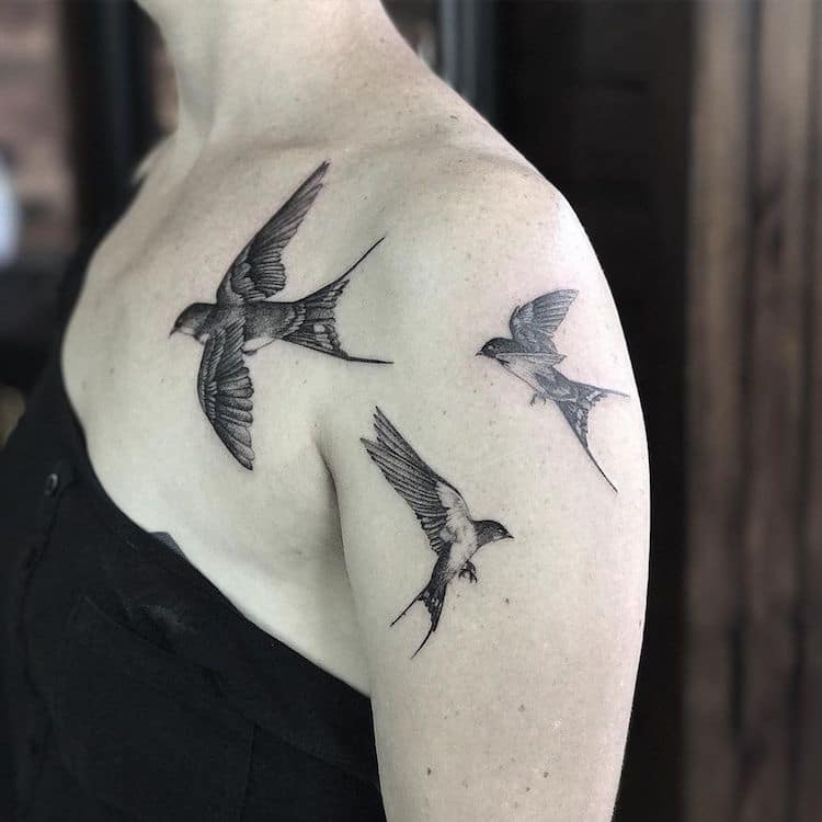
Her incredible works look just like old lithographs etched onto the skin.
My Modern Met granted permission to feature photos by Annita Maslov.Related Articles:30+ Minimalist Tattoo Ideas That Prove Less Is More Tattoo Artist Uses Dotwork to Beautifully Illustrate Surreal Storybook Scenes Exquisite Fine Line and Dot-Filled Tattoos of Nature by Bicem Sinik How the Pioneers of Pointillism Continue to Influence Artists Today The post Tattoo Artist Creates Gothic Nature-Inspired Tattoos That Look Like Old Lithographs appeared first on My Modern Met. via RSSUnify feed https://mymodernmet.com/dotwork-tattoos-annita-maslov/
0 Comments
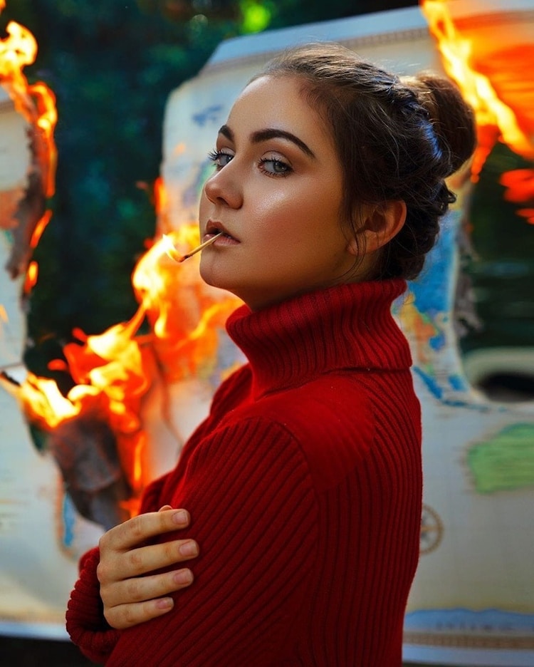
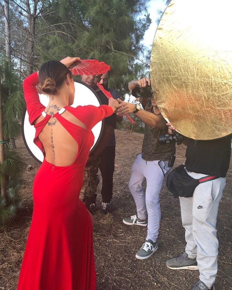
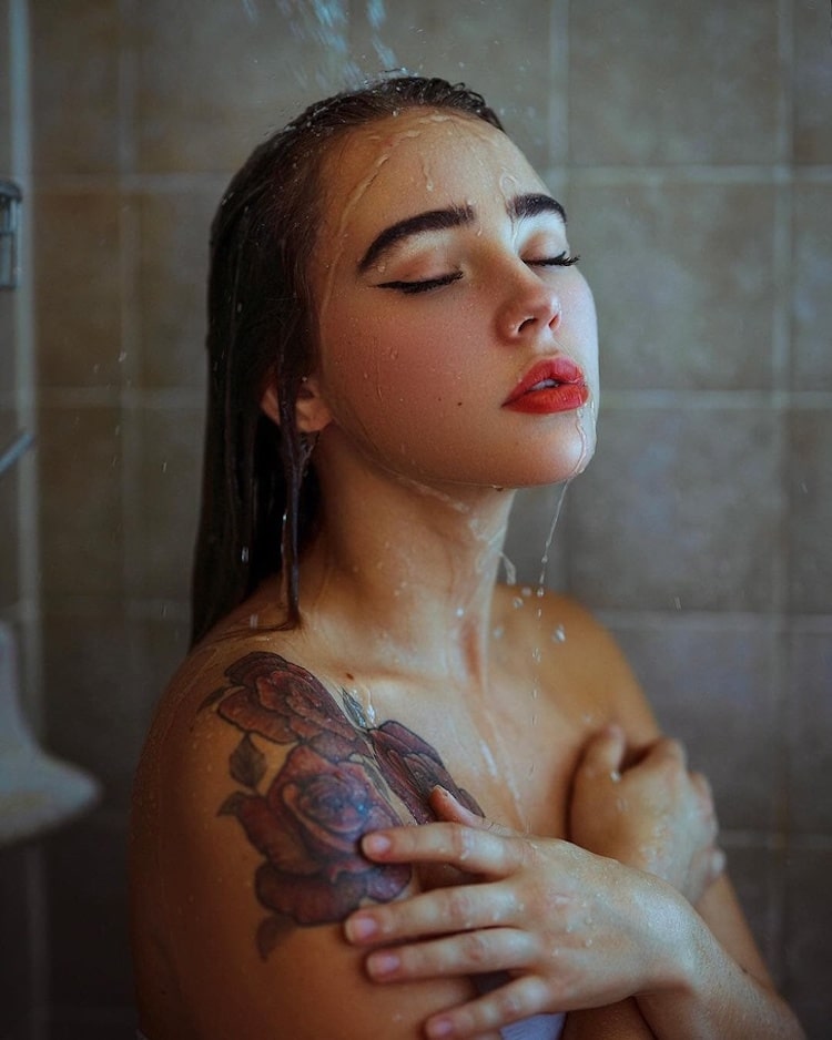
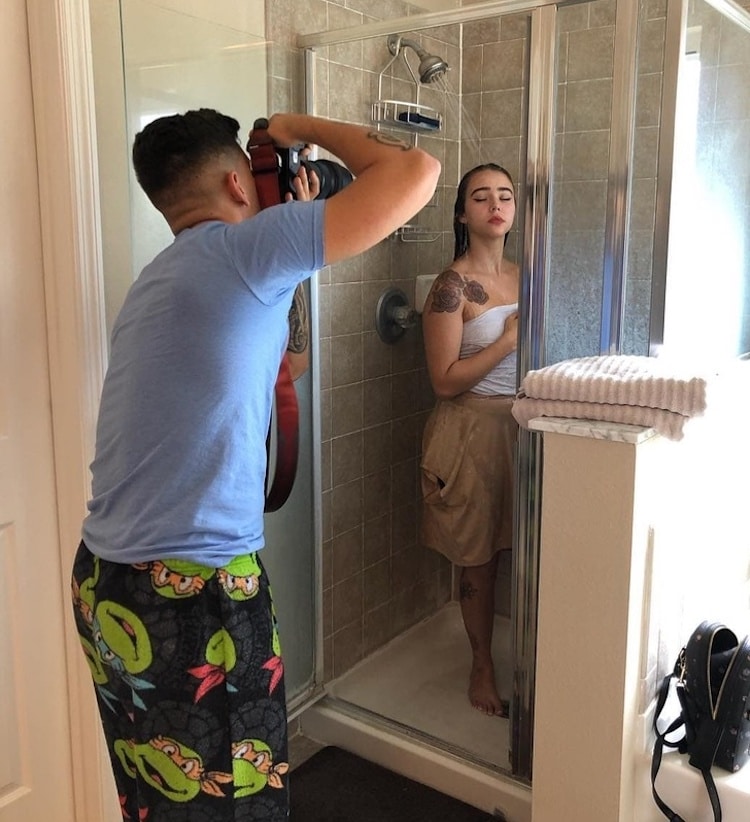
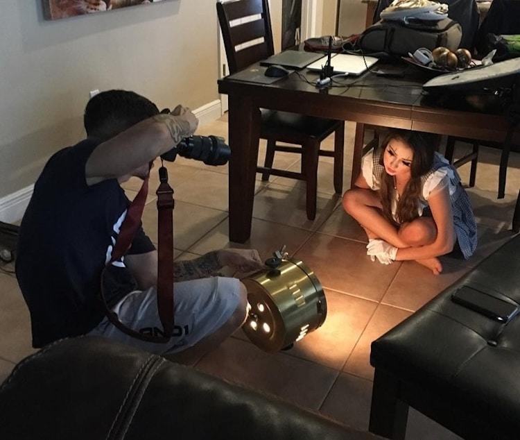
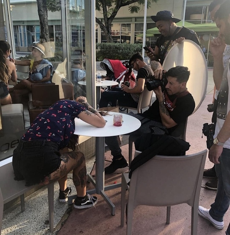
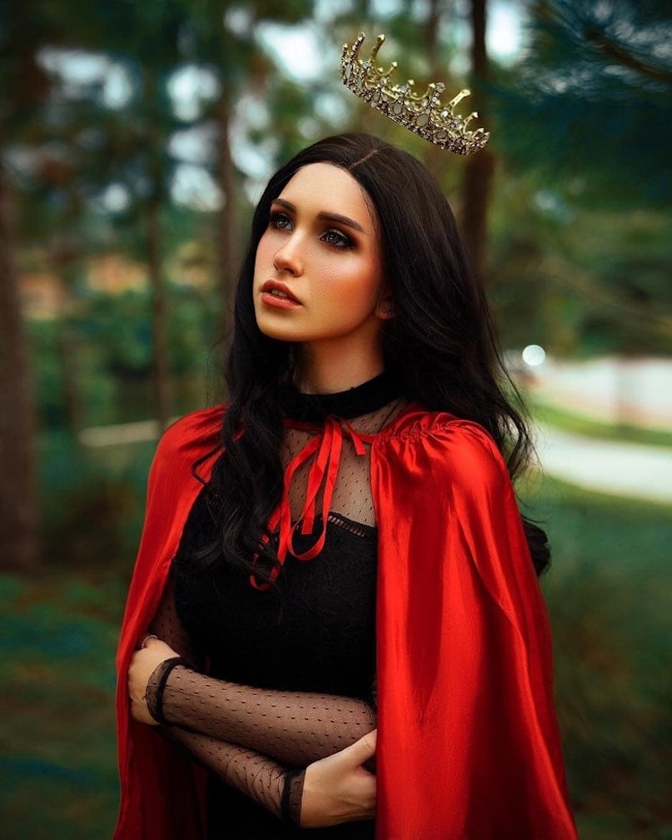
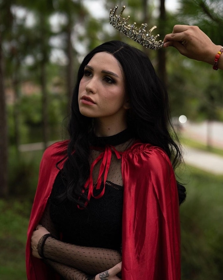
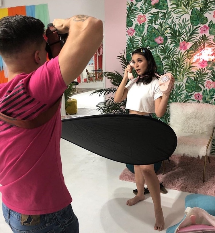
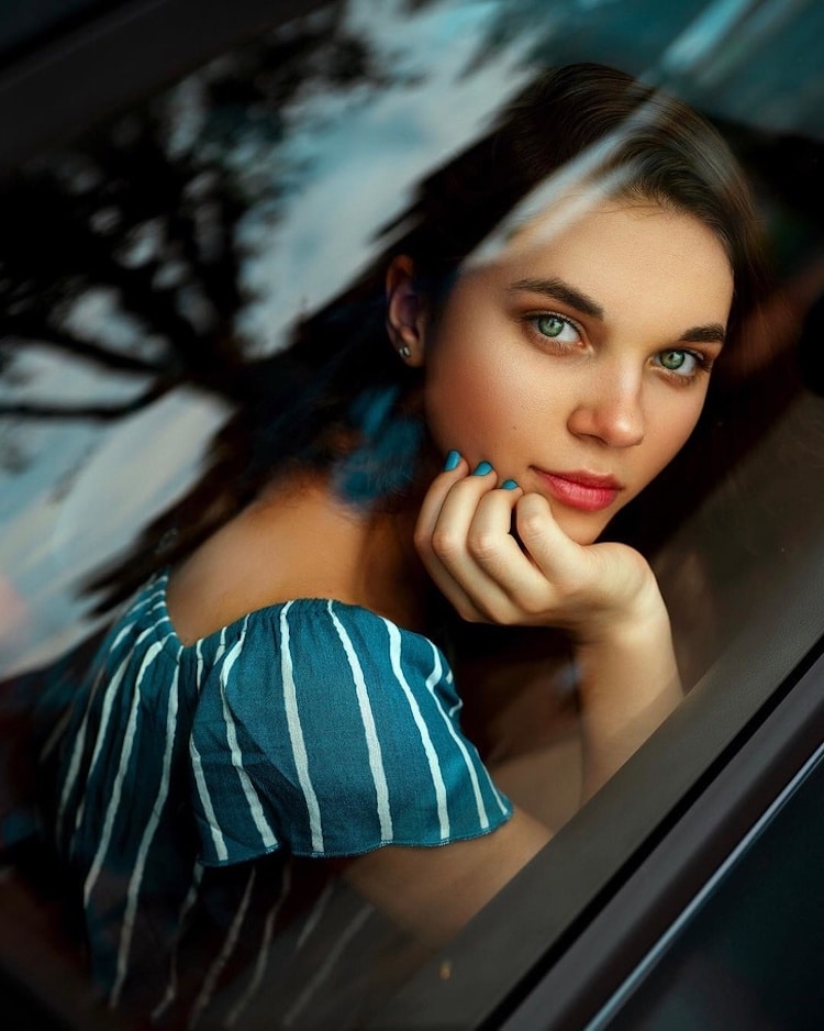
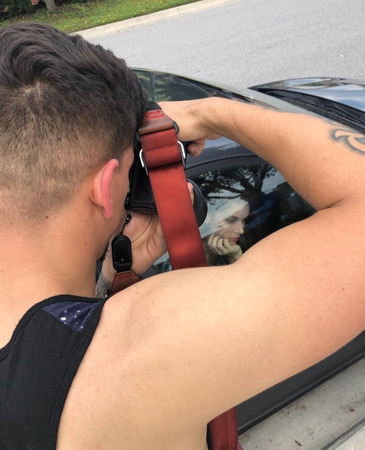
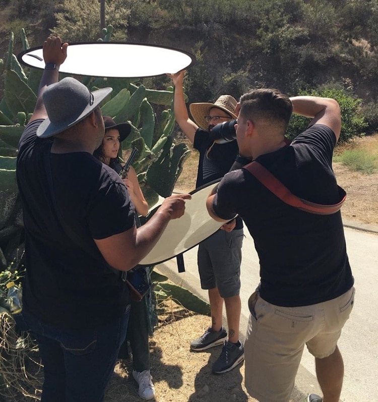
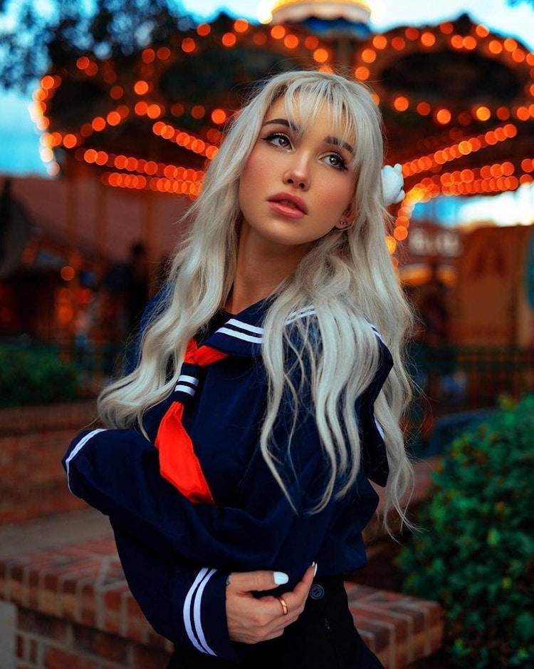
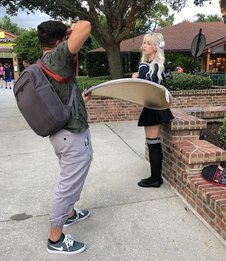
From models and photo assistants to the perfect lighting and props, there’s a lot that goes into capturing the perfect shot. What ends up as a stunning portrait often has a much different story if we take a step back behind the scenes. While most photographers keep the tricks of the trade to themselves, Florida-based photographer Geo Leon gives us a peek into his creative process by revealing what it really takes to achieve his stunning fashion portraits. One of the things about a great photographer is being able to see the potential beauty in the most unlikely of places. Other than having great models, Leon’s behind-the-scenes shots reveal that you don’t have to pay a fortune or travel far to find interesting backdrops. The talented photographer reveals how he shoots his scenes in car parks, cafes, and other everyday locations. But the resulting photos are anything but ordinary—with the right lighting and composition, each image looks like it belongs in a high fashion campaign. In one image, Leon’s photo assistant stands behind the model, holding a burning map. From an onlookers’ perspective, the scene looks a little silly, but the final image reveals a different, much more glamorous and dramatic story. For another image, Leon asks his model to lay down into the shrubs and flower beds of a street corner, but the resulting shot looks like it was taken in a gorgeous spring meadow. Scroll down to check out Leon’s before and after images, and why not try out some of his photography tricks at your next photo shoot on a budget? Florida-based photographer Geo Leon gives us a peek into his creative process by revealing what it really takes to achieve his stunning fashion portraits.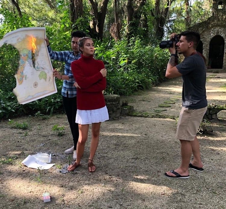  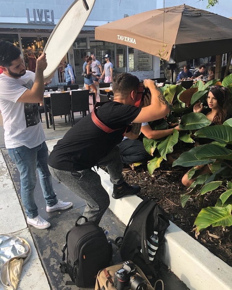
His behind-the-scenes shots reveal that you don’t have to pay a fortune or travel far to find interesting backdrops.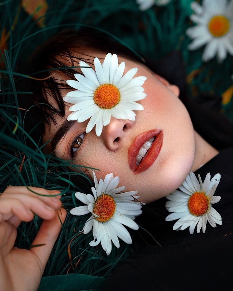 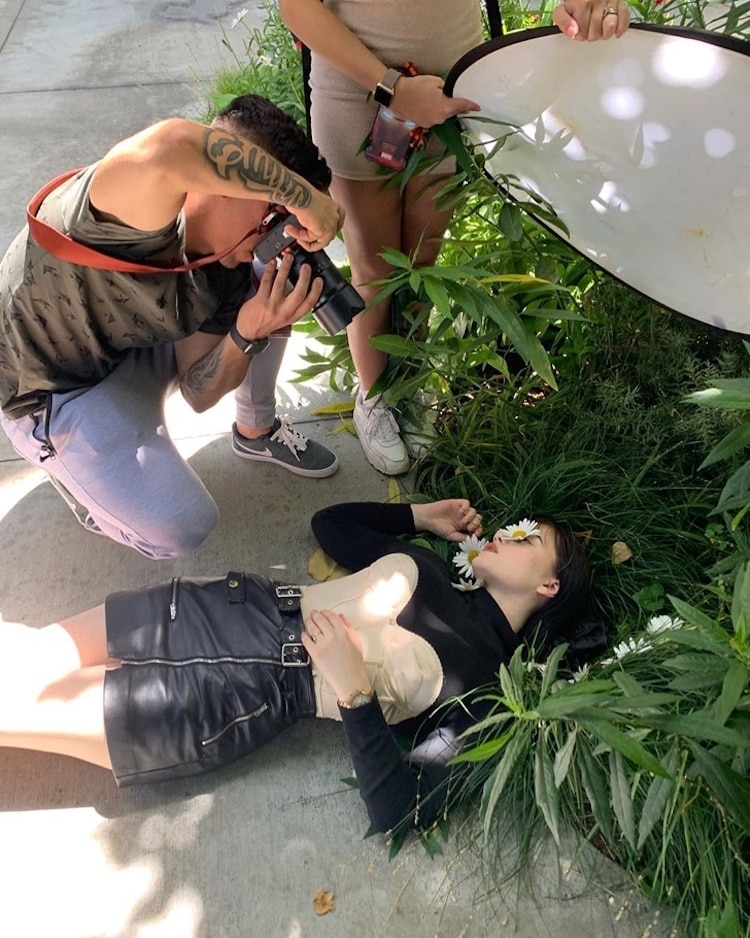 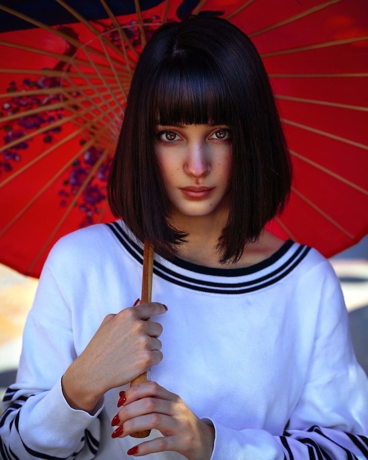 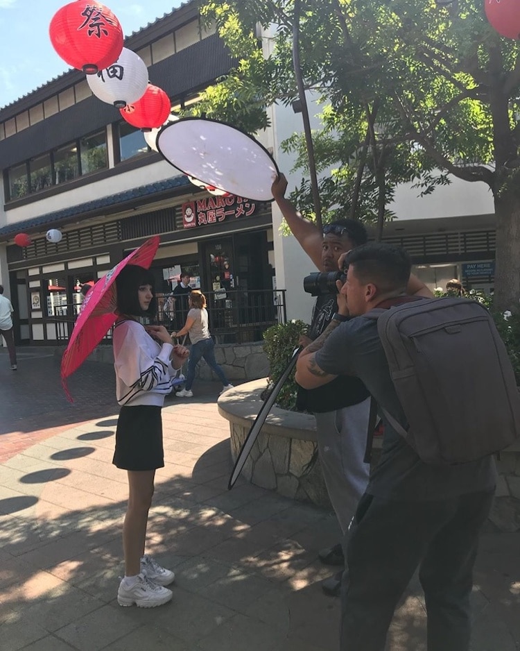 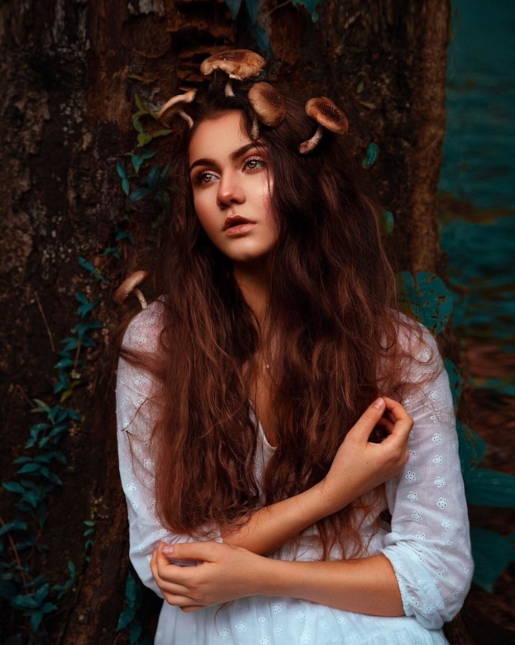 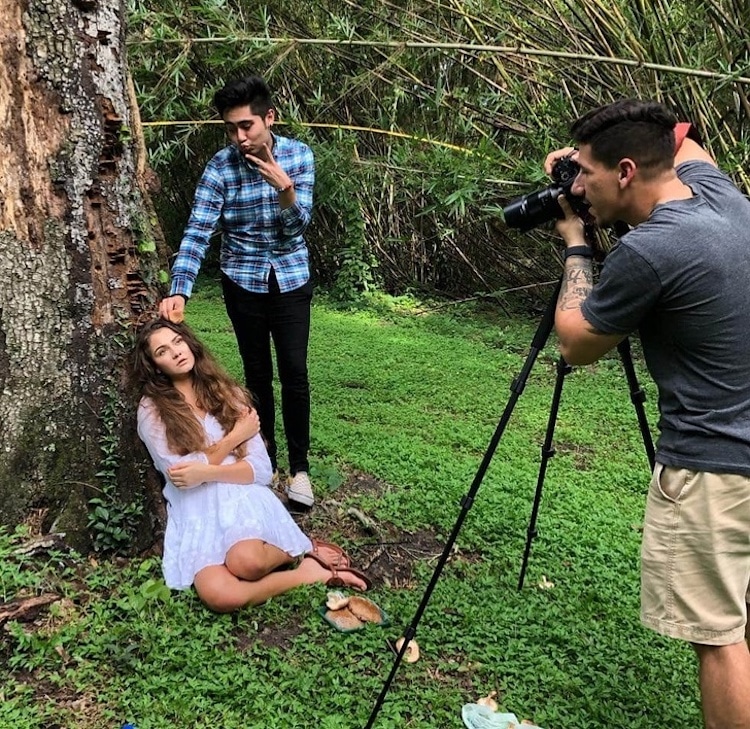
With the right lighting and composition, each image looks like it belongs in a high fashion campaign.My Modern Met granted permission to feature photos by Geo Leon.Related Articles:Behind the Scenes Perspective of What a Photographer Sees and What They Capture Photographer Exposes What Really Happens Behind the Scenes of a “Perfect” Shot Photographer Reveals Unglamorous Behind-the-Scenes Shots of Magical Instagram Photos Behind-The-Scenes Images Reveal the Secret Life of Photography Assistants The post Photographer Reveals Surprising Behind-the-Scenes Process of Stunning Portraits appeared first on My Modern Met. via RSSUnify feed https://mymodernmet.com/behind-the-scenes-photoshoot-geo-leon/ 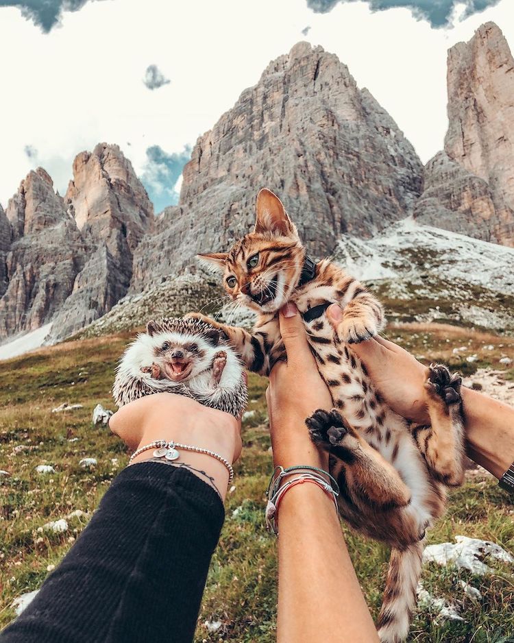
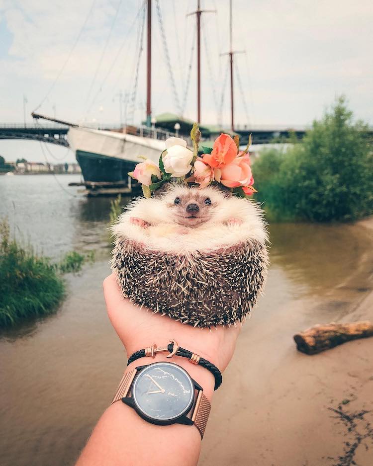
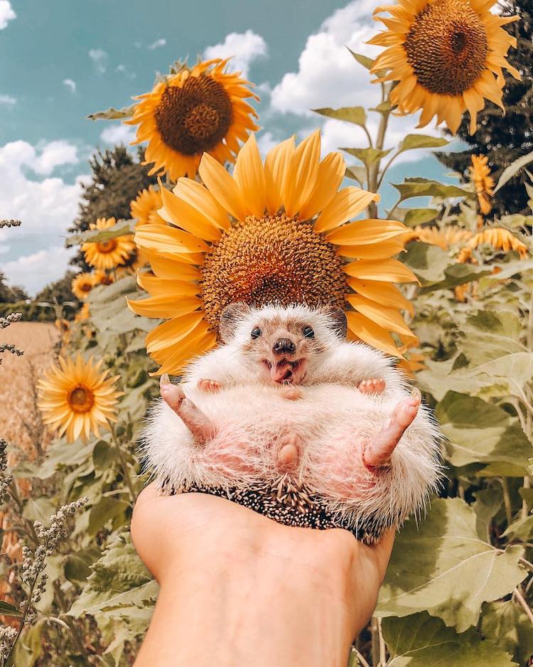
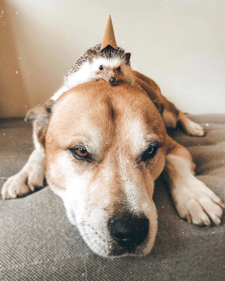
Animals are the world’s cutest adventurers. Proving this true is the happy hedgehog Herbee and his furry feline friend Audree. Together, they traverse gorgeous landscapes as a dynamic duo that makes the most of every moment. Their human, Talitha Girnus, captures beautiful portraits of them posing against mountain backdrops, among fields of wildflowers, and as they enjoy an afternoon snack while Herbee lounges in an empty coffee cup. Their jubilance is palpable and makes their popular Instagram account a delight to follow. Girnus posts pictures of the animal pals under the name @mr.pokee, an adorable hedgehog who started it all back in 2015. It was love at first sight for Girnus who got Pokee when he was just eight weeks old. “Do you know that feeling when the world stands still for a few seconds? That’s how it was when I first held Pokee in my hands,” she recalls. “He was very calm and laid flat on my hand as if he wanted to tell me that he belonged right there.” Sadly, Pokee passed away shortly before his fourth birthday in early 2019. But his spirit lives on through Herbee and Audree. “Between all the serious things happening in the world every day, Pokee and now also Herbee and Audree are here to give you a reason to be happy and smile,” Girnus says. “Whenever you return to our page, we want to remind you to never lose faith and always follow your heart.” Herbee the hedgehog and his Bengal cat friend Audree travel the world snapping adorable photos along the way.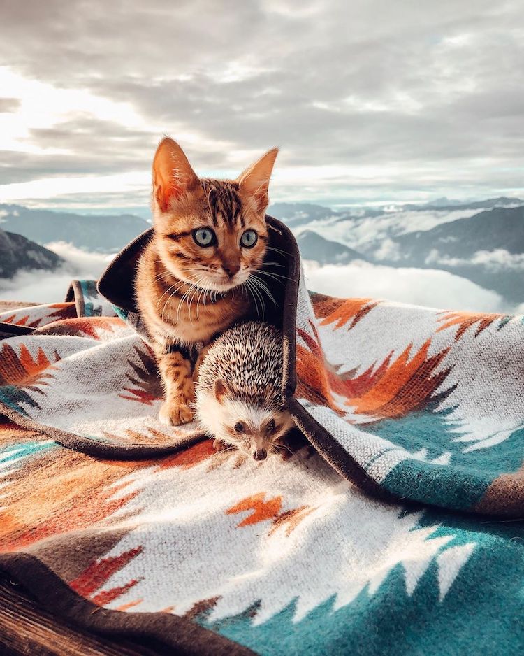 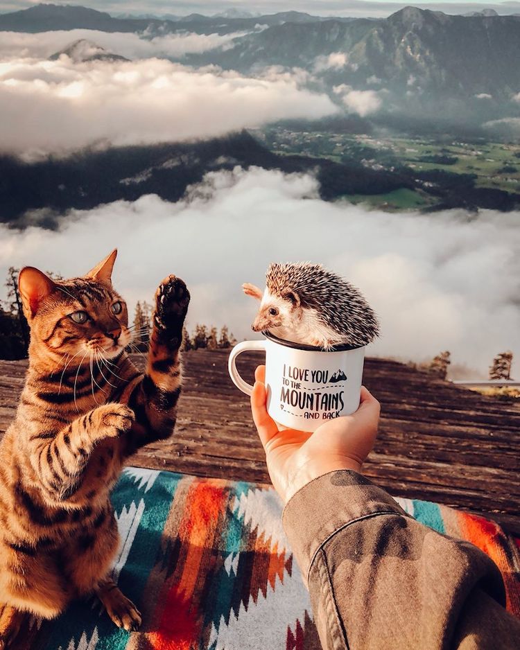
Their popular Instagram account will make you smile.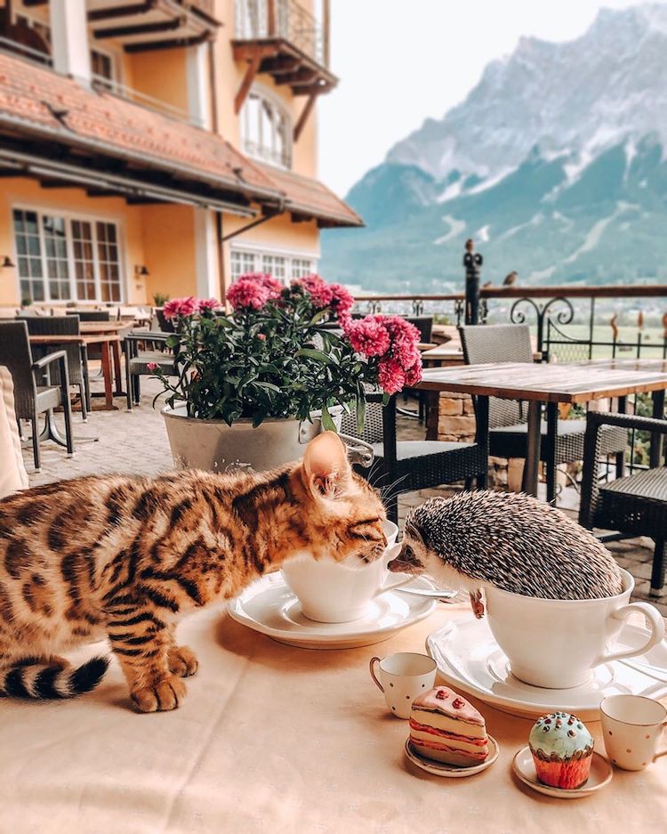 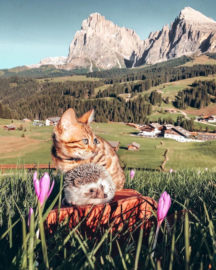
Sometimes, they’re pictured solo…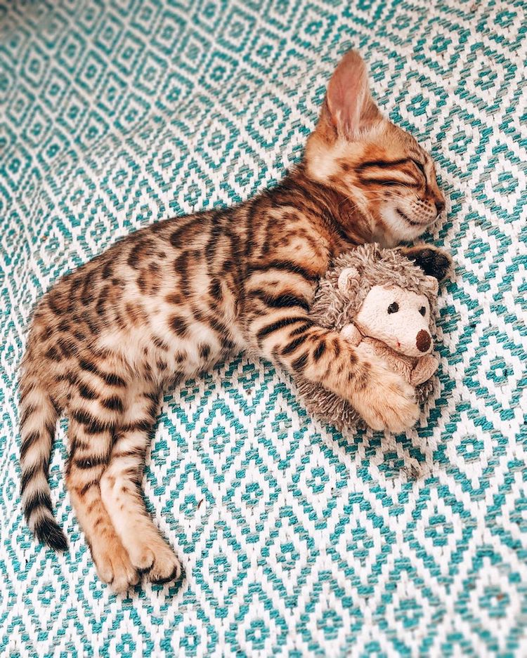   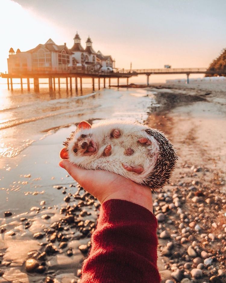
…and other times, with friends.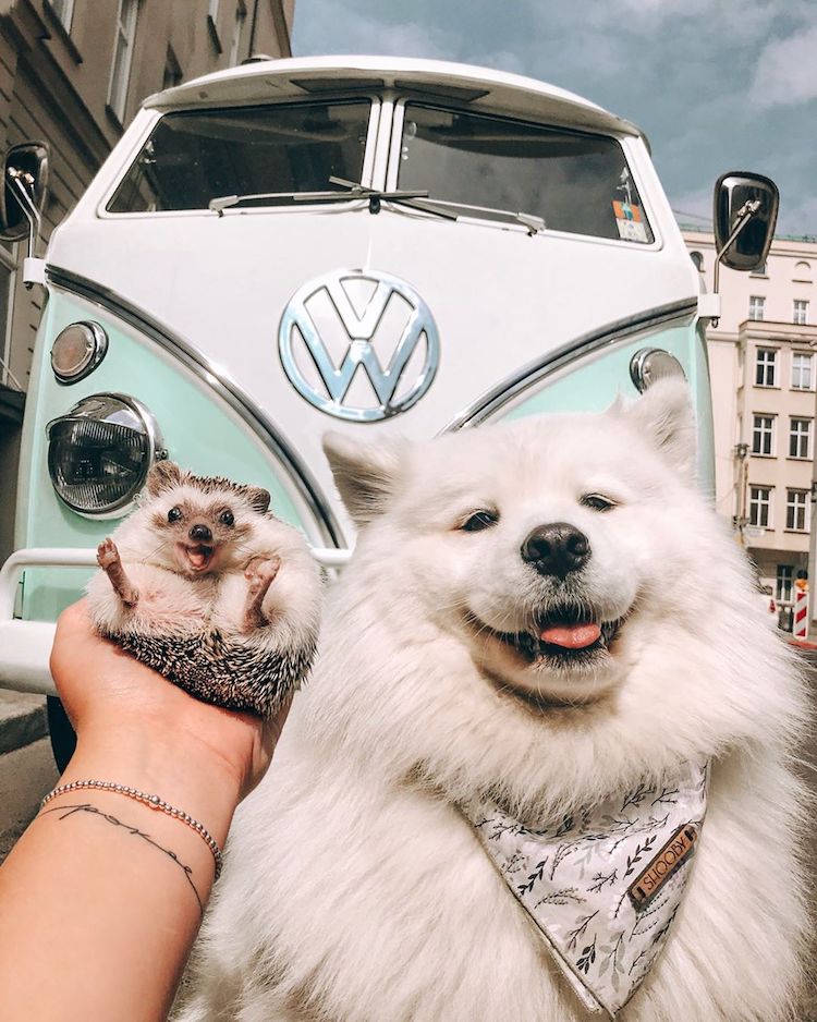
Their jubilant spirits keep alive the memory of hedgehog Mr. Pokee, the Instagram’s namesake, who sadly passed away in early 2019.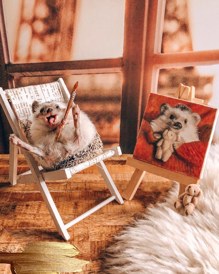
Herbee with a painted portrait of Mr. Pokee
My Modern Met granted permission to feature photos by Talitha Girnus.Related Articles:Adorable Dalmatian Has Lovely Heart-Shaped Spots Around His Eyes This Dog and Duck Have the Most Adorably Unexpected Friendship 25+ Purrfect Gifts for People Who Love Animals The post Adorable Adventures Chronicle the Friendship of a Hedgehog and Bengal Cat appeared first on My Modern Met. via RSSUnify feed https://mymodernmet.com/mr-pokee-friends-hedgehog-photos/ 
STRANGE FUTURE is an exhibition by painter & muralist Tristan Eaton who is known for his maximalist collage and illustrative pop art style. The exhibition features a wide range of new works including large assemblages of spray paint on canvas, skateboard grip tape, auto body paint and laser etched textures.
These graphic, abstracted compositions put modern themes of sex, crime, technology and war into pulp novel and comic book context allowing us to see the present from afar with child-like shock and wonder.Unimaginable sci-fi, horror and sexual fantasy are no longer fiction in Eaton’s STRANGE FUTURE, they are the reality of the dystopian world we live in. STRANGE FUTURE is an independently produced exhibition by the artist and will be on view for one week only. Exhibition highlights include: Collaborations with HEAVY METAL Magazine, an anaglyphic 3D Floor installation, blacklight posters and a Top Secret release with Kidrobot (a toy company Eaton bring tofame in the mid 2000’s). 
“We are living in a STRANGE FUTURE. Yet no one predicted how silly our dystopia would be… I always loved Pulp novels, Sci-Fi comics and Horror movies until I realized that we’re now living in one. The subversive storytelling in American Pulp, Horror and Sci-Fi have long influenced my art and myoutlook on the world but more importantly these dark renditions of the future have become prophetic, forcing life to imitate art in the most perverse way. No matter how we got to this point, we are all a little responsible for our collective compulsions and embar-rassingly human urges that led to this dysfunctional, sci-fi future we find ourselves in. America in 2019is a badly written, well illustrated pulp novel that exposes our deeply seated evil and profound stupidi- ty. These paintings are the cover art.” – TRISTAN EATON 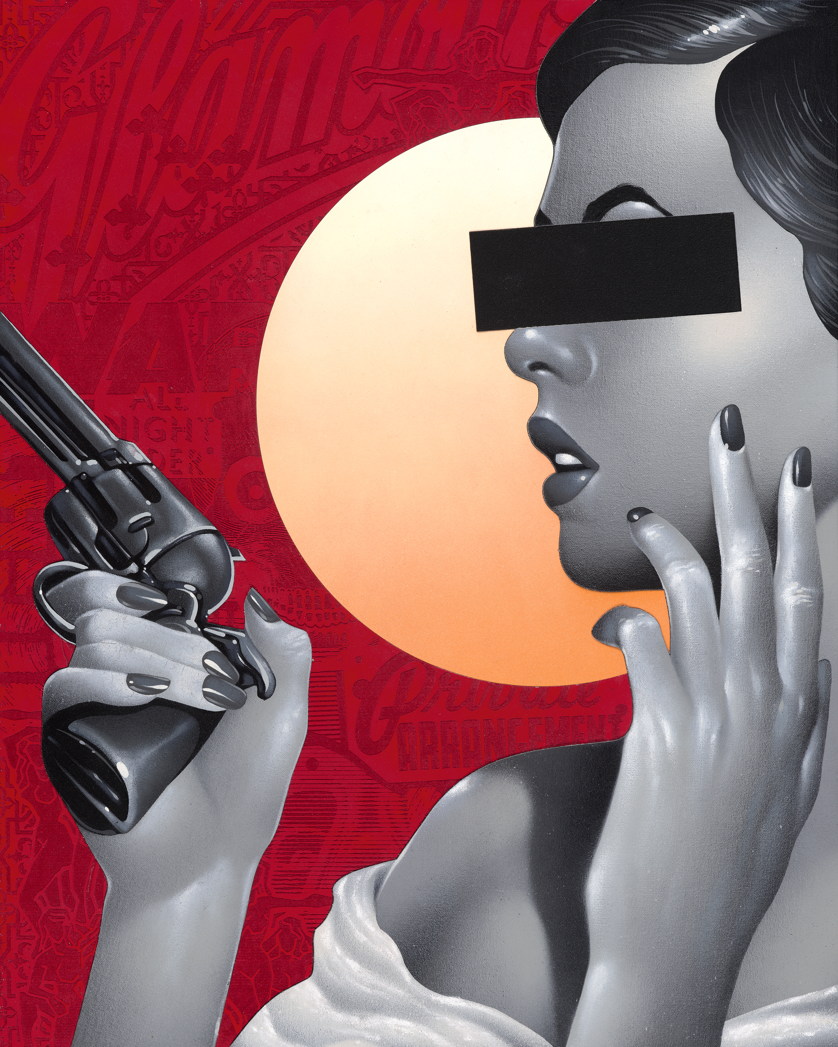
; Tristan Eaton’s Solo Exhibition “Strange Future” will be on display October 3-9th. 198 Allen St. Lower East Side, NYC Opening reception October 3rd 7-11pm. The post Tristan Eaton “Strange Future” An Exhibition of New Works Opening 10/3/19 NYC appeared first on StreetArtNews. via RSSUnify feed https://streetartnews.net/2019/09/tristan-eaton-strange-future-an-exhibition-of-new-works-opening-10-3-19-nyc.html
In the early to mid-20th century, many American artists flocked to the country’s major metropolises. From the California Impressionists who set up camp in the state’s coastal cities to the Abstract Expressionists whose home base was in bustling New York City, these modernists found success in these urban settings. ;In the meantime, however, Iowa-born painter Grant Wood was making a name for himself in the Midwest, a region that would inspire his most celebrated painting: American Gothic. Featuring a stoic portrait of a farmer and his daughter, ;this painting offers a fascinating glimpse into life in the rural United States. While many have misconstrued its meaning and misinterpreted its subject matter since its debut in 1930, this depiction of small town life remains one of art history’s biggest icons—and it’s all thanks to a tiny white house. ; Who was Grant Wood?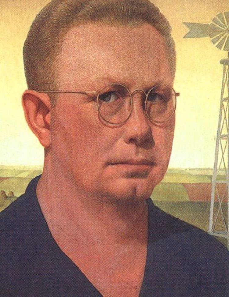
Grant Wood, “Self Portrait,” 1925 (Photo: Wikimedia Commons Public Domain) Before diving into the history of ;American Gothic, it’s important to understand the person behind the painting. Grant Wood was born in Anamosa, Iowa, ;in 1891. Though he spent much of his childhood in this rural town, Wood moved many times during his formative years. Following the death of his father when he just ten years old, his family moved to Cedar Rapids. Wood lived here until his late teen years, when he relocated to Minneapolis to enroll in ;the Handicraft Guild, a school that played a prominent role in the proliferation of the Arts and Crafts Movement. After one year, he returned to Iowa, and, in 1913, he moved to Illinois to study at the School of the Art Institute of Chicago. In addition to migrating around the Midwest, Wood frequently traveled abroad. Between 1922 and 1928, he visited Europe four times, where he developed a devoted appreciation for the work of Jan van Eyck. A pioneer of the Northern Renaissance, Van Eyck is renowned for his detailed paintings rendered in a realistic style. Though this artistic approach would greatly influence Wood, he did not share Van Eyck’s interest in biblical motifs or spiritual symbolism. Instead, he found inspiration in daily life, which is central to American Gothic. “Technique does not constitute art,” he said. “Nor is it a vague, fuzzy romantic quality known as ‘beauty,’ remote from the realities of everyday life. It is the depth and intensity of an artist’s experience that are the first importance in art.” ; American Gothic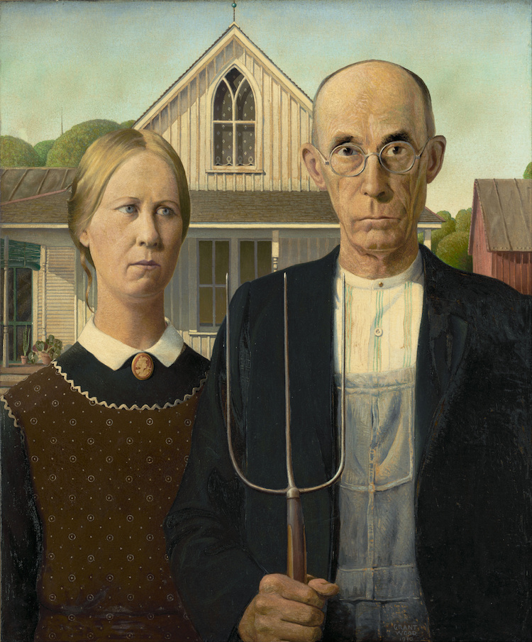
Grant Wood, “American Gothic,” 1930 (Photo: Google Arts & Culture Public Domain) In the late summer of 1930, Wood was back in Iowa. While traveling around the tiny town of Eldon, he discovered a “very paintable house.” Known as the Dibble House, this humble abode was built in 1881 in a Gothic Revival style called Carpenter Gothic. Architects working in this style sought to translate the forms and motifs found in medieval stone buildings as wooden homes. The Dibble House, for example, features a steep-pitched roof and two arched windows with intersecting wooden tracery. 
American Gothic house in Eldon, Iowa (Photo: Stock Photos from Scott Cornell/Shutterstock) In addition to its Gothic elements, however, Wood was drawn to its characteristically “rural” appearance, typified by its small stature, cream-colored walls, and shingled roof. When he spotted the home, it immediately caught his eye—and sparked his imagination. “I imagined American Gothic people with their faces stretched out long to go with this American Gothic house,” he said. Specifically, he pictured a farmer and his daughter, who—though make-believe—he opted to immortalize through portraiture. Rather than completely imagine his subjects or seek out sitters for what would become American Gothic, Wood made perfect models out of two people he already knew: his younger sister, Nan Wood Graham, and, unexpectedly, his dentist, Dr. Byron McKeeby.
The painting features Wood Graham and McKeeby positioned before the home. To aptly illustrate ;“the kind of people [he] fancied should live in that house,” Wood dressed the figures in clothing typical of a farming family. Wood Graham, for example, wears a colonial print apron and has a cameo pendant pinned to her high-collar, while McKeeby wears overalls and carries a pitchfork. He also opted to give the figures stoic expressions—a choice that many Iowans misinterpreted as an attempt to portray them as “pinched, grim-faced, puritanical Bible-thumpers.” ;Wood, however, stressed his appreciation for his home state and stated that this was not the case. This is not the only misunderstanding sparked by the portrait. Since the piece’s conception, many people have assumed the figures to be husband and wife. ;Wood, however, intended the pair to represent a father and his daughter—though he always allowed the painting to be open to interpretation. “These particulars, of course, don’t really matter,” he wrote in a letter in 1941. “What does matter is whether or not these faces are true to American life and reveal something about it.” Still, even with some controversy, the piece met mostly positive reception. In fact, when Wood entered it in a contest at the Art Institute of Chicago, it not only won him a ;$300 cash prize; it culminated in the painting’s permanent place in the museum’s collection. ; American Gothic Today
Stock Photos from oe Taylor Cinema/Shutterstock Today, fans of American Gothic can view the painting in the esteemed Art Institute of Chicago, where it has remained for decades. However, those who are truly interested in stepping into Wood’s world can actually visit the still-standing ;Dibble House. Listed on the National Register of Historic Places, the quaint cottage is practically identical to its painted likeness. The only difference? It ;now has a museum and ;visitor center, aptly illustrating the extent of the lasting legacy that started with a “very paintable house.” ; Related Articles:8 Real-Life Locations of Famous Paintings You Can Visit Today 8 Real-Life People Who Became the Stars of Art History’s Most Famous Paintings 5 Things to Do in Chicago for Art and Culture Lovers The post How a “Very Paintable” House Inspired ‘American Gothic,’ a Modernist Masterpiece appeared first on My Modern Met. via RSSUnify feed https://mymodernmet.com/grant-wood-american-gothic/ 
This post may contain affiliate links. If you make a purchase, My Modern Met may earn an affiliate commission. Please read our disclosure for more info. Italy-based, Armenian graphic designer and illustrator Nvard Yerkanian ;pays homage to her home country with an ongoing series of minimalist illustrations inspired by Soviet Modernist architecture. “It is an ode to the architectural heritage that is either lost or unfairly undervalued,” she explains. “The main aim of the project is to reveal the beauty and value of soviet-modernism to the indifferent public through the magic of colors that accentuate the simple yet fantastic forms of these monuments.” Yerkanian’s Soviet Modernist subjects include the Sevan Writers’ Resort in eastern Armenia, designed by Gevorg Kochar and Mikael Mazmanyan in 1965. The architectural complex juts out above the Sevan lake and was built to provide relaxation and inspiration to authors. Yerkanian’s illustrated rendition highlights its curved windows and balcony with minimalist shapes filled with colorful gradients. Yerkanian has also captured the charm of other epic structures such as the now abandoned Echmiadzin diving tower designed by Felix Hakobyan during the ‘60s, and the star-shaped Central Bus Station in Hrazdan built by Henrik Arakelyan in 1976-78. Each illustration pays homage to this distinct era of design by celebrating the buildings’ bold forms with graphic shapes and vibrant color. Scroll down to see Yerkanian’s fantastic architecture-inspired illustrations and follow her on Instagram to keep up to date with the ongoing series. If you like this artist’s work, you can purchase her illustrations as prints and more on Society6. Illustrator Nvard Yerkanian’s ongoing series of minimalist illustrations celebrates Soviet Modernist architecture in Armenia. 
Each illustration pays homage to this distinct era of design by celebrating the buildings’ bold forms with graphic shapes and vibrant color. 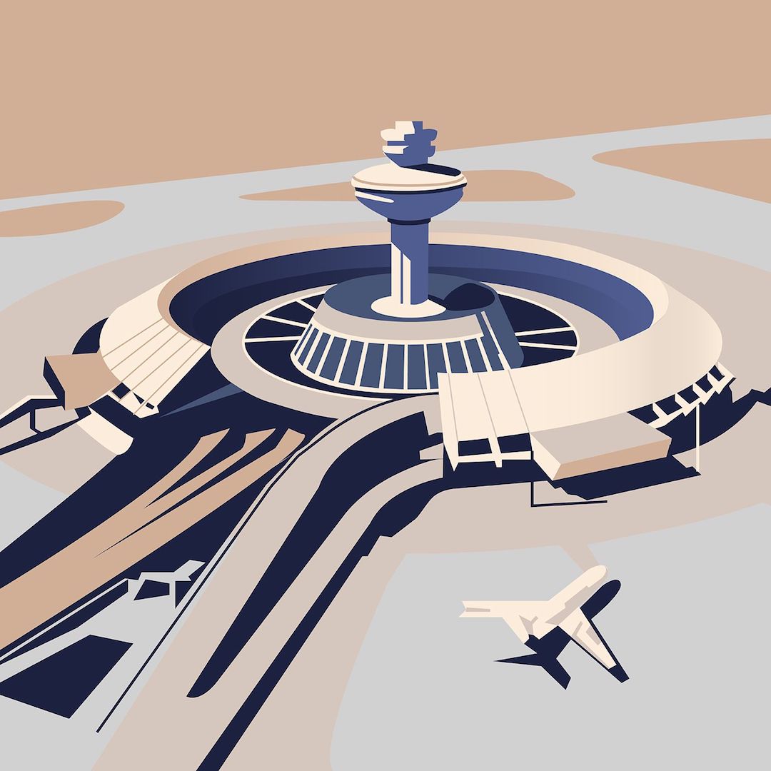 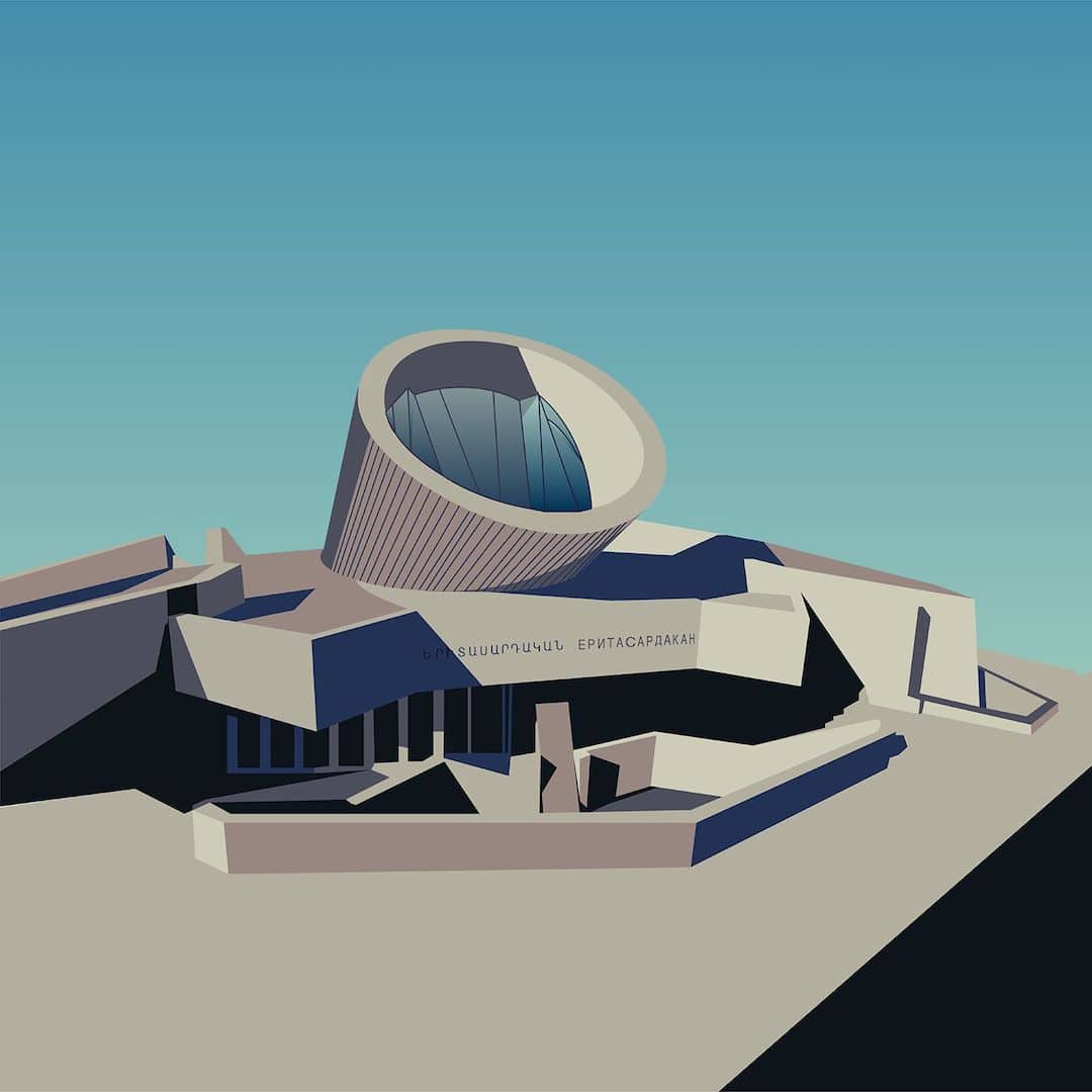 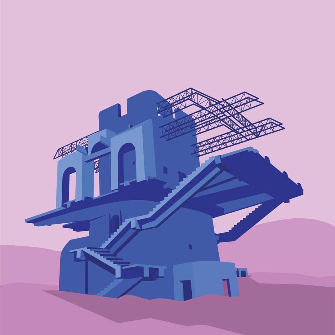 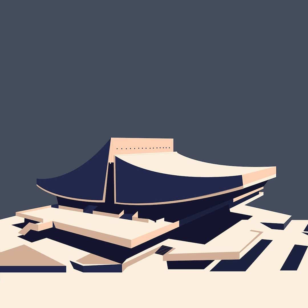 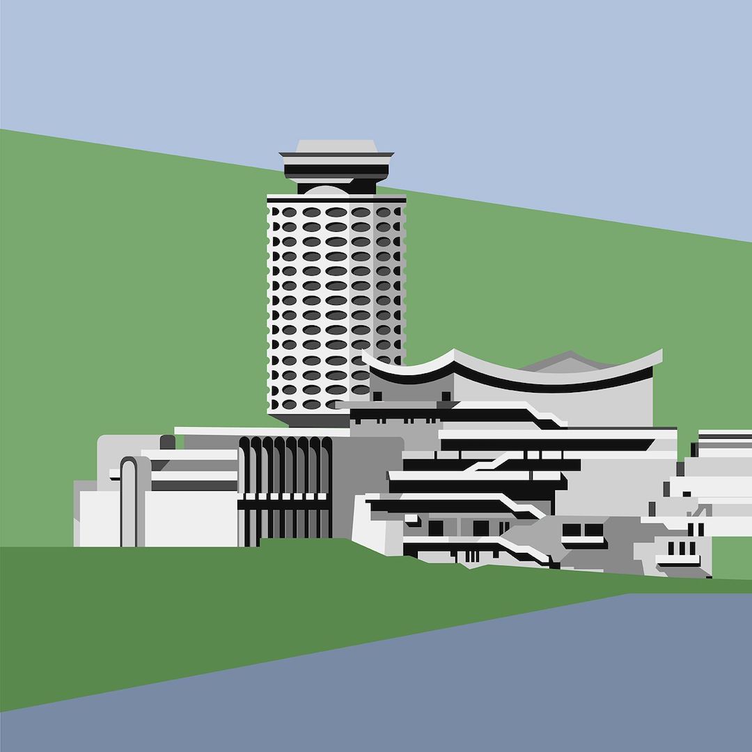 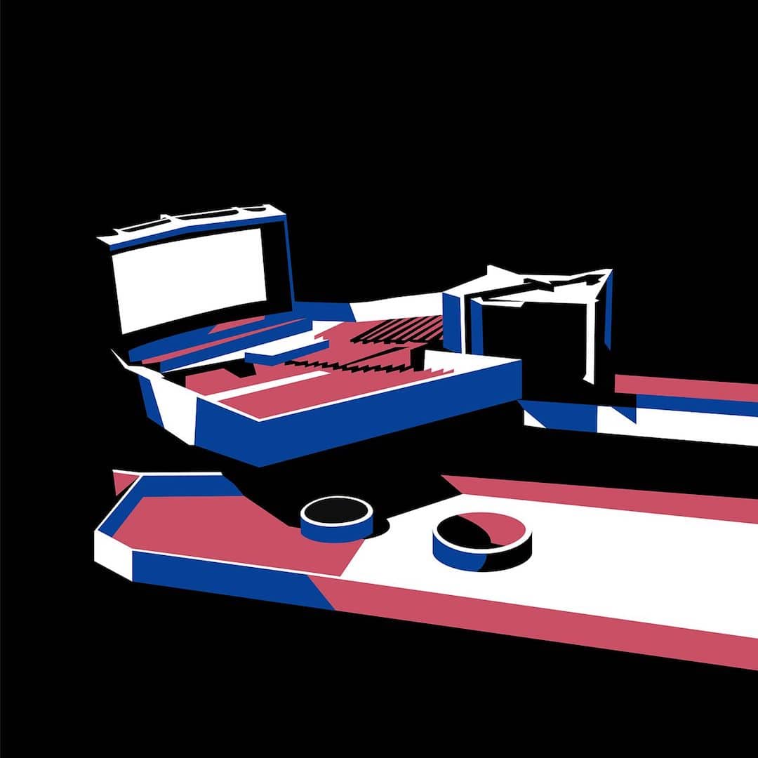 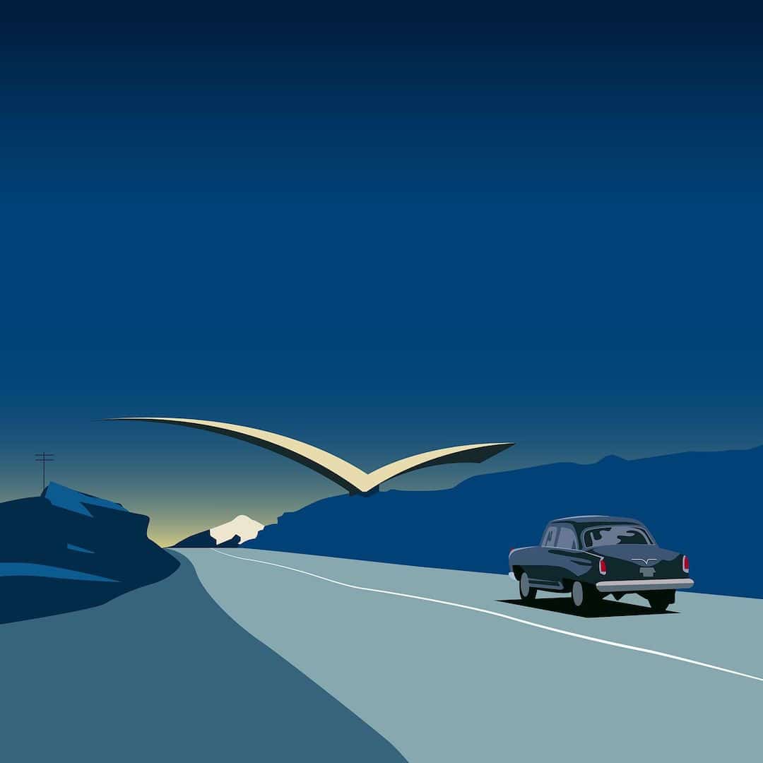  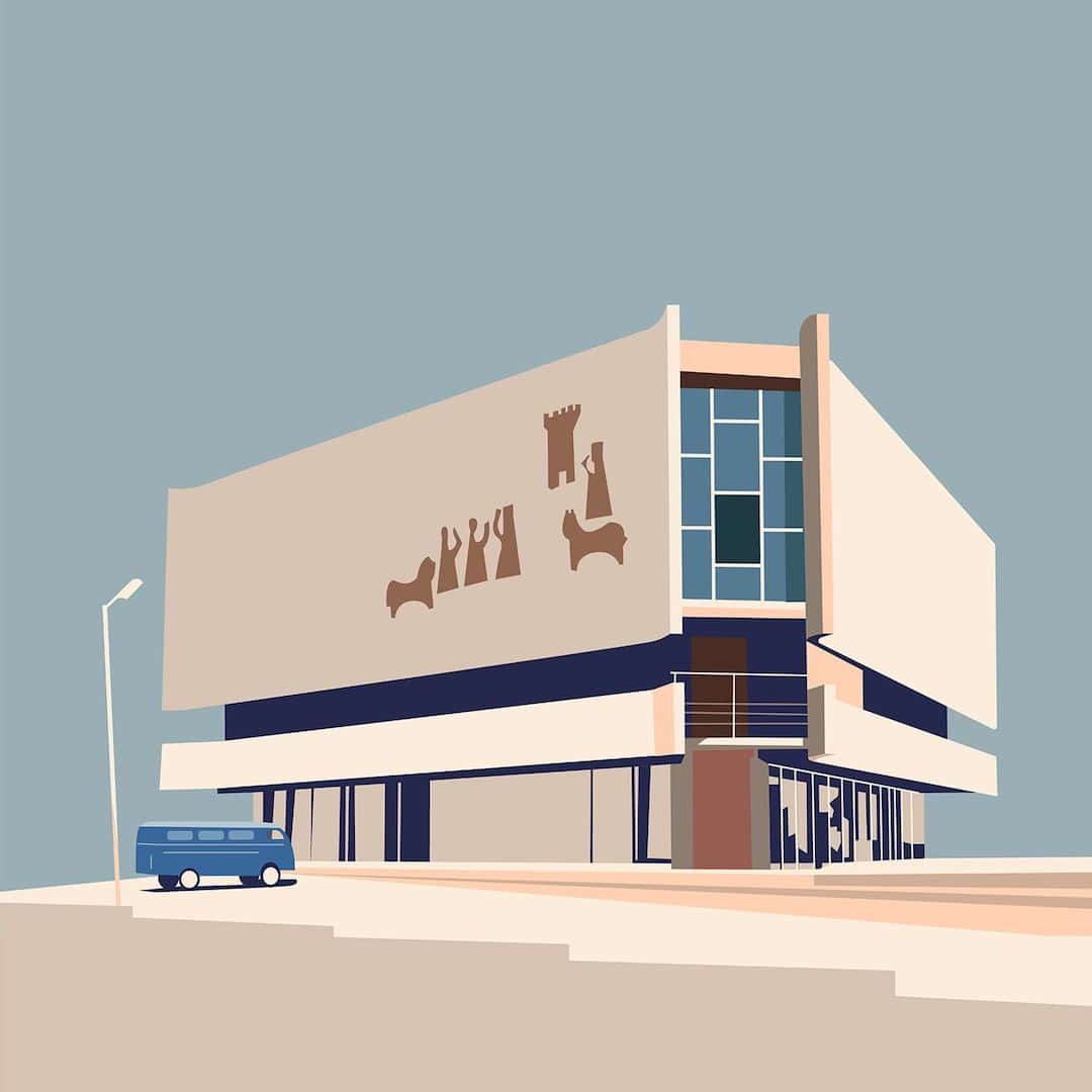
Nvard Yerkanian: Website | Instagram | Behance | Society6My Modern Met granted permission to feature photos by Nvard Yerkanian.Related Articles:Minimalist Illustrations Celebrate the Beauty of Oscar Niemeyer’s Modern ArchitecturePhotographer Explores the Rainbow-Colored Neighborhoods of IstanbulArchitecture 101: 10 Architectural Styles That Define Western Society25+ Creative Gifts for Architects and Architecture LoversThe post Vibrant illustrations Pay Homage to Armenia’s Soviet Modernist Architecture appeared first on My Modern Met. via RSSUnify feed https://mymodernmet.com/modernist-soviet-architecture-illustrations-nvard-yerkanian/ 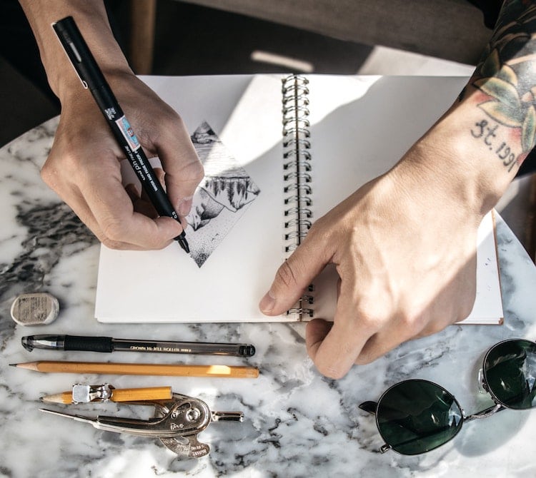
Photo: Kaizen Nguyễn Whether you’re a professional artist or a hobbyist who wants to get serious about your craft, you’re going to need an essential set of supplies. Drawing comes with its own list of recommended sketching utensils from erasers to pencils to tools that help you blend graphite. While this might not be the only items you need to tackle a specific project, they are some of the best to have on hand if you feel like sketching on the fly or you’re looking to complete a simple drawing exercise. When building your drawing tool kit, where do you start? Scroll down for our suggestion of supplies to buy. ; Essential Art Supplies for DrawingWith all drawing supplies, it’s best to try a few brands before you make your final decision of what will be your go-to pencil maker or sketchbook producer. They might be the same type of products, but each manufacturer will have their own formulas and characteristics you may love or hate. To ensure you’re getting the highest quality supplies, we recommend opting for “Artist” or “Professional” grade on the label as opposed to “Student” grade. The latter tend to be made of lower quality materials which, while cutting down on cost, probably won’t save you much money in the long run; they won’t last as long. ; A Range of Graphite Pencils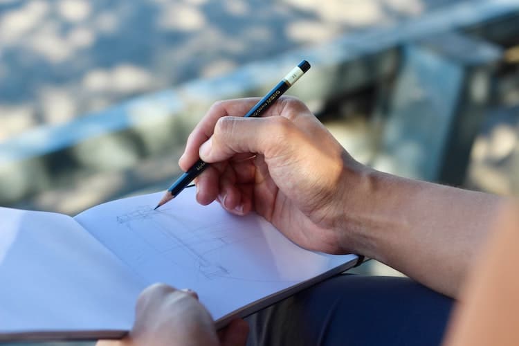
Photo: Chance Centeno Pencils might seem dull, but don’t sleep on this ubiquitous utensil. They have serious range. Great graphite is an essential part of an artist’s tools, and there are many considerations you’ll need to make when selecting a pencil. One of the first things is to figure your personal drawing style. Are you interested in tight, detailed technical drawing, or do you prefer loose sketching such as figure drawing? Do you like making thick, dark lines or do find yourself gingerly moving your pencil back and forth across the page? 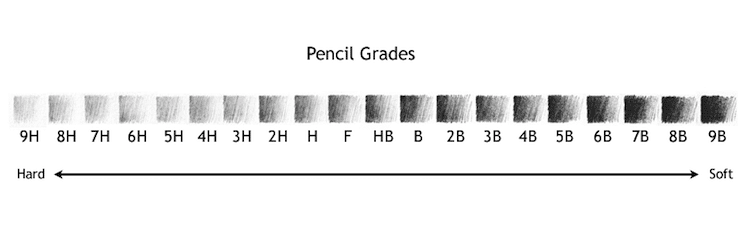
Photo: smbhax In the course of your drawing, you’re bound to find a pencil that you like, but make sure you have at least two or three of these utensils handy. Doing this will allow you to “mix and match” the needs of your drawing. An “H” pencil can be used for light sketching while a “B” grade is ideal for capturing shadows. We like Derwent’s set of 12 pencils. Check out our guide for more of the best drawing pencils for professionals and beginners who love to sketch. ; A Trusty Set of Colored Pencils
Photo: Markus Spiske Colored pencils are commonly associated with kids or adult coloring books, but they have proven to be powerful tools for creativity. With the right techniques, you can create drawings that boast multifaceted color and lifelike dimension. Like graphite, selecting your favorite colored pencils comes down to personal preference. One thing to look for is their materials, as colored pencil pigments can be made of either wax or oil. An oil-based pencil will effortlessly move across the page while those made of wax can be brittle and hard to blend colors. We like Prismacolor Premier’s set of 72 pencils. Check out our guide for more of the best colored pencils for professionals artists and coloring book enthusiasts. ; Next: More Essential Drawing SuppliesThe post New to Art Making? Make Sure You Have These Essential Drawing Supplies appeared first on My Modern Met. via RSSUnify feed https://mymodernmet.com/essential-drawing-supplies/ 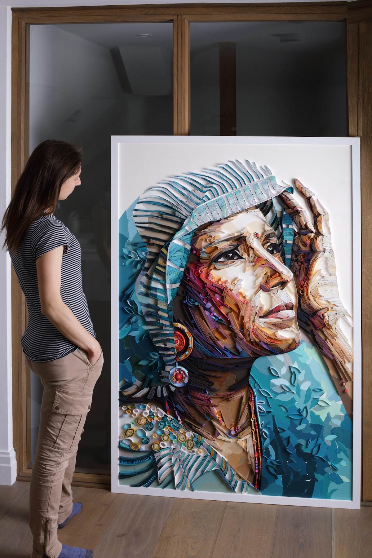
Brodskaya with her piece “Seeing” Renowned paper quilling artist Yulia Brodskaya never imagined that her career would lead to where it is today. Originally trained as a commercial artist, her first forays into papercraft were born out of a desire to create self-promotional work to woo potential design clients. But by spelling her first name in strips of paper, she had unknowingly entered the world of this centuries-old craft that traces its origins back to the Renaissance. Since beginning to experiment with paper, Brodskaya has honed her craft by continually pushing herself to produce new and increasingly complex pieces. This encourages her to improve on her current approaches to quilling while inventing alternative ways to depict things like facial features and decorative motifs. The results showcase her love of interdisciplinary art, and her latest large works straddle the line between paper quilling and Impressionist-style paintings. Brodskaya has recently written a book about her artistic process called Painting with Paper—Paper on the Edge. You won’t find paper quilling tutorials in it, but it will certainly inspire you to follow your own creative voice. We spoke with Brodskaya more about her book as well as about her art—including some of her most breakthrough pieces. Scroll down for My Modern Met’s exclusive interview. 
“Seeing” When did you first learn paper quilling? I never really “learned” it because when I first started working with paper strips, I had no idea what quilling was (people told me about the term quilling after my projects started to appear online). I always had a special fascination for paper as a material, but I studied graphic design and illustration and never thought that paper art would become my true passion. About 10 years ago, I was mainly interested in creating hand-drawn illustrations, especially letterforms, and after working at them for a year or so I had put together a number of typographic designs good enough, in my opinion, to get me editorial commissions from magazines and newspapers. My idea was to make a little self-promotional booklet featuring some of these designs and send it out to potential clients. The crucial thing that was missing was an eye-catching cover image that would make certain my booklet would be noticed. I decided that it had to be my name illustrated and featured on the cover. I created several hand-drawn versions of my name—Yulia— but none of them seemed to be good enough, so I discarded them. 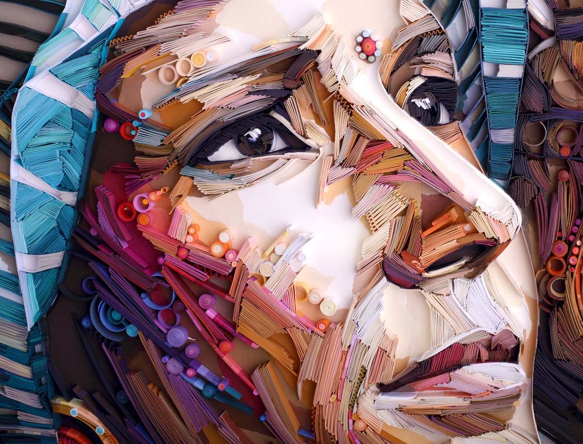
“Seeing” (detail) (continued) ;At some point, somehow, the idea to cut a sheet of card into strips came to my mind, and I began gluing these strips’ edges down, repeating the letter outlines. As soon as the “Yulia” paper design was ready, I realized that I’m onto something very exciting, I immediately dropped the illustrative booklet idea and instead immersed myself into this new world of paper. I, unknowingly, invented quilling from scratch for myself; but it turned out that my method is not really the same: the key difference is that I use heavy paper or card which I shape and manipulate any way I want to as if I’m drawing or painting with paper strips. 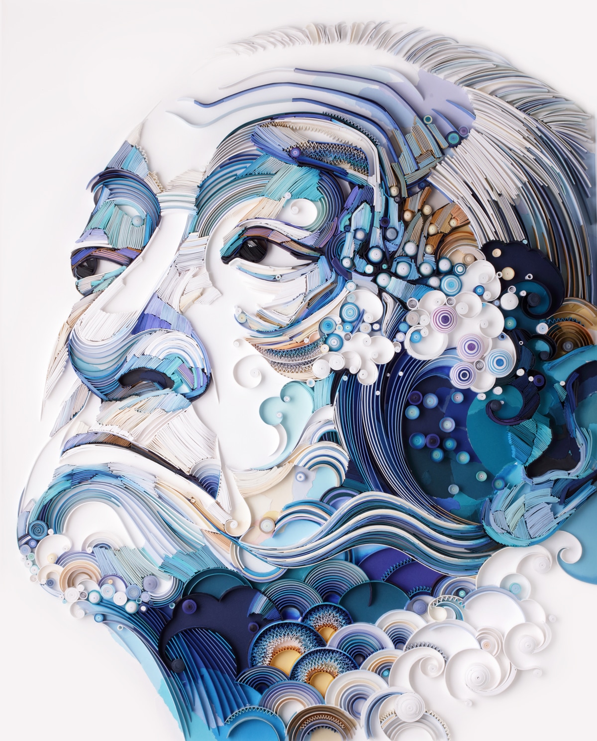
“Samurai Dreams” 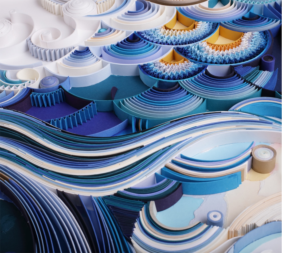
“Samurai Dreams” (detail) What were your first projects like? My very first projects were completely different compared to the large-scale portraits that I work on nowadays. I was mainly focusing on typography and making decorative letters with paper strips. This was an essential period though because my commercial work for editorial and advertising projects has brought exposure and popularity to this type of papercraft and made it look modern and exciting. So many people practice quilling these days compared to a small number of dedicated quillers, school kids, or scrapbook making enthusiasts who were familiar with this craft 10 years ago. 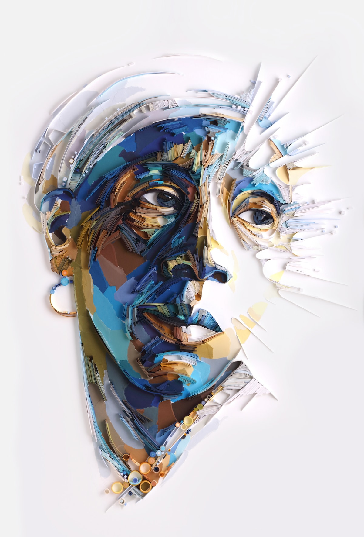
“Pull to the Light” Paper quilling has been around since the Renaissance, yet you have reinvented the craft time and again. What inspired you to experiment? ; My paper art is a reflection of my development as a person, basically, it evolves naturally versus me having some plan and a clear idea of where it’s going; I just follow my instincts/heart/intuition (call it any way you want) and allow these transformations to happen and come through. How long did it take to develop these new techniques? In my book, I write about my 10-year journey and explain the evolution that had to take place for me to arrive at this moment when I don’t really feel any medium constraints, I’m just excited to see what’s next: possibilities are endless. 
“Sheshall” Is there a piece you consider a “breakthrough” in your work, in terms of approach or subject matter? ; I can name several projects that seem to stand out. In my early years: A commission for The Guardian newspaper (g2) which was my very first commercial job using paper strips, it was a real breakthrough project bringing me a tone of exposure, basically it “got the ball rolling” for my art, I never had to look for jobs since they kept coming my way. Later on, there were other projects that played a big part in the development of my methods (having said that, I do believe that every single work played its part), but to name just a few:
The list can go on because I do learn something new with every new artwork completed. 
“Sheshall” (detail) For those that would like to try paper quilling for themselves, what are your top tips for beginners? I always give the same advice: just give it a try and enjoy the process. You will know that it’s right for you. If you feel joy and pleasure from working with paper strips, at this point the outcome is secondary. Remember: There is no right or wrong way, and it is NOT about the tools. There are thousands of tutorials for those who need them, but it is important not to get stuck and develop a habit of needing somebody else to outline and plan every creative decision for you. The real unique creativity comes from inside when you find the courage and learn to make your own decisions (and, sometimes, mistakes) but ultimately create the art that is as unique as you are.
I’ve been approached by multiple publishers offering me to write a book about quilling; however, they were only interested in project-based/tutorial books believing that this is the only format that people would be interested in. I only agreed to give this adventure “a go” when at some stage of discussion everyone involved in the book production agreed to take a leap of faith and allow me to write a book the way I believe it needs to be written to reflect my work. What can readers expect? People ask me for tutorials all the time, but I can never bring myself to do them because they don’t represent my creative process. The book is an insight into the way I work, the creative decisions I make every step of the way; there is plenty of practical tips too, but most of all, I hope my journey will inspire people to get in touch with their innate creativity (if you recognize and see beauty, it means that there is already that dimension present in you). The book is not just for those interested in quilling and papercraft, many of the things I write about are inter-disciplinary and might be interesting for anyone who enjoys art in general. 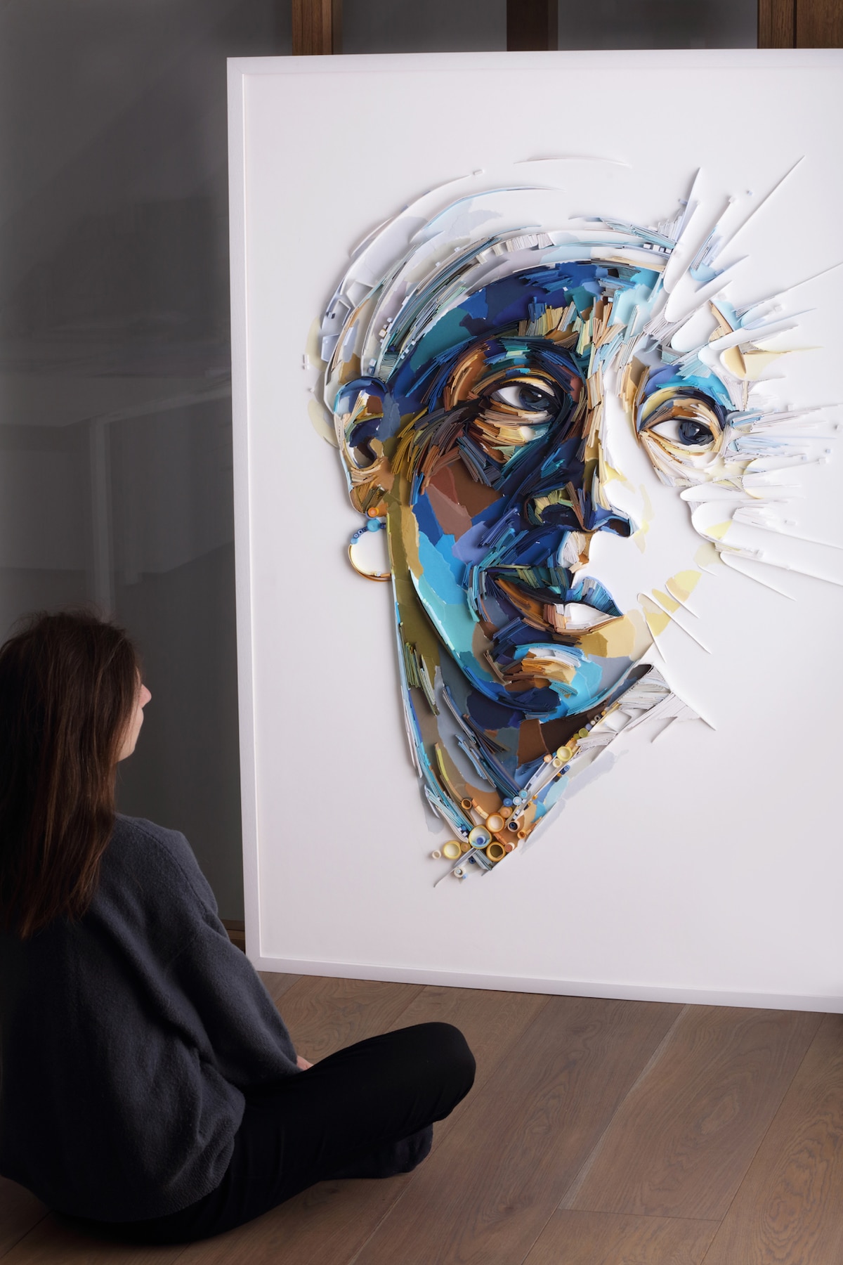
Brodskaya with her piece “Pull to the Light” What are you working on now? Anything exciting you can tell us about? Right now, I’m all about exploring large scale (I must say that it is not LARGE universally speaking), but large for the techniques that I use, e.g. my recent works are about 1 by 1.5 meters. Of course, it is possible to fill in a large space with hundreds of tightly rolled circles or coils; however, my personal interest lies in conveying a deeper emotional complexity into larger paper artworks, ensuring that the larger scale does not become a goal in itself. I also feel a new urge in choosing my subject matter: it feels that depicting just a beautiful flower, a pretty shell or a decorative wave on its own is simply not enough. A human presence is needed to deepen the visual experience, the feel and emotional charge coming from the artwork, so I end up combining the natural motifs with human faces. It is probably just another step in my art evolution, and who knows what I am going to create next. It is all exciting and I’m happy to share my paper art journey with so many people! Yulia Brodskaya: Website | Instagram | FacebookMy Modern Met granted permission to feature photos by Yulia Brodskaya.Related Articles:Learn How Paper Quilling Started Centuries Ago and Why It’s So Popular Today10 Creative Art and Craft Ideas That Are Pinterest-Approved31 Artists Who Transform Ordinary Paper Into Astonishing Works of ArtThe post Interview: Renowned Paper Quilling Artist Reveals Her Most Groundbreaking Works appeared first on My Modern Met. via RSSUnify feed https://mymodernmet.com/yulia-brodskaya-paper-quilling-interview/
In the early to mid-20th century, many American artists flocked to the country’s major metropolises. From the California Impressionists who set up camp in the state’s coastal cities to the Abstract Expressionists whose home base was in bustling New York City, these modernists found success in these urban settings. ;In the meantime, however, Iowa-born painter Grant Wood was making a name for himself in the Midwest, a region that would inspire his most celebrated painting: American Gothic. Featuring a stoic portrait of a farmer and his daughter, ;this painting offers a fascinating glimpse into life in the rural United States. While many have misconstrued its meaning and misinterpreted its subject matter since its debut in 1930, this depiction of small town life remains one of art history’s biggest icons—and it’s all thanks to a tiny white house. ; Who was Grant Wood?
Grant Wood, “Self Portrait,” 1925 (Photo: Wikimedia Commons Public Domain) Before diving into the history of ;American Gothic, it’s important to understand the person behind the painting. Grant Wood was born in Anamosa, Iowa, ;in 1891. Though he spent much of his childhood in this rural town, Wood moved many times during his formative years. Following the death of his father when he just ten years old, his family moved to Cedar Rapids. Wood lived here until his late teen years, when he relocated to Minneapolis to enroll in ;the Handicraft Guild, a school that played a prominent role in the proliferation of the Arts and Crafts Movement. After one year, he returned to Iowa, and, in 1913, he moved to Illinois to study at the School of the Art Institute of Chicago. In addition to migrating around the Midwest, Wood frequently traveled abroad. Between 1922 and 1928, he visited Europe four times, where he developed a devoted appreciation for the work of Jan van Eyck. A pioneer of the Northern Renaissance, Van Eyck is renowned for his detailed paintings rendered in a realistic style. Though this artistic approach would greatly influence Wood, he did not share Van Eyck’s interest in biblical motifs or spiritual symbolism. Instead, he found inspiration in daily life, which is central to American Gothic. “Technique does not constitute art,” he said. “Nor is it a vague, fuzzy romantic quality known as ‘beauty,’ remote from the realities of everyday life. It is the depth and intensity of an artist’s experience that are the first importance in art.” ; American Gothic
Grant Wood, “American Gothic,” 1930 (Photo: Google Arts & Culture Public Domain) In the late summer of 1930, Wood was back in Iowa. While traveling around the tiny town of Eldon, he discovered a “very paintable house.” Known as the Dibble House, this humble abode was built in 1881 in a Gothic Revival style called Carpenter Gothic. Architects working in this style sought to translate the forms and motifs found in medieval stone buildings as wooden homes. The Dibble House, for example, features a steep-pitched roof and two arched windows with intersecting wooden tracery.
American Gothic house in Eldon, Iowa (Photo: Stock Photos from Scott Cornell/Shutterstock) In addition to its Gothic elements, however, Wood was drawn to its characteristically “rural” appearance, typified by its small stature, cream-colored walls, and shingled roof. When he spotted the home, it immediately caught his eye—and sparked his imagination. “I imagined American Gothic people with their faces stretched out long to go with this American Gothic house,” he said. Specifically, he pictured a farmer and his daughter, who—though make-believe—he opted to immortalize through portraiture. Rather than completely imagine his subjects or seek out sitters for what would become American Gothic, Wood made perfect models out of two people he already knew: his younger sister, Nan Wood Graham, and, unexpectedly, his dentist, Dr. Byron McKeeby.
The painting features Wood Graham and McKeeby positioned before the home. To aptly illustrate ;“the kind of people [he] fancied should live in that house,” Wood dressed the figures in clothing typical of a farming family. Wood Graham, for example, wears a colonial print apron and has a cameo pendant pinned to her high-collar, while McKeeby wears overalls and carries a pitchfork. He also opted to give the figures stoic expressions—a choice that many Iowans misinterpreted as an attempt to portray them as “pinched, grim-faced, puritanical Bible-thumpers.” ;Wood, however, stressed his appreciation for his home state and stated that this was not the case. This is not the only misunderstanding sparked by the portrait. Since the piece’s conception, many people have assumed the figures to be husband and wife. ;Wood, however, intended the pair to represent a father and his daughter—though he always allowed the painting to be open to interpretation. “These particulars, of course, don’t really matter,” he wrote in a letter in 1941. “What does matter is whether or not these faces are true to American life and reveal something about it.” Still, even with some controversy, the piece met mostly positive reception. In fact, when Wood entered it in a contest at the Art Institute of Chicago, it not only won him a ;$300 cash prize; it culminated in the painting’s permanent place in the museum’s collection. ; American Gothic Today
Stock Photos from oe Taylor Cinema/Shutterstock Today, fans of American Gothic can view the painting in the esteemed Art Institute of Chicago, where it has remained for decades. However, those who are truly interested in stepping into Wood’s world can actually visit the still-standing ;Dibble House. Listed on the National Register of Historic Places, the quaint cottage is practically identical to its painted likeness. The only difference? It ;now has a museum and ;visitor center, aptly illustrating the extent of the lasting legacy that started with a “very paintable house.” ; Related Articles:8 Real-Life Locations of Famous Paintings You Can Visit Today 8 Real-Life People Who Became the Stars of Art History’s Most Famous Paintings 5 Things to Do in Chicago for Art and Culture Lovers The post How a “Very Paintable” House Inspired ‘American Gothic,’ a Modernist Masterpiece appeared first on My Modern Met. via RSSUnify feed https://mymodernmet.com/grant-wood-american-gothic/
This post may contain affiliate links. If you make a purchase, My Modern Met may earn an affiliate commission. Please read our disclosure for more info. Italy-based, Armenian graphic designer and illustrator Nvard Yerkanian ;pays homage to her home country with an ongoing series of minimalist illustrations inspired by Soviet Modernist architecture. “It is an ode to the architectural heritage that is either lost or unfairly undervalued,” she explains. “The main aim of the project is to reveal the beauty and value of soviet-modernism to the indifferent public through the magic of colors that accentuate the simple yet fantastic forms of these monuments.” Yerkanian’s Soviet Modernist subjects include the Sevan Writers’ Resort in eastern Armenia, designed by Gevorg Kochar and Mikael Mazmanyan in 1965. The architectural complex juts out above the Sevan lake and was built to provide relaxation and inspiration to authors. Yerkanian’s illustrated rendition highlights its curved windows and balcony with minimalist shapes filled with colorful gradients. Yerkanian has also captured the charm of other epic structures such as the now abandoned Echmiadzin diving tower designed by Felix Hakobyan during the ‘60s, and the star-shaped Central Bus Station in Hrazdan built by Henrik Arakelyan in 1976-78. Each illustration pays homage to this distinct era of design by celebrating the buildings’ bold forms with graphic shapes and vibrant color. Scroll down to see Yerkanian’s fantastic architecture-inspired illustrations and follow her on Instagram to keep up to date with the ongoing series. If you like this artist’s work, you can purchase her illustrations as prints and more on Society6. Illustrator Nvard Yerkanian’s ongoing series of minimalist illustrations celebrates Soviet Modernist architecture in Armenia.
Each illustration pays homage to this distinct era of design by celebrating the buildings’ bold forms with graphic shapes and vibrant color.
Nvard Yerkanian: Website | Instagram | Behance | Society6My Modern Met granted permission to feature photos by Nvard Yerkanian.Related Articles:Minimalist Illustrations Celebrate the Beauty of Oscar Niemeyer’s Modern ArchitecturePhotographer Explores the Rainbow-Colored Neighborhoods of IstanbulArchitecture 101: 10 Architectural Styles That Define Western Society25+ Creative Gifts for Architects and Architecture LoversThe post Vibrant illustrations Pay Homage to Armenia’s Soviet Modernist Architecture appeared first on My Modern Met. via RSSUnify feed https://mymodernmet.com/modernist-soviet-architecture-illustrations-nvard-yerkanian/ |
AboutContemporary Art and Design Lover Archives
April 2021
Categories |
 Annita Maslov:
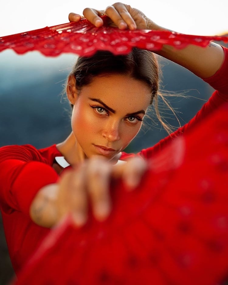


 Geo Leon:
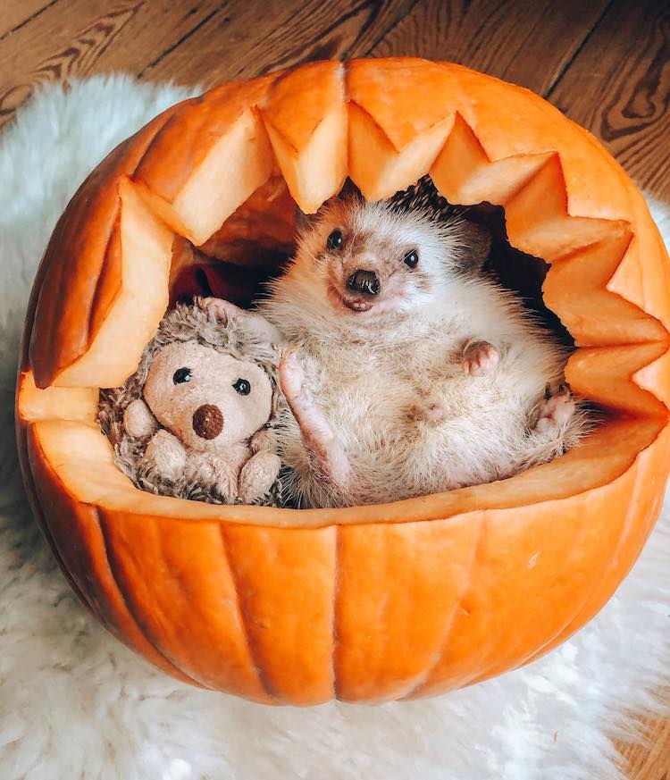


 Mr. Pokee:
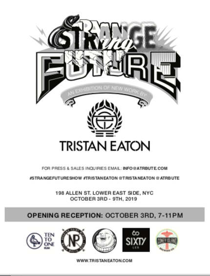


 What can you tell us about your book
  RSS Feed
